Social Dissonance – Blasphemy or Opportunity?

Unlike.

I am sure that most people who use Facebook must have felt a pressing need for a  an ‘unlike’ button at least once so far. There are a lot of irritatingly clichéd, painfully faked, ostentatiously humane kind of shares, messages, pics and videos out there so much so that you would sometimes cringe at even a hint of such posts. Give me an ‘unlike’ button or better still ‘hate’ button – you might yearn, at such times!

The bad news obviously is that Facebook bans even the usage of the words ‘hate’ or ‘unlike’ in the Apps and hence developers are told that it is a strict ‘NO GO’, evidently in the spirit of fostering more inclusive communities, curating  conversations and triggering engagements that are more positive in nature.The good news however is that very recently, a new kind of App has come into the ‘Social AppSphere’ that kind of comes close to this ‘dislike’ / ‘hate’ kind of intent. Records say that it became so controversially popular that it had got more than 10,000 users in just 36 hrs.  Enter EnemyGraph.

Created by a Dean Terry and his Grad Student Bradley Griffith (at University of Texas at Dallas), EnemyGraph essentially is a Facebook App that lets you identify, create and share your enemies list with your friends online. I have to admit that when I first heard of it I wasn’t very impressed by the idea. It smacked of something that’s trying hard to be innovative by deliberately trying to think different. But before pursuing the story further on the WWW, I froze in my heels and tried to argue with myself to see if there is something more to it.

Let’s get back to the basics – What are communities? and how are communities built? Wikipedia defines a community as a group of people that share common values and are bound by ‘social cohesion’. Now these vibes of cohesion or a shared set of values/beliefs are nothing but those that are created out of very strong affiliations – affiliations that are overwhelmingly positive or negative in sentiment.

So any strong sentiment that is overwhelmingly positive or negative in nature turns out to be a potential binding force for bringing together groups of people as strong communities. This very insight must have triggered this ingenuous attempt to foster and leverage upon the seeds of social dissonance planted in the social media landscape.

At a very simplistic level, assume that you like Justin Bieber, but one of your friends lists him as an “enemy.” EnemyGraph will send you a “dissonance report,” pointing out the difference and offering it up for conversation. What is actually happening here? Dissonance always tends to capture people’s attention. So when I know that something that I like, is hated by my friend (or vice-versa) it  makes me pause for a while (even in the occasional social media ‘rush hour madness’) and compels me to reflect upon this new equation, this new conversational dynamic and makes a participant out of me. Isn’t that cool?

Sadly the founders themselves feel that this could soon be seen as a blasphemy by Facebook as it could go against their social media philosophy, and hence fear that it could soon be shut down by Mark Z and his aides.

I, for one believe that there is a phenomenal opportunity in the idea – as a consumer and more importantly as a marketer. Interesting co-incidence that my previous blog post was about brands that have sought to create a distinctive and (in some cases like Marmite) an almost irresistible kind of proposition by using a HATRED related angle.

Let’s take Marmite as an example.To take their positioning that you either love it or hate it, to the next level, it could potentially have ‘fans’ (or let’s’ say active participants of a community) who declare their authentic affiliations towards the brand on their Facebook page. Tons would love/like it (as the pouring online evidence shows). Many could even hate it (as the brand communications boldly state). Just imagine. If there were to be an EnemyGraph kind of platform that helps the brand to capture these strong dual affiliations online, wouldn’t that be a very powerful source that truly reinforces its fundamental brand truth and thereby its iconic appeal?

From Marmite’s part, agreed that it requires a meticulously careful management of this love/hate relationship as it pans out in real time online and a very mature capability of curating content around that community in the over all interest of the brand.  Agreed that it could be a leap of faith for the brand (as things can very rapidly go downhill online if mismanaged). But we are speaking about a brand as iconic as Marmite, a brand that has literally taken a leap of faith nearly 3 decades ago and amazingly embraced the magical possibilities of a proposition like “You either love it or hate it”. Aren’t we 🙂

Lasltly, to sign off and to quote Dean Terry..

“You learn a lot about people by what they dislike.This app opens the door to wondering if there’s a way to draw people together against something that in turn results in positive social change, or at least brings [people] together in new ways.”

And yes, do check out the EnemyGraph site, it even has a “Trending List of Enemies”. And guess who is in the top 5 list? Internet Explorer – the browser that you loved to hate!

Marmite, Mouthwash and Microsoft

Marmite and Listerine are often quoted as common examples for a peculiar kind of reason – HATE.

These are classic examples of brands that have spun a hatred related angle into a brand positive. Just as a very quick recap, for the uninitiated.

Marmite – An English brand is essentially a Yeast Extract commonly used as bread spread (and many others) and is known for a very.. let’s say peculiar kind of taste – that has nearly polarized the world into 2 camps: People who love it and people who hate it. Through the decades it has established itself as a truly iconic brand based on just this simple ‘brand truth’ – you either hate it or love it. In fact it goes the extra mile in communicating to us that people who hate it do indeed find it repulsive to the highest degree.

Listerine – on the other hand was originally known for its very ‘non inviting’ medicinal kind of taste. When competitors began to launch mouthwash known for its ‘good taste’, Listerine smartly (and courageously) stuck to its ground and attributed its ‘virtues’ to its taste – that people hate twice a day.

Through the years, these brands have leveraged upon this ‘HQ’ (Hatred Quotient) and spun it into an incredibly positive sounding/ stimulating discourse about themselves.

(Source for the classic Listerine Ad)

Spurred by these very interesting examples of brands using ‘hatred’ as a nearly irresistible proposition, I tried to search around and see if there are any other similar examples. After about a few unsuccessful days of online crawling for ads/ brands/ campaigns high in HQ, I was almost about to give up when I stumbled into this.

The browser that you have loved to hate campaign by Microsoft.

Essentially this was a campaign for the launch of the ‘newest’ browser from Microsoft – IE9. See the cheeky/ballsy video here. In a nutshell, the campaign idea seems to be predicated on what is meant to be an honest disclosure from Microsoft. “We gave you a crappy product – you obviously hated it – we listened to you – we now confess our bluff – and hence we present to you a newer version of the browser that you had loved to hate”

See the official tumblr page here. Some highlights of the campaign as seen through the tumblr page:

  • The site reflects the new penchant that Microsoft seems to be developing for self mockery
  • But again (just seconds after you buy into the mockery confession), Microsoft tries to get into a more serious discourse on ‘comebacks’ with some seemingly unrelated examples of how comebacks come in many shapes and sizes (by speaking about moustaches, birds, false perceptions of reality, bikes that are hard to ride etc!!!)
  • The 2nd page has a list of all reviews of the IE9 from different sources while the 3rd page is a pin board of different tweets extolling the IE9

Now taking a step back and pulling all these 3M’s (Marmite, Mouthwash, Microsoft) together, I guess, these brands/executions are more different than not from each other. Fundamentally the reason they jumped into the ‘HQ’ bandwagon is for very different purposes.

Marmite –the story goes, that these 2 creatives (Flintham and McLeod) from DDB London didn’t actually set out to think of any new slogan. In fact it just struck to them as a fundamental brand truth as that’s how Flintham and McLeod saw the brand ; While Flintham loved the spread, McLeod hated it and thus was born a powerful idea that was then presented to the client, who in turn courageously embraced all its possibilities. The rest, as they say, is history. In essence, You either love it or hate it – has been the fundamental brand truth and thereby the core positioning that it had and still has in the minds of the consumers.

Listerine, as mentioned above, got into the hatred related discourse only in response to a competitive onslaught. Over the years, Listerine has been launched in various flavors most of which are more inviting and non medicinal in taste as opposed to the original Listerine. Naturally it is no more using this erstwhile campaign around the taste that people hate twice a day, as this was originally meant to be a tactical response and not much of a strategic initiative from the part of the brand.

Microsoft IE9, I guess, is a tricky case. It is neither a strategic move (obviously) and nor is it a tactical initiative. I guess it has been envisaged as a stand alone campaign to create awareness about the new browser – presumably by trying to ‘cut through the clutter’. In simple words, Microsoft, I guess wanted to gate crash into your chrome/firefox browser experience by entertaining you with a video of self mockery and reminding you that it is the browser you loved to hate, hoping that you would find it funny and thereby pass it over to your friends. As a result of the ensuing viral phenomenon it expects that it could count upon a good number of downloads and hopefully some converts along the way. Period.

The browser you loved to hate campaign reminded me of the Domino’s Pizza campaign aired 2 years ago. But what differentiates both is that the Domino’s campaign was not a self mockery exercise for fun, it had elements of communicating a serious, critical, introspective and an honest look that they had cast upon their own products, talked with the consumers and thereby made what they call as a ‘PIZZA TURN AROUND’.

On the contrary, the IE9 campaign puts its own authenticity into question, especially when you become aware that the IE8 was launched in 2010 with pretty much similar fanfare and positioned as a browser that enables you to browse with confidence. And just after an year it comes out and tells you that it’s actually a browser that you could potentially have hated. Wow! from selling ‘confidence’ to seeding ‘hatred’ – that was quite a journey!

Are there any other brands that have sought to ride upon the HATRED bandwagon?

Power of Imagination. Unleashed

It’s funny – I just realized a recent happening in the world of brands that has, in a queer way, connected my previous 2 blog posts.

Speaking about Apple and Minimalism, I have posted designer Wonchan Lee’s much acclaimed minimalistic posters that are inspired from Pixar’s famous characters.

You would see that in each of these posters, Wonchan Lee has sought to, and incredibly succeeded at, bringing out  the personality of each character by using almost only the eyes, and leaves no doubt about who these characters are (to someone who is familiar with these movies – Up, Wall-E, The Incredibles, Monsters Inc, Monsters Inc (Sully), Toy Story, Ratatouille and Finding Nemo – in that order). His website says that each of these posters come in Synthetic Matt finish and an A3 size comes for 25$. Given the pull factor that these minimalist posters could have, as they challenge the viewer and plays with his/her imagination, I am sure these would have many takers – potentially also spawning fakes!

Cut to my previous post on brands that use the inherent limitations/constraints of their ‘system’ to create a commonly identifiable set of shared experiences among the user base and thereby make ‘tribes’ of them. One of the examples that I wrote about was Lego – a brand that was literally built by its famous and consistent ‘Lego bricks’. My argument was, given that each of these bricks are functionally similar to each other (for over decades!), they come with very similar set of capabilities and constraints for any given user across the world. Thereby any interesting possibility that can be realized out of these bricks tends to be limited only by the user’s imagination and subsequently spurs the other members of the tribe as an inspiration or a challenge. If you stop for a moment and reflect upon these dynamics, it would be evident that Lego is also speaking (in a focussed way) to an adult (as a potential consumer), an adult who loves to exercise his creative/exploratory capabilities to his/her ‘playful fullness’; an adult who is imaginative and yes fun loving.

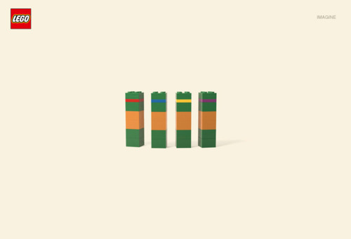
Probably it is along these lines that Lego has commissioned the following line of Print Ads with the help of an agency named Jung von Matt.

(Source)

Essentially, these are minimalistic interpretations of popular cartoon-characters. Can you guess who’s who? I loved their simplicity and the power of imagination that is evoked by these executions. Squarely hits at the bulls eye of their ‘adults’ target group and seeks an undivided quantum of their attention by means of this ‘Guess-Who’ kind of dialogue/challenge that they are playfully throwing at them.

Being, not super comic-savvy, I set out to Google around and tried to build parallels with the actual cartoon characters referenced in these executions. Following is what I could knit together as an exercise for myself.

(Cartoon referenced: South Park)

(Cartoon referenced: Uncle Scrooge and the nephews: Huey, Dewey, and Louie)

(Cartoon referenced: The Simpsons) – this is my 2nd favourite!

(Cartoon referenced: Asterix, Obelix and Dogmatix)

(Cartoon referenced: Teenage Mutant Ninja Turtles) – this is my 1st favourite!

(Cartoon referenced: Bert and Ernie)

I should say that I am very inspired by this upcoming trend in brand communications that seeks to engage the consumer, grab an undivided pie of their attention (even if it is for a sliver of a moment) and evoke their imagination so that they discover something by themselves and thereby are entertained.

That is the power of imagination. Unleashed.

The New Theory of Constraints

What is common between Lego, NASCAR and Instagram?

Answer: A shared set of constraints (in functionality/features) and a shared set of capabilities that form the bedrock of the whole experience for any ‘participant’ in any part of the world. Well almost.

Let’s start with Lego – a brand with a phenomenal presence around the world that charmingly scales to ‘62 little color blocks for everyone on the planet’.

Throughout its roller coaster ride, over the last 60+ years, ‘despite’ new ideas and innovations that redefined dominant themes and possibilities that can be realized out of these toys, one thing remained the same throughout the times: the Lego brick.

(Dimensions of standard Lego bricks and plates. Source)

Lego bricks have constituted the fundamental building block of any Lego toy built through the ages. While they come in various sizes and shapes opening up newer possibilities, they are basically and functionally similar (if not same) to each other – in fact it is said that Lego bricks of 1950s can connect even with their 2009 counterparts as if they have been made for each other! So barring some theme specific add-ons that are sometimes bundled along with the building kits, all Lego toys come with the same/similar set of capabilities and constraints at a fundamental level. I feel it is this shared awareness of the multitude of possibilities that can be realized using the same set of blocks and the constituent constraints (or absence of them), that fires up peoples’ imagination and makes them co-creators of the brand’s physical and virtual footprints. And thereby makes this a real shared experience.

NASCAR is different from F1 in a number of ways.F1, besides from being a race among the drivers and their teams, is also a race among the ‘constructors of the car chassis’. So there are a number of factors at play in the run up to that coveted podium position in every Grand Prix– the engine, its aerodynamics, tyres, the technical support, the strategy, the drivers etc. But NASCAR on the contrary largely remains a race among drivers – with everything else (for most part) being equal. So what essentially matters is just the competency of the drivers and their strategy. In fact, this is what makes maintaining any given position consistently (1st or the 25th), while aiming to overtake the next man (or woman) in front of you  extremely challenging in a NASCAR rally. So in many ways, it is this ‘race among equals’ philosophy that makes NASCAR for as engaging a watch and fan following that it has as of today.

Over to photo sharing.  There are many social networks predicated on the concept of photo sharing and social networks. While they must be doing a great job in terms of providing a common platform for people to share their photos with friends and others, they lack what it takes to foster a real shared experience among the users. For eg, if I want to share my pictures that I have taken with my mobile phone and hence were to be on say flickr (I must admit I really like flickr for what it is, but that’s besides the point now), I might run into tons of stunning, visually breathtaking photos posted by a number of photographers around the world. So, while I might sometimes stop by and enjoy these pictures for what they are, I don’t and cannot relate to them. I might think that these have been shot with a Full Frame DSLR by a trained photographer and even post produced in some professional photo editing software. So this benefit of doubt that I give to these pictures in deference to those great cameras / photographers and software stand in my way of seeing this a real shared experience. Enter Instagram.

There is no doubt that factors like the quality of its filters, the reach (of iPhones), a well designed interface, the access to a visceral world that it fosters and the immediacy of outcomes that it presents the user have all made Instagram as popular as it is today. But, these factors alone never answered my question as to why Instagram has become ‘this’ popular. I set out to find out and I was so glad to have discovered this great insight. Nate Bolt’s article on TechChrunch nails it when he says…

“…There’s something enticing about knowing that most Instagram photos are created on the iPhone…… That makes it fun to see what other people can create with the same technical constraints you have. Photography has always been all about the equipment, and not at all about the equipment. Knowing millions of people are creating with roughly the same camera and app as you makes it exciting creatively. So constraints, combined with quality and an audience are what makes Instagram so addictive…..”

This also answers why Instagram hasn’t been in a rush to release an Android version of the App so far; for if it does so, there could be a sudden explosion of photos taken by thousands of different mobile phones / tablets with different specifications and capabilities. Hence suddenly the whole deal ceases becoming a real shared experience that it has always been till now.

So there you go – a common thread that connects and potentially explains the popularity and the impact that brands like Lego, NASCAR and Instagram enjoy. A celebration of the lowest common denominator in features/functions and constraints.

Can you think of any other brand/innovation/business model that thrives upon fostering a shared experience for the user/consumer based on a set of common constraints (and common capabilities)?

Minimalism and Apple

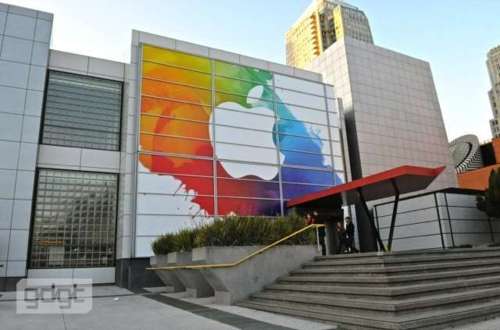
As I write this, Gizmodo shares an update that the latest version of the iPad could actually be called as the iPad HD (as opposed to iPad 3 or iPad 2S). I refresh my browser a number of times as I try to get all updates from the live blogs from gizmodo, wsj, cnet etc that are chronicling the event as it unfolds.

OK, the iPad HD (or is it?) release is just a couple of minutes away and I know that by the time anyone reads this post, the new iPad and a host of the other products from the Apple Stable would be announced by Tim Cook.

An observation that I have on the eve of the announcement:

This is one of those ‘new product announcements’ from Apple in the run up to which, there had always been a near synchronous, peaceful and a calm prediction on what could this next big thing be, from a number of expected sources. Relative to the previous events at this famous Yerba Buena Center for Arts, this is one event regarding which there has been very little debate, argument, disagreement, flight of wild fantasies etc on the shape and form of the things to come.

This is not to say that there is little excitement or any less eager sense of anticipation from the market, media and the consumers. This is one event that would be watched, dissected, analysed and evaluated on various counts – How would Tim Cook carry this off? How much more would the Apple Share price grow? To what greater degree would the traditional business models like books, TV, Cable be affected? Who are the new partners? And finally and more importantly for how much and when can I get my new iPad?

But, this definitely would be remembered as a launch event that was devoid of the kind of buzz, noise and the crazy and sometimes hysterical levels of anticipation that normally precede the actual event. I have always believed that it was this eclectic and testosterone charged set of rumour mills, discussion forums, blog posts, twitter feeds, photo shopped predictions regarding the next big thing that had actually stoked the fanaticism that only kept growing for the brand exponentially – event after event. It was these word of mouth, PR, earned and owned media components that have helped grow and build the brand equity of Apple event after event – duly supported and sustained by the product quality of these products.

Now, if these levels of ‘near stoicism’ and ‘no-brainer predictions’ prevail in the subsequent product launches too, I am afraid if the turbo charged growth engine – that Apple brand has been so far – would run out of its much needed fuel to get its share price touch $ 1000.

Neither Apple as a brand or its product experiences are to be blamed for any of this dumbed down levels of  mass hysterics. In fact all of these products are known to duly stand up to or often out pace the consumer expectations giving them sheer pleasure of usage. However there is one thing that is to be blamed. And that ironically is..

Apple’s Minimalism!

This post, is one of the truly fantastic and insightful commentaries on why Apple’s gospel of minimalism could actually constrain the brand in the long term. The iPad 2 is a minimalist in its design and so was the original iPad. So for any subsequent relaunches of the iPad, given that Apple has an all encompassing design ethic that  spans across every single gadget, it would be a philistine to itself if it dramatically changes its fundamental design strokes that define and characterizes its products. Result: a set of design tweaks that are extremely conservative and again minimalistic in degree. Besides, given the prominence and the centrality that ‘the screen’ has (for good) in most Apple products, the actual real estate available for the designers to play around with is dramatically on the decline. The result: innovations that are mostly under the hood coupled with minimal physical changes that are often millimeters or centimeters in their definition. This had been the case with the iPhone 4S release too and could possibly repeat itself at different instances in the future.

I am very eager to see the ‘real next generation product’ launches from a brand like Apple as opposed these incremental improvements it makes riding on the Moore’s Law.

Bonus read: Speaking of minimalism and Apple, I couldn’t resist myself from posting this link. Check out the minimalist designs of the popular PIXAR Characters. Do read this nice piece of commentary here praising the genius of the designer Wonchan Lee.

A 100m dash to reach out to the consumers. And the winners are..

I am sure most of you would already know that Facebook has introduced a number of new features for brands which could potentially redefine the way they have been ‘traditionally’ advertising/reaching out/featuring their brand presence on Facebook.

(wow.. what everyone was doing till last week is now traditional!)

For starters,  since just 2 days (29th Feb 2012), brands are now allowed to have a ‘timeline’ kind of presence and hence they can re-layout their page using a cover picture. Click here to read about  the 6 major changes that marketers should know about changes in facebook.

Reading this I thought, there could never be a better time to identify which brands are really ‘tech savvy’ or lightning fast when it comes to rolling out a change for their consumers, than now.

So I spent some time today morning to manually search for most popular brands across categories and realized that only a handful of them have put in their cover picture on facebook (something that could be representative of how fast a brand reacts to change ‘digitally’)

Following is a  compilation of various brands that have proven to be very nimble on their foot by upgrading their pages to the timeline interface, representative of which is their cover picture.

And ofcourse, the brand facebook would also have it’s own timeline, and this is their cover picture.

What also struck me was the nimbleness of the Indian beer brand ‘Kingfisher’ (despite its promoters being stuck in …let’s just say an unenviable position). But way to go Kingfisher!


Note that for every brand you see, I have also searched for most of their competitors across categories, and it is a telling sign when their competitors are not in the list (for eg,. Nike updated its facebook page, but Adidas didn’t yet. Coke did. Pepsi didn’t yet. Jaguar did, BMW and Audi didn’t yet…). And to further validate, I pulled out a numbere of top 10 lists of brands on Facebook, and most of the above brands figure in them. No wonder they are so popular with their fan base.

This exercise was exciting as it was incredibly easy to see right in front of your eyes, evidence of how really fast brands can be and should be digitally. When you are on FB during the weekend, try doing this. You could soon lose track of time.

Note that this list is as of 2nd March 2012 1:45 PM (Sing time). I know that as we speak more brands would be jumping onto the new facebook bandwagon, and even the above brands could update their cover picture regularly.

Is your brand/ or you already on the ‘timeline’ bandwagon?

PS: Bonus read on ‘Brands as people: on facebook’, here