Gyotaku And The Trailer

What is common between Gyotaku and Movie Trailers?

Gyotaku Trailer

1. Both are traditionally forms of ‘advertisements’ of another art form

2. And both have evolved into specialized art forms unto themselves

Let’s start with Gyotaku

Gyotaku is the traditional Japanese art of fish printing dating back to the mid 1800s. Before you read any further, you might want to begin with this fabulous TEDEd video to get a quick introduction on this fascinating art form.

As you can see, the purpose of the early Gyotaku print was to serve as an advertisement and proof of the fisherman’s skills as reflected by the quality of his catch.  The emphasis was thereby to capture just the basic proof of the size and species of the fisherman’s “trophy fish” and to record this permanently.

Now Gyotaku has become so popular around the world that it has dedicated competitions, hobby clubs, instruction classes, museums, books, textile prints etc;  and has currently evolved to the point where the actual activity of fishing is almost besides the point.  The craft has now become a unique representational art of Japanese Culture that honors realism and story telling.

The insight for me here is that,

A good piece of Gyotaku art captures a moment in the ocean and not just a piece of dead fish.

Gyotaku2

In other words each piece of Gyotaku tells a story where:

1. The narrative often comes from what you don’t see – the negative space: A good Gyotaku composition is known to make use of the negative space within the frame and brings to life the concepts like idea, flow and freedom of movement that come with the ocean.

2. Our minds are lead into the frame and then set free : A good Gyotaku ‘hand holds’ our mind by gently leading us into the exquisite form and finish of the fish. But a great Gyotaku takes it a step further by then carefully setting our imagination ‘free’ as it allows ample space for the mind to take the fish on its journey.

Moving on to Movie Trailers

Just like Gyotaku, the movie trailer has come a long way from being a plain advertisement (of a full length movie) to becoming a genre unto itself. Today it is a thriving industry that is almost as popular as that of the movies they’re teasing, with legions of fans following, dissecting, analyzing, reviewing and rating them on a regular basis even as they are feted out at forums like The Key Art Awards and The Golden Trailer Awards (the Oscars of movie trailers).

From being just a linear montage of title cards, voice-over, a few key scenes followed by a cast run-through, movie trailers today are part art, part marketing wizardry and part awesome creativity. Result: They can tease, titillate, shock, seduce, awe, thrill or even hypnotise us via subliminal messages, imagery, and music and lull us into the cinema for the actual full length fare.

The latest edition of the WIRED magazine has an insightful feature on the Art Of The Movie Trailer. Two insights that emerge from the construct of great trailers:

1.The narrative of the trailers doesn’t necessarily come from what you see, it comes from what you hear (the negative space of trailers = music): Trailers are all about rhythm, pacing, and feeling. That’s why music plays a vital role as a key narrative device and can more often than not make or break a trailer. Mark Woollen, the man behind the trailer for The Social Network shares a secret of how he came up with its music for an evocative narrative ..

I’d had “Creep” on my iTunes for five or six years kind of kicking around before the Social Network trailer…And then when this project came along, I started to consider that song. There are a couple of qualities to it that I thought could do a lot for the trailer. It was a fantastic piece of music—the build, the message, the flavor.

And the rest as they say is history – with the trailer going on to win both The Key Art Awards and The Golden Trailer Awards for 2011 for its outstanding achievement in advertising movies. See this trailer here:

2. Our minds are lead into the plot and then condemned to a free fall: A good trailer gently leads our minds and imaginations into the centre of the plot or the tension that is eventually created in the act 2 and then sets it on a free fall. E.g., Alfred Hitchcock’s trailer for Psycho (though being a tad bit long at ~ 6 mins) very gently teases us bit by bit till almost the end before throwing us off the cliff! See the iconic trailer here: (don’t miss the last 2.5 mins at least)

The trailer for Alien is another master piece that stands out for a similar reason.

So there you have it – Gyotaku and Movie Trailers:  two art forms that have begun to become bigger than the art forms that these are based upon, two powerful examples where creativity thrives despite the underlying constraints ; or probably examples where creativity thrives due to its underlying constraints.

Toothbrush, Vitamins And Pain Killers

Starting from 2001, Google has made 127 mergers and acquisitions till date.

Which makes it nearly 6 acquisitions for every 7 months over the last 12.5 years. It is expected now that this M&A rate is further going to accelerate with Google – for the first time –  considering forging alliances with private-equity firms to help it structure deals.

During the recent Bloomberg Next Big Thing Summit, speaking about how Google evaluates a potential M&A target, Don Harrison –  Google’s mergers and acquisitions chief said

“We apply something called the toothbrush test, which is we ask ourselves, ‘Is this something people use once or twice a day and does it solve a problem?’”

Thanks to its immensely sticky nature (and aided by the current  rock star status of Google), this toothbrush analogy has seemed to have gained an instant global popularity and is shooting to newer heights in terms of recorded “interest over time” as we speak. I did a quick sense check myself  by entering  “the toothbrush test”  as the search term and this is what I see on Google Trends:

ToothBrush Test

(Click to see larger image)

While this sounded to me like a fascinating analogy that brings a powerful idea to life, the concept of The Toothbrush Test somehow didn’t quite fit in within the schema of what I had in my mind regarding so many things that Google does today.  For e.g., I began to wonder –  Is Google+ a ‘toothbrush’? i.e., does it solve a problem and is it something that people use once of twice a day? Or is Sparrow (acquired by Google in July ’12) a ‘toothbrush’?

May be it  is. Or  may be it isn’t. But probably for me there’s a missing piece to the jigsaw here.

That’s when I hit upon this very useful question that VCs are known to ask entrepreneurs. (source)

Is your product like candy, vitamins, or pain-killers for your market?

2806-940x626

(Image Source)

To elaborate:

  • Candy = a product that is a nice-to-have, that people enjoy and can be wildly successful if it becomes a fad (like Beanie Babies)
  • Vitamins = a product that is a nice-to-have and serves an emotional need, used to augment and improve things but sometimes harder to quantify and has an unknown market
  • Pain Killers = a product that is a need-to-have and serves an obvious need, or solves critical problems that need to be alleviated and has a quantifiable market and thereby immediately monetizable

While it might probably take a ‘marketing master stroke on steroids’ to sustain a successful company based on ‘candies’ alone, many product ideas can probably be placed in the continuum between ‘vitamins’ and ‘pain killers’.

Vitamin Painkiller

(Image Source)

In this context, as someone who blogs at the intersection of  psychology, technology, and business –  Nir Eyal at the Stanford Graduate School of Business posits that successful companies are known to be so good at embedding/implementing hooks in their products that they travel along the above continuum from being vitamins for ‘pleasure seeking’ consumers to becoming pain killers for their pain alleviation as they cement enduring habits in them.

In other words, a ‘cleverly designed vitamin product experience’ hooks the consumers and becomes so important in their lives that – because it becomes a habit, it becomes a pain relieving product.  Flip through the following presentation by Nir to get a more comprehensive view on his theory of  Hooked – The Psychology Of How Products Engage Us.

That’s when the insight stuck me:
For any well designed product/ experience the question is not IF it passes The Toothbrush Test.
The question is WHEN.
Don’t believe me? Ask the largest cigarette makers in the world who are currently making a gold rush to acquire/ develop e-cigarettes and they will tell you.

On Looking Back To The Future

Have you ever thought about looking back to the future?

This is not about the acclaimed 1985 Academy Award winning American Science Fiction Comedy directed by Robert Zemeckis and produced by Steven Spielberg – which by the way is a must see.  The question is whether you have ever thought about the notion of ‘looking into the future’ as akin to that of looking back.

Let’s talk about the Aymaras

Apparently this tribe of indigenous people in South America called the Aymara have an unusual way of referring to the future – when they talk about the past, they point to the space in front of them and when they talk about the future, they point behind them. Wonder why?

As Austin Kleon succinctly puts it …

The reason they point ahead of them when talking about the past is because the past is known to them — the past has happened, therefore it’s in front of them, where they can see it.The future, on the other hand, is unknown, it hasn’t happened yet, so it’s behind them, where they can’t see it.

A very thought provoking concept if one begins to think about it.

After embarking upon a mini thought + search experiment, I have come to appreciate that looking back to the future can be more than just a conceptual metaphor of the Aymara’s. My three riffs on this concept:

1. First a relatively straight forward one –  in a very practical sense, the notion of looking back into the future can be said to be closely related to the concept of Retro Innovation. Think about it. Isn’t it? More about it here.

2. We have heard about Chris Anderson‘s concept of The Long Tail. Of comparable significance is Bill Buxton‘s concept of The Long Nose of Innovation – a must read for anyone fascinated by the world of Innovation and Design. Flip through the following slide deck to get a gist of what he meant by this in just under 50 – 60s.

He makes a strong case that – any technology that is going to have significant impact over the next 10 years is already at least 10 years old. And thereby says The Future Is History and goes to conclude with the advice –  “Use history to evaluate new concepts and ideas instead of only gut feel”.
So may be next time we ideate within a category/segment for innovation ideas, it might be worthwhile to look for trends that go back to nearly 10 years from now for a change.

3. Lastly, in many ways the concept of looking back to the future could also be related to the idea of photography as time travel.

Irina Werning was a virtually unknown photographer till she embarked on a project called Back To The Future in 2010 (and subsequently in 2011) and the rest as they say is history, with her photographs going hugely viral – even becoming Internet Memes and her project becoming a big sensation. Read more about Irina’s obsession as a photographer to take her subjects back and forth in time through her unique project here. Enjoy the behind the scenes video of the project here.

I find the idea of looking back to the future hugely fascinating and as Austin Kleon says, the Aymara’s way of referring to the future continues to blow my mind no matter how long I think about it.

And you thought History and Innovation make strange bedfellows?

Icons – The Visual Metaphors Of Our Culture

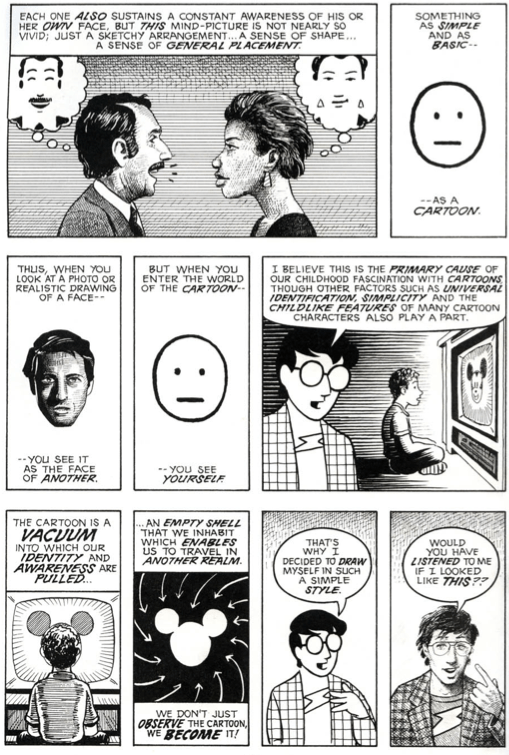
Ever wondered what could be the primary cause of our childhood fascination with cartoons? I did. Tons of times in fact. With little success very often.  Thankfully for me Scott McCloud in Understanding Comics gives a clear and a straightforward explanation for that.

Understanding Comics Pg 36

(Scott McCloud, Understanding Comics, Pg 36)

Essentially, he posits,  the mental picture that we we have of ourselves is simple and basic . Therefore, we are able to project ourselves into the ‘simple character’ but not the ‘complex one’.

The obvious lesson here that is applicable to advertising could be – if you want your audience to feel like they are the main character, make sure the character isn’t overly elaborate and detailed.

The classic iPod ads of 2001  have smartly taken this theory a step further by featuring just a set of male and female silhouettes.

iPod

(Image Source)

This abstraction of pictures from reality to icons is thus a powerful mode of expression that comics (and comic artists) have deliberately and meaningfully perfected over the years.  For, after all, (visually) quoting Scott..

Understanding Comics Pg 59

(Scott McCloud, Understanding Comics, Pg 59)

“There is no life in an icon except that which you give to it.”

While this insight forms the cornerstone of what constitutes the vocabulary of comics, it lends a very powerful commentary  that is relevant for our practical lives too. Let me explain.

Just like we are said to be exposed to thousands of marketing/ brand impressions per day, I’d wager that we are also exposed to as many (if not more) iconic impressions each day. While a brand’s logo – by definition – could also be called as an ‘icon’, my focus here is more on icons that constitute the typical signage/symbols that we are used to seeing all around us each day – e.g.,  traffic signage, safety signage, industrial signage, traveler signage etc.

dot_pictograms_full

(DOT Pictograms)

Since these signage icons have been around for years, most of us grow up intuitively accepting them as part of our unspoken language. Thereby they practically end up becoming the visual metaphors of our culture.

Armed with this insight – The Accessible Icon Project was born with a goal to  show a more humanized depiction of the differently abled in the International Symbol of Access.

Symbol of Access

I’ll let you read a comprehensive account of the project here, but the highlight of this guerrilla art project was that it succeeded in reorienting the visual focus of the symbol from the chair to the person, while replacing the rigid, static representation with something more dynamic and active.

Result: The idea has been gaining tremendous momentum around globally as we speak, with NYC becoming one of the first cities in the world to formalize and adopt this new symbol with many disability organizations around the world vehemently following suit.

Metaphors are said to have the power of influencing our ideas, challenging assumptions and creating new world views. And if a picture is worth a thousand words, the power of a visual metaphor like this new ‘access icon’ above can be said to be amplified a thousand fold in shaping our collective biases, informing our cultural opinions and influencing our societal attitudes as humanity.

That’s when things get interesting. Symbolically and literally.

Blood In The Gutter – On Smart Narratives

Cleverly disguised as an easy to read comic book, Understanding Comics is a masterpiece from Scott McCloud on what makes comics as a medium – tik. Called as “…one of the most insightful books about designing graphic user interfaces ever written..” by Andy Hertzfeld, the co-creator of the Mac, Understanding Comics bares fascinating insights on time, space, art and the cosmos. A must read for anyone with a curious mind and a willingness to have some fun along the way. Go get yourself a copy if you haven’t yet and it might as well turn out to the best gift you’d have given yourself in a long time.

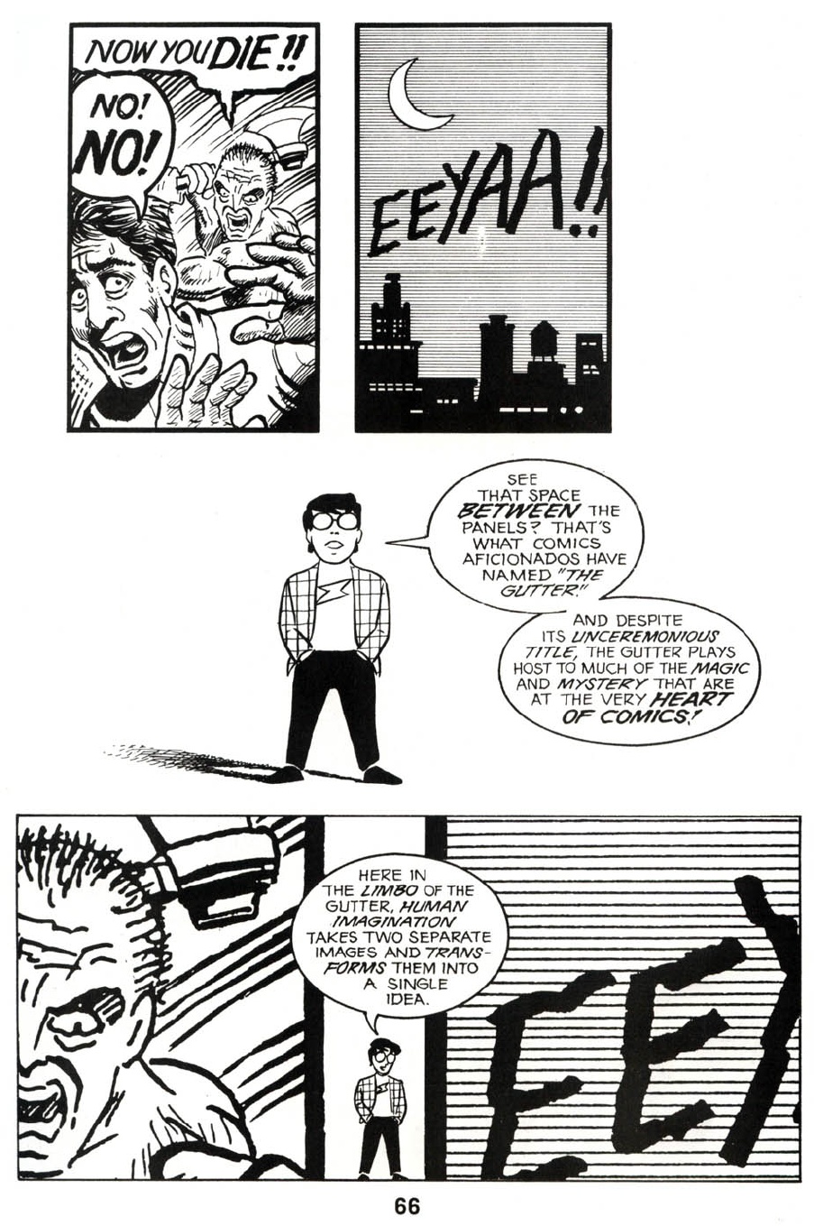
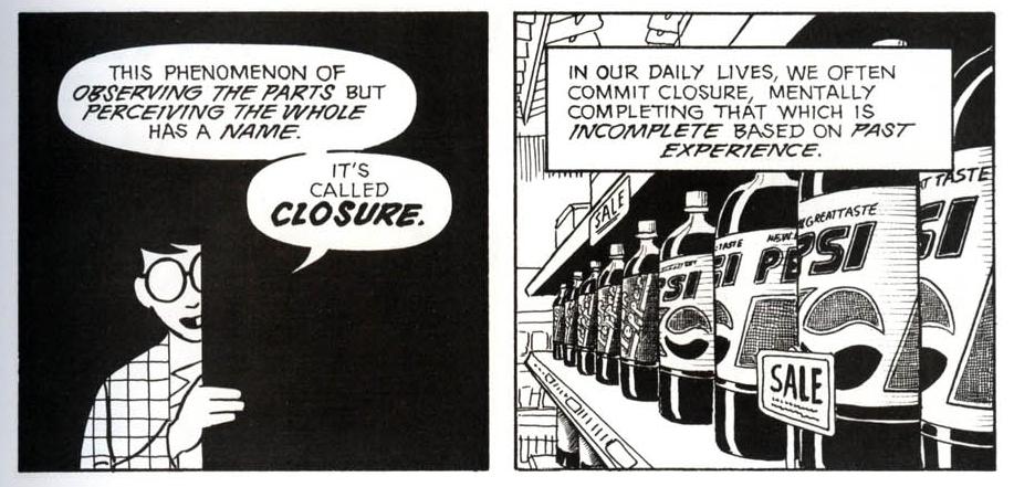
Blood In The Gutter is the name of my favorite chapter from the book where Scott explains what constitutes the magic and the mystery of comics through a concept called ‘Closure’. Following are some panels from the chapter that explain this concept in lucid detail:

Blog UC 1

Blog UC 2

Blog UC 3

(Scott McCloud (1993), “Understanding Comics”, p. 66, 68, 63)

It is closure that makes Comics an immersive medium that they are. For e.g., unlike in say radio and film, the audience for comics are compelled to participate more because they are required to perceive the gaps between panels and fill in the missing content themselves. No wonder then, artists from different media (Literature, Photography, Film etc) have experimented and adopted the techniques of ‘closure’ as a compelling narrative style in their own works. Three examples where this technique of closure has been adopted in 3 different media: literature, photography and film below:

Closure in Literature: One Day

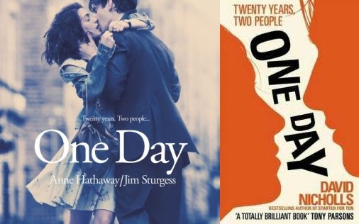
One Day is a novel by David Nicholls published in 2009. While it is essentially a ‘When Harry Met Sally‘ kind of genre, the unique feature of the book is its narrative. Each chapter covers the lives of the protagonists on exactly the same day (15 July) every year for twenty years.

One Day Movie_book

This literary technique of ‘closure’ as adopted by David Nicholls in One Day had its expected results with the book being praised as a ‘persuasive’, ‘ fast’, ‘absorbing’ and ‘smart’ and went on to be named 2010 Galaxy Book of the Year. Nicholls adapted his book into a screenplay; the feature film, also titled One Day, was released in August 2011. 

As with comics, closure –  when executed well in any media – facilitates smooth and seamless transitions in time and space and establishes a tightly symbiotic relationship between the reader’s imagination and the narrative.

Closure in Photography: The Whale Hunt

The Whale Hunt is a story telling experiment by Jonathan Harris who spent nine days living with a family of Inupiat Eskimos in Barrow, Alaska, the northernmost settlement in the United States. He documented their traditional whale hunt with a plodding sequence of 3,214 photographs, taken at five-minute intervals for seven days, and at even higher frequencies in moments of high adrenaline.  He then developed a framework for experiencing this story, allowing the viewer to rearrange the photographic elements of the story to extract multiple sub-stories focused around different people, places, topics, and other variables. (Source)

Go to the WhaleHunt page and experience the story unfold along different dimensions and see the cadence of closure engage your curiosity, senses and imagination.

The Whale Hunt

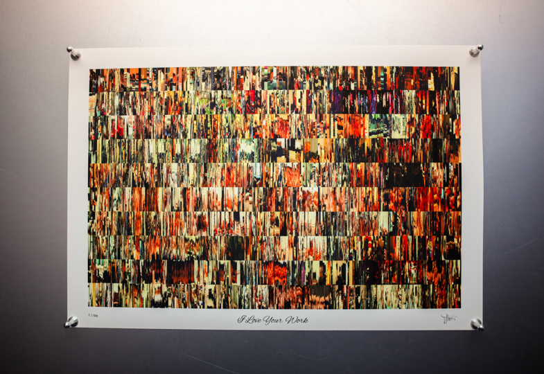
Closure in Film: I Love Your Work

Using a similar narrative style as used in The Whale Hunt, Harris now steps into a bold new territory by holding the spotlight on the world of lesbian porn.

Called as I Love Your Work, the project in Harris’ words “is an interactive documentary about the realities of those who make fantasies.It is a raw and intimate portrait of the everyday lives of nine young women who make lesbian porn.It consists of 2,202 10-second video clips, taken at five-minute intervals over 10 consecutive days.There is an interactive environment for exploring this material (around six hours of footage).”

What’s revealed through this tapestry of video clips separated by 5 min time intervals is an intimate portrait of a community opening up about topics like sex, gender politics, and their daily grind in a way that’s downright real and some times hard hitting.

I Love Your Work

Read this Fast Company article for a more detailed account of the project.

This powerful concept of closure (as it pans out in comics or in experiments like the ones shown above) seems to suggest one thing for certain. In order to engage, captivate and involve our minds and senses, the narrative of a story need not be continuous or seamless.

In fact what could work better in capturing and sustaining our attention spans can just be fragments of the story that are disjointed enough to let our imagination do the ‘connecting-the-dots’ drill and joint enough to let us feel that we are smart indeed!

Speak about the power of ‘smart narratives’.

Our perception of ‘reality’ is an act of faith, based on mere fragments.

Scott McCloud, Understanding Comics (1993)