The Liminal Space

Quick Read: Motion blur in animation, the current pandemic times and quadratic voting systems have one thing in common – they magnify and normalise that moment in time/space/perspective that’s neither ‘here’ nor ‘there’. And that could have its own benefits.

Motion blur is an interesting concept in animation.

In fact it’s a unique technical challenge that consumed Ed Catmull and his team during his early days leading to Pixar Animation. Quoting from his book Creativity, Inc.

Another technical challenge that occupied us was the need for something called motion blur. With animation in general and computer animation in particular, the images created are in perfect focus. That may sound like a good thing, but in fact, human beings react negatively to it.

When moving objects are in perfect focus, theatregoers experience an unpleasant, strobe-like sensation, which they describe as “jerky.”  When watching live-action movies, we don’t perceive this problem because traditional film cameras capture a slight blur in the direction an object is moving. The blur keeps our brains from noticing the sharp edges, and our brains regard this blur as natural. Without motion blur, our brains think something is wrong. So the question for us was how to simulate the blur for animation. If the human eye couldn’t accept computer animation, the field would have no future.

-From Creativity, Inc. by Ed Catmull

Today, motion blur has its own place in the craft of visual expression across still photography, film making, animation and video games.

Figure-Animation2 (1)
Two animations: with motion blur (left) and without (right) Source

Without that, we’d have no way to capture and process the concept of ‘something being in a state of motion’ – that state of being neither here nor there, that state of ‘in-betweenness’.

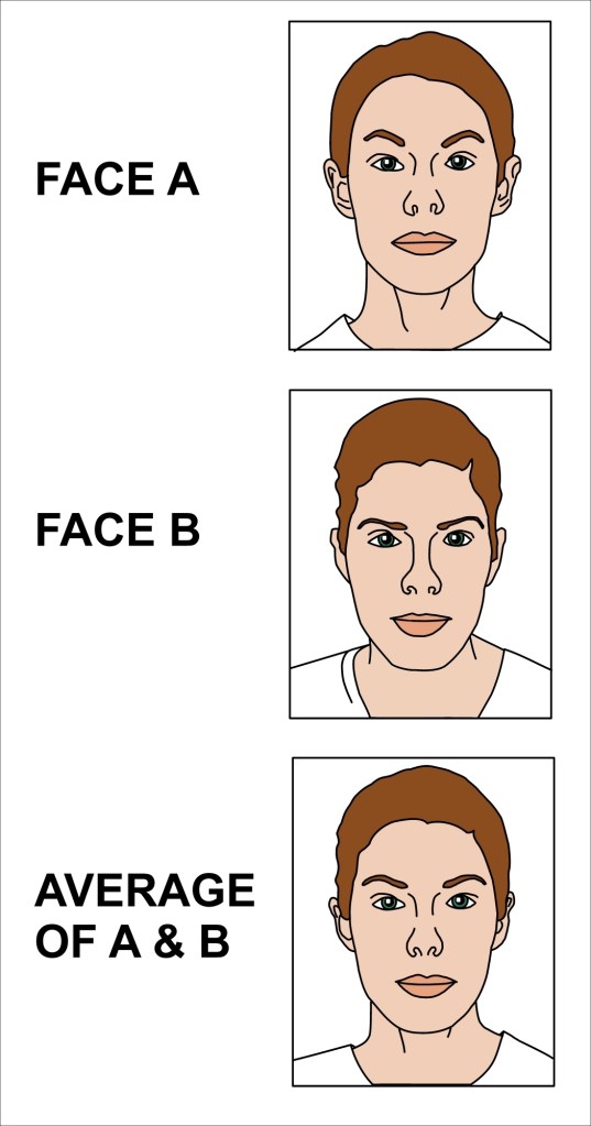
At its purest, motion blur could be said to be the visual expression of an abstract concept called ‘liminality’.

What is liminality?

In anthropology, liminality is the quality of ambiguity or disorientation that occurs in the middle stage of a rite of passage, when participants no longer hold their pre-ritual status but have not yet begun the transition to the status they will hold when the rite is complete. (wikipedia)

Evidently when liminality as a concept was first developed, it was more in the anthropological contexts of rites and rituals. But today, the usage of the term has broadened to describe socio, political and cultural changes across contexts. Sample this, again from Wikipedia..

During liminal periods of all kinds, social hierarchies may be reversed or temporarily dissolved, continuity of tradition may become uncertain, and future outcomes once taken for granted may be thrown into doubt. The dissolution of order during liminality creates a fluid, malleable situation that enables new institutions and customs to become established.

Wikipedia on liminality

Reminds you of something?

To be in today’s pandemic crisis is to be betwixt and between. Our conception of space and time is unmoored from the conventional constructs of ‘home’ and ‘work’.

What does this liminality mean to our individual and collective consciousness? How does this change our relationships with institutions – our offices, schools, places of worship? How does this redefine our notions around concepts like commute, entertainment, socialising? Who knows?

But at least these liminal times are forcing us to question our deeply held assumptions and mental models and be a bit more tolerant to well considered alternatives while arming us with a better compass to help navigate our complex world.

In fact, I tend to wonder if the current Covid times and the recent mass mobilisations in support of movements like Black Lives Matter have a good degree of causality associated with them. Which leads me to..

Liminal Thinking

It might be instructive to take a closer look at the word liminal. It’s a derivative of a Latin root that means threshold – which literally means doorway.  Seen with that lens, a threshold is essentially a boundary that marks a point of transition between one state and another.

How do you then find, create and use ‘thresholds’ to create change that matters? How do you deliberately create those opportunities to make a transition from one world view to that of another? What is obvious to you that is not so obvious to someone else? And how do you recognise that?

Liminal Thinking is Dave Gray’s answer to this question through his book by the same name. A quick whiteboard version of his book here.

Our world today, a boiling pot of divisions and polarisations could perhaps do with a dose of liminal thinking so we seek out and normalise that middle ground versus prying it out of shape and character in an attempt to take one side or the other.

And speaking of polarisation

One just needs to look at the democratic politics today to see that one of its key problems is the lack of a middle ground. The result: political polarisation and amplification of extreme views.  Now juxtapose that with another key element of our reality – that while we may seem more divided than ever before, many people on all sides of the political spectrum care about the same handful of issues — education, healthcare, pensions, and etc.

So how do we make a provision for the expression and capture of a more nuanced voting preference in a participatory democracy.

One potential answer: quadratic voting. Unlike a binary “yes” or “no” vote for or against one thing, quadratic voting allows a large group of people to to express the degree of their preferences, rather than just the direction of their preferences through a decentralised voting system.

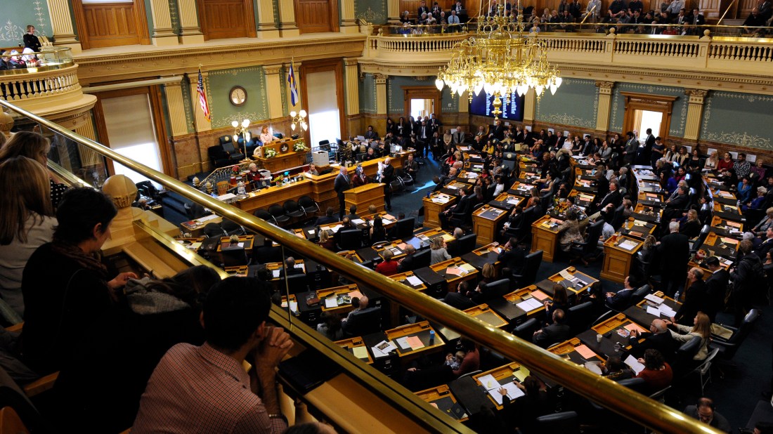
In fact, the Colorado’s legislature has successfully become one of the first test cases for quadratic voting in the public policy realm. This is the remarkable story of how it deployed Quadratic Voting to normalise the middle ground (vs amplifying the bi-partisan extremes) and how it managed to get a ‘better signal with less noise’.

Seventy-second General Assembly first regular session.
Chambers of the Colorado Capitol where the quadratic voting took place. Source

So there we have it, while we see ourselves stuck in an unfavourable state of liminality in the current times, sometimes it is these very liminal spaces that could potentially make allowances for solutions that magnify and normalise perspectives that are unfettered by extreme/bi-partisan imperatives.

And just sometimes it might mean that we become a bit more tolerant, a bit more inclusive in our beliefs and a bit more optimistic as we hope to see our world become a better place.


Noteworthy ingredients – that may or may not have gone into the making of this post:

[Featured Image: Motion Blur expressed through Still Photography, Source: BGU

Pixels to Pronouncements

Quick Read: Pixels – the building blocks of our digital edifices – could be assuming an influence of mammoth proportions across verticals. For e.g., an interesting wave of ‘virtual dressers’ is catching the fashion world by storm.

30 Rock..

..or 30 Rockefeller Plaza is a skyscraper that forms the centrepiece of Rockefeller Center in Midtown Manhattan, New York City. When walking by its Sixth Avenue entrance one might find something curious. It has four sculptures – bas reliefs, carved in stone by Gaston Lachaise, an American sculptor  – placed all the way up on the third floor.

One might ask, “What are they doing all the way up there?”

15kimmelman-rockcenter18-superJumbo
Sixth Avenue Entrance of 30 RCA Building. Source

The answer is that when Rockefeller Center was built, the elevated train still ran up Sixth Avenue. The Lachaise reliefs were placed so these ‘El riders’ passing through the station could see them.

This happens all around us. 

When real estate is at a premium – from facades of iconic buildings to the shelf space in our neighbourhood grocery stores – one can make an entire career out of optimising the design/layout of the underlying physical space for our attention, so it delivers on its intended ‘return on placement’.

These days it could almost be trite to state that it is actually the ‘digital real estate space’ that arguably commands a greater premium vs that of any physical space. And the job of the UX/UI designer thereby becomes one of the most influential (and in my opinion – one of most fulfilling) roles in Product Dev/ Management. In fact, the ‘pixels that they design’ essentially become the gateways to digital products/services shaping the user experience for millions of us around the world. No wonder great UX/UI designers are in great demand.

ux-design-book-combined

And never is the product designer’s* significance more evident than in the current Covid times when the design/layout of an app could be a true window into its product’s soul. (*’product designer’ as a catch all phrase for all design functions in the service of a product) 

For e.g,. given these unprecedented times, how does a product balance its rational (product/services) promise with that of its emotional (empathy/sensitivity) narrative? What are its core values and beliefs and how does the product reconcile it with its commercial underpinnings – its core reason for existence?

Check out a highly recommended read here on this very topic. Post reading it, one could even be tempted to take a walk down one’s playground of pixels (a.k.a one’s apps on their phone) to try and infer those subtle truths that govern their design.

These days, pixels don’t just make for subtle commentary, but also influential pronouncements impacting the zeitgeist of the times.

When pixels become fashion pronouncements

In what now feels like a different meta verse, human beings used to gawk at outfits on the streets or ogle at chic strangers’ coats to see what new brands/designs/designers people are into while designers used to organise their new expositions through coveted fashion shows and had hordes of fans waiting in lines for their exclusive pop up sales. Well now (or rather here in this current meta verse of social distancing) some designers have still been able to do this and more.

For e.g., on a recent weekend, the fashion designer Sandy Liang held an extremely exclusive pop-up sale. Only six people were allowed in at a time, with attendees (the list that swelled to almost 100 people at one point) waiting in line for over two hours.

Before you panic about the potential social distancing violations involved, know that this sale took place on a completely virtual plane: an island in the video game Animal Crossing.

sandylianganimalcrossing2-1588626066
Enter a captionScene from Sandy Liang’s Animal Crossing pop-up. Source

For the uninitiated, a quick crash course on Animal Crossing below:

With the Nintendo game Animal Crossing: New Horizons, players can customize their looks to show off outfits that reflect their personal style, something that piqued the interests of fashion enthusiasts playing the game, who quickly began designing custom looks that riffed on the trendy designers of the moment. Coupled with social distancing and less opportunities to show off fits in-person, it’s created an unorthodox, but amazing opportunity for Animal Crossing users to show off their outfits — so much so that many real-life fashion designers are creating official clothing codes so users can cop designs from their latest collections.

–Time

Today there are entire Instagram communities centered around Animal Crossing fashion. Marc Jacobs even created his virtual fashion line available for gamers through codes.

And if I’ve run out of style codes or ideas, there are even virtual stores like nookazon (a fan built enterprise) where I can buy clothing for in-game characters. And we have not even scratched the surface of this trend of fashion-conscious people using the game as a platform for style expression by dressing their avatars in pixelated versions of clothes by Gucci, Celine, Supreme and more.

For many, it could even look like Animal Crossing is the only place where people seem to get dressed up for now. Clearly ‘pixels’ seem to have become our canvas for self expression like never before.

Could this change the way fashion works forever?

[Featured Image: Animal Crossing illustration on The Washington Post]

The Sci-Fi Pay Phone Fallacy


Quick Read: Future predictions could sometimes just be past projections – repurposed to fit the current context. Sometimes that could make for a liberating realisation – especially in current times.  

3.15.20

That’s the name of the latest album by Donald Glover aka Childish Gambino – an American actor, comedian, writer, producer, director, musician, artist and DJ – a polymath in the entertainment business.

What’s unusual about this album?

It has no title except the date of release, 3.15.20; no artwork; and except for 2 songs, none of the 12 tracks has a title. Quoting Sanjoy Narayan on mint:

On Sunday, 15 March, Donald Glover Jr, better known by his stage name Childish Gambino, launched a new website called Donaldgloverpresents.com and released a new album, which streamed on a loop on the site for most of that day. There was no fanfare; no announcements; no publicity.

For an artist as high-profile as Glover, this was an unusual approach….

…Shortly after his new website stopped streaming the album and went blank, Glover’s, or, rather, Gambino’s, new album got more conventionally released on music-streaming services where you can hear it now. It has no title except the date of release, 3.15.20; no artwork; and except for the second and third songs, Algorhythm and Time, none of the 12 tracks has a title. Instead, Gambino has chosen to title his tracks by time codes—the points in time that they come up on the album. For instance, the first track is labelled 0.00; the fourth is 12.38; the fifth 19.10; the sixth 24.19; and so on.

donald-glover-presents
The album initially played on a loop on the site ‘Donald Glover Presents’, accompanied by an unfinished illustration depicting a very modern scene of rioting, fiery chaos and selfie-taking. (Source)

What’s truly unusual about the album, however, is how it mocks at our assumptions and shatters our accumulated biases about his music. Quoting Sanjoy Narayan again:

It’s an astonishingly experimental album on which Gambino is, in parts, a rapper, a soul, funk and R&B guy, and a sonic innovator who composes melodies and harmonies and melds them to make songs that push every boundary…

..It’s a super ambitious album that traverses so many genres and styles that it would require multiple listens to try and list out or even describe. Funk and soul collide with electronic music; modern hip hop gets to mate with elaborate orchestral arrangements; and smart lyrics comment on the state of the world and other serious issues.

Unique juxtapositions, delightful blends, unexpected connections, inventive remixes and surprising twists. That’s always been the recipe for great story telling across formats from stand up comedy and sci-fi thrillers to food and fashion.

It is compelling how consistently it works every single time – get people to default to their baseline expectations and add in an unexpected twist to move the carpet off their feet and presto, you have a winner! In fact an entire movie was made literally off this very premise.

Turns out getting us to default to our baseline world views/expectations is not that hard after all. Simply because we tend to base our assumptions of a likely future basis our previous experiences. In fact, research suggests that humans predict what the future will be like by using their memories.

Imagining the future then becomes a kind of nostalgia. 

This fallacy could sometimes be evident in sci-fi movies.

Let’s take a classic example: the original Blade Runner from 1982.

In the film, Harrison Ford’s character Deckard makes several calls to other characters using a “videophone,” which is essentially a glorified payphone with a VHS-quality video screen glued on top. Incidentally, the film is supposed to take place in a futuristic 2019, but it makes a faulty assumption that human beings will still be using pay phones as their primary form of communication by then.

payphone
Video Pay Phone in Blade Runner (1982), Source

Back to the Future II also prominently featured payphones and fax machines—both of which were prevalent at the time the film was made, but are obsolete today.

Writers even have a name for this – the science fiction pay phone problem. It essentially refers to how we often assume the continuity of our previous experiences, and subsequently bring our accumulated biases with us, when trying to predict the future.

This could perhaps help serve as an instructive reminder to us that even though we can dream up detailed, novel scenes of things yet to come, our imagined futures could sometimes really just be projections of our past.

And nowhere is this reminder more relevant than in the current times when we are inundated with predictions and discourses about what a post Covid future could look like and how it could potentially impact us, our educational institutions, organisations, cultures, traditions, industries, economies and nation states at large.

As the sci-fi pay phone fallacy reminds us, the future always holds more surprises than we might predict. So instead of stressing about and losing our minds on what a post Covid scenario would pan out to be, sitting back, relaxing and enjoying some Childish Gambino could just be what the doctor ordered for us.

Stay safe. And here’s hoping we all come out of this better, stronger and together. Real Soon.

[Featured Image: Payphone from Back to the Future, digital wallpaper source]


Of Similarities and Split Screen

Quick Read: There are ads that try and communicate a message of ‘contrast’ and there are those that communicate ‘similarity’. While the former type of ads ride on a diverse set of story telling devices, there seems to be an interesting trend in the story telling devices deployed by the latter set. It’s the ‘Split Screen’.

A lot of advertising is meant to tease out / explain / amplify an element of a brand that is supposedly in contrast w.r.t the competition. Think about it for a moment and think of the core narratives behind most of the ads that you see around.
A lot of advertising narratives tend to fall into this camp, where they try to land a message through a narrative that is designed to communicate a contrast – sometimes in a straightforward manner or sometimes in perhaps a tongue in cheek style.
A few share worthy ads of that kind below.
1. Jeep,  Anti Manifesto
(Agency: Arnold Worldwide. H/T: Bhatnaturally)
And oh, btw just for fun, see this one and it’s hard to not think that the Jeep’s creative team didn’t have this in mind while conceptualizing the above work.
2. Fevicol, Ezee Spray
(Agency: Ogilvy)
3. Eko Kom, Flight Attendants / Garbage Collectors
 
(Agency: Havas, Prague. H/T: Bhatnaturally)
As you can see, ads that have ‘contrast’ as the core message, ride on a diverse set of story telling devices.
Interestingly, this is in contrast with ads where ‘similarity’ is the core message.
When similarity is the core message..
.. there seems to be an interesting trend in the story telling devices that most of them seem to draw upon. Most of such narratives are rooted in a singular story telling device – the split screen.  
Sample the following examples.
1. The Day Before 
(Agency: Leo Burnett Chicago)
2. McDonald’s
(Agency: Agency: Leo Burnett Chicago)
3. John Lewis
(Agency: DDB Worldwide)
4. Coca Cola UK
(Agency: David The Agency, Buenos Aires)
For the record, the split screen as a story telling device has also been used in ads that seek to communicate a contrast.
Like this one from Apple.
In fact this entire campaign for iPhone (in May 2017) had creatives that all used the split screen.
What other story telling devices have caught your eye in the recent past?


Nomadism

Quick Read: The idea of breaking free and getting lost has always fascinated us. Interestingly this idea manifests itself not just outdoors but also indoors. 

Ajatashatru the fakir, renowned conjurer and trickster, lands in Paris.

His mission? To acquire a splendid new bed of nails. His destination? IKEA.

And there he decides to stay, finding an obliging wardrobe in which to lay his head. Only when he emerges from his slumber does he discover that he is locked in, unable to free himself and heading for England in the back of a truck.

So begins The extraordinary Journey of the Fakir who got Trapped in an Ikea Wardrobe – a book by Romain Puertolas

Book1

Or let’s take Allan Karlsson who’s sitting quietly in his room in an old people’s home, as his one-hundredth birthday party is to begin. The Mayor and even the press will soon be there. But for some reason he doesn’t want to attend his own party. So what does he do?

He climbs out of his bedroom window and disappears. And embarks on an unlikely journey involving criminals, murders, police and a suitcase full of cash.

That’s the theme of a book by Jonas Jonasson called The Hundred-Year-Old Man Who Climbed Out of the Window and Disappeared.

Book2

The idea of breaking free and getting lost seemed to have always fascinated us as a species. Call it our natural state of entropy or a throw back to our primal tendencies of being a nomad, we seem to have always nursed a flame for throwing everything away and becoming a nomad.

Naturally, the SUV category lends itself to both literal and metaphorical articulations of this yearning of breaking free.

Time to get out there

While typical ads for such ideas tend to showcase the spectre of seduction of the wild vs the boredom of getting chained amongst sterile urban landscapes, the recent Volkswagen campaign by DDB Berlin pushes the creative envelope by taking inspiration from the most unexpected – yet very apt –  sources.

The idea: The great majority of us are not as adventurous and well-traveled as we might think we are. In fact, if we think about it, we are surrounded by ordinary objects that have traveled way more than us. Based on this insight, DDB Berlin created a series of print ads that tell the exciting stories of a paper clip, a disposable lighter, a coin, and a pencil, in a way that pokes fun at our own sedentary lives.

vw_lwmity_coin_rgb_2500px
Volkswagen SUV range, Source

vw_lwmity_clip_rgb_2500px
Volkswagen SUV range, Source

vw_lwmity_lighter_rgb_2500px
Volkswagen SUV range, Source

Each one is a copy writing gem on its own!

While driving off in an SUV is a natural expression of our innate nomadic tendencies, recent times have seen this philosophy seep even into the confines of our bedrooms or drawing rooms!

Nomadism within our homes 

Lidewij Edelkoort, a Dutch trend forecaster, believes that nomadism is a key trend that can be seen playing even within our homes. We no longer adhere to strict borders or rules even within homes: a formal drawing room to entertain guests, a bedroom to sleep in, a study to work. That’s not how the urban citizen lives, so there’s a need to design for a fluid home.

IKEA India’s creative director Mia Lundström in one of her recent interviews echoes this insight around nomadism and says “People live, eat, work, sleep a little bit everywhere in the home. So we make products that don’t have a specific destination but fit in many different contexts around the home. We don’t tell people this cushion is for the sofa. It could be for that or the Rattan chair on the terrace.”

Earlier this year Ikea even launched two collections ostensibly designed for today’s modern nomads living life on their own terms.

A chair that is your own little cocoon? Check.

IKea - cucoon
IKEA, Source

A chair to sleep on? Check this out chair with 18 cushions!

IKEA-chair
IKEA, Source

And many more such designs (see here).

It will be interesting to see how ideas and products across categories adopt this philosophy of nomadism, i.e., those that are designed for fluidity – so they don’t necessarily adhere to categories but contexts.

(Featured Image:Volkswagen Lighter Ad, DDB Germany. Source )

The Overview Effect

Quick read: Overview Effect – a phenomenon from space travel can have some great creative parallels in the arts. 

There’s a strange phenomenon that happens to astronauts when they see Earth from space. Most astronauts describe this as a cognitive shift in awareness, a state of mental clarity or a sense of deep connection.

This state called the “overview effect,” occurs when you are flung so far away from Earth that you become totally overwhelmed and awed by the fragility and unity of life on our planet. It’s the uncanny sense of understanding the ‘big picture’ and a humbling appreciation of our infinitesimalness in comparison – all at the same time.

Recently, two creative technologists have created an oddly mesmerizing website that provides something approximating the ‘Overview Effect’ for the rest of us.

Check it out at astronaut.io

screen-shot-2017-01-30-at-5-31-47-pm
astronaut.io

Andrew Wong and James Thompson created an algorithm that picks YouTube videos fitting specific criteria: uploaded within the past week, with generic file names (IMG, MOV WMV) as titles, and zero views. And juxtaposed this seemingly endless stream of random videos against a view of our planet from low Earth orbit. (source)

The result is a fascinating glimpse at the mundane, perplexing, and oftentimes sweet events of everyday life juxtaposed against the monumental, mystical and often times sublime views of the planet earth.

The insight here could be about the possibilities that can be achieved w.r.t driving a shift in the viewers’ perspective when an object is made to interact with a meta object. E.g., what if a character in a story interacts with someone that typically exists in a dimension higher to that of the character, like the author? 

Let’s take two examples.

The Gunfighter

Think of an actor in a film as an object.

Now think of the narrator of this film. A narrator is conceptually meant to be at a degree higher in dimension or abstraction vs an actor in that film, in order for him to be able to narrate the story to us. Right?

But what if the actor in the film is made to interact with its narrator?

The result? See it for yourself here. The Gunfighter

Directed by Eric Kissack, The Gunfighter has won several awards across categories like best narrative, best short film, best comedy etc and was the official selection for various film festivals.

Old Mout Cider even commissioned him to shoot a film with the same narrative device for their ad. (see here)

The Museum’s Ghosts

This eponymous photography project by Andrés Wertheim is an experiment on similar lines.

the-museums-ghosts_andres-wertheim_munich11-adapt-1190-1
Photograph from The Museum’s Ghosts – Andrés Wertheim

The premise as stated by Andrés Wertheim is simple.

It is assumed that when people go to a museum, they carefully observe the paintings and sculptures and thoroughly read the explanatory panels.

But what if the characters portrayed in nearby paintings looked upon visitors while they aren’t paying attention, what unusual scenes would we find ?

Through double exposures made in camera, Andrés Wertheim merged in a single photoframe, both planes of the visible reality – the audience in a museum’s room and the portrayed characters on the same room’s walls – trying to create a dialogue between them.

The Museum’s Ghosts as a photography project, has also been featured in National Geographic for its creation of such surreal scenes that place art and its observers together in a new imagined dimension.

The bottomline

Whether it’s art walking off the walls to interact with the visitors of a museum, or the characters in a film being able to interact with its’ narrator, or a micro level human narrative getting juxtaposed against the macro level perspective of the planet earth, they all have one thing in common.

They are all examples of objects interacting with meta objects, compelling us to re-evaluate and reconsider our perspectives of the world within and around us – perhaps just like in the ‘Overview Effect’ as experienced by a space walker when looking back at our planet earth.

(Featured Image: Photos being shot from International Space station. Source)

Expressions and Insights

Quick Read: No matter what we do, we tend to express ourselves. And these expressions can lend themselves to interesting insights. 

A very popular class of Kenneth Goldsmith at the University of Pennsylvania is called “Uncreative Writing”.  As part of this course, students are forced to plagiarize, appropriate, and steal texts. In fact, they are said to be penalized for originality, sincerity, and creativity.

What does the course do?

As Kenneth elaborates ..

What they’ve been surreptitiously doing throughout their academic career—patchwriting, cutting-and-pasting, lifting—must now be done in the open, where they are accountable for their decisions.

Suddenly, new questions arise: What is it that I’m lifting? And why? What do my choices about what to appropriate tell me about myself? My emotions? My history? My biases and passions? The critiques turn toward formal improvement: Could I have swiped better material? Could my methods in constructing these texts have been better?

Not surprisingly, they thrive. What I’ve learned from these years in the classroom is that no matter what we do, we can’t help but express ourselves.

No matter what we do, he says (and I repeat), we cannot help but express ourselves. And this forms of expression if interpreted and analyzed could lend themselves for some valuable insights.

Let us take a few examples from the most unlikeliest of the sources of expression.

The link between crime and ink

People choose to draw stuff on their bodies because of what that specific tattoo means to them. With one of the hotbeds of tattooing being the American prisons, The Economist set about to investigate what inferences it could possibly draw about a life of crime from different types of tattoos.

mob
Source:  Robert Gumpert 


Their question: If people’s ethnicity and sex determines their tattoos, can the same be said of their types of crime?

Using data from the Florida Department of Corrections (FDOC) – a downloadable database featuring records for all the 100,000 inmates currently incarcerated in the Florida state prison system –  The Economist built a series of statistical models to predict the likelihood  of criminals committing specific crimes based on their demographic traits and choices of tattoos. (see table below)

crime-ink
Source: The Economist

For example, their  analysis had found that inmates convicted of property crimes and weapons-possession offences have the most tattoos, while sex offenders, particularly those convicted of paedophilia, tend to have the fewest. For a full commentary on this revealing analysis read the full article here.

One big insight based on this analysis is that tattoos tend to be supremely effective in predicting recidivism – the tendency of an ex convict to relapse into criminal behavior. (Of the inmates who have been re-incarcerated, 75% percent had tattoos!)

So non profits like Homeboy Industries – one of America’s largest gang rehabs – have free tattoo removal services. For, the act of removing tattoos reflects a genuine investment in ones change and thereby almost guarantees a step change in how you see yourself.

Bespoke fashion: an investment in self expression

Getting a pair of bespoke shoes is considered an epitome in luxury grooming for men.

One, because of its obscene cost. And two because it requires a considerable investment of time—typically, you fly off to Europe to get your feet measured and place the order (or the shoemaker flies in to your city), there may be two-three more visits for fittings, and then you wait anything from 9-12 months for the final shoe.

These connotations of luxury don’t still capture the essence of the bespoke fashion movement, until one begins to see it as an investment in self expression.

Bespoke, thereby, is a journey where you typically start with shirts, move to suits, and then some men take the logical next step to shoes as a final expression of their overall style and look. So next time you see someone with a bespoke suit you know where they are in their journey of self expression.

berluti-shoes
Source: Berluti, Mastery of Form

Now, given that there’s greater variety in women’s body shapes than men’s, one would expect a greater choice for women’s bespoke fashion. Interestingly it’s the other way round.

Cost is one challenge – more curves mean more measurements, more places a garment might need to be adjusted and more time getting the fit just right, making the whole process more expensive.

But the key challenge could be in being able to support for the underlying vocabulary of self expression dormant in women’s custom clothing. After all, bespoke fashion for women is an ocean of choice for personal expression that goes beyond just body fit, spanning attributes like apparel, color, fabric, style, occasion and perhaps even mood.

Now that’s one heavily under served segment in the super lucrative world of bespoke fashion –  if only one could demystify the method to the madness of the infinite variations of expressions that constitute women’s custom clothing.

Anyone that’s sartorially linguistic?

(Featured Image: Bespoke Shoes by Gieves and Hawkes)

Experiences Shaped

Quick Read: 3D replicas can make a killer demo of not just products but also experiences.   

Vincent van Gogh’s bedroom in Arles, France is arguably the most famous bedroom in the history of art.

It also held special significance for the artist, who created three distinct paintings of this intimate space from 1888 to 1889.

(Van Gogh’s Bedroom Painting, Source)

Earlier this year, the Art Institute of Chicago was to throw open an exhibition called Van Gogh’s Bedrooms containing 36 of his works including paintings, drawings, illustrated letters as well as a selection of books and other ephemera known to have been in his possession.

As part of the promotional campaign for this exhibit, the institute did something innovative.

It recreated his famous bedroom in Chicago’s River North neighborhood and threw it open for rent on Airbnb.

Result: the first block of nights sold out in 5 mins on Airbnb. It helped generate massive buzz about the exhibition that saw 200,000+ visitors in just a few weeks making it the highest attended exhibit in 15 years.

See this video for a sneak view into this initiative.

Commissioning 3D replicas to drive awareness and trial of a product is nothing new. Examples like the above show that they can also make for a killer demo in the realm of experience marketing.

For these are professional grade art works at the intersection of consumer psychology, complex 3D modeling, con art and story telling.

Or take the world of shokuhin samples – the hypnotic world of fake Japanese food. 

In Japan, fake food can look very, very real. It’s called “shokuhin sample” (食品サンプル) or “food sample”, and it appears outside restaurants so customers can know what they are ordering.

And it is a damn big deal.

Shokuhin samples have become such an intricate part of the Japanese dining experience that many people stop in front of glass cases filled with fake food, decide what they want, and then enter the restaurant. Some Japanese even complain about the lack of fake food when dinning abroad—that they don’t get to see what they are ordering beforehand!

shokuhin-sample
Shokuhin Sample (Source)

Most shokuhin samples are still hand made by highly skilled artisans whose painstaking craft – honed over several years of training – results in textures and colors that are so precise that it’s often difficult to tell real food from the samples.

Today shokuhin sample manufacturers fiercely guard their trade secrets as business is lucrative; the plastic food industry in Japan, by conservative estimates, has revenues of over 10 billion yen per year.

Unsurprisingly there are also stores that sell this fake food. Ganso Shokuhin Sample-ya  is one such shrine dedicated to all things fake food. It has been producing plastic replicas for display in restaurant windows since 1932, but in recent years it’s even wisened up to the tourist trade by selling fake food keyrings, magnets and phone straps as souvenirs.

640px-food_samples_1
Shokuhin samples in a restaurant, source

Journalist Yasunobu Nose has a theory that links the plastic replicas to the visual aesthetic of Japanese food appreciation. In his book titled “Me de taberu Nihonjin (Japanese People Eat With Their Eyes),” Nose writes that food samples are part of the Japanese tendency to “first ‘taste’ dishes by sight, then eat with their mouths and stomachs.” (source)

With such a strong visual aesthetic underpinning the Japanese way of food appreciation, it would be a massive opportunity lost if the food brands (all kinds from ingredient brands to ready to eat brands) in the Japanese supermarkets do not leverage the power of shokuhin samples in their visual merchandising on the shelves.

After all, this is serious performance art that seeks expressiveness of deliciousness and a sincere pursuit of reality as its objectives. While being rooted in local culture.

Can you think of any other multi sensory experiences that can be brought to life with the help of 3D replicas?

Other than sex dolls, I mean 🙂

(Featured Image:  Van Gogh’s bedroom replica as listed on Airbnb)

Isomorphism

Quick Read: Cooking up amazing food and language translation could have something in common. Isomorphism. 

Chef David Chang – the famed American restaurateur who owns the Momofuku restaurant group shares a great insight on what characterises amazing food.

When you eat something amazing, you don’t just respond to the dish in front of you; you are almost always transported back to another moment in your life.

He believes that food – like fragrances – has a set of ‘base patterns’ that people inherently respond to. So, as long as you can string together the required base patterns of any given dish- no matter what the ingredients are – you are sorted.

So the formula for a hit, according to him, is to strip a dish down to its component flavours,  and re-compose the dish bottom up, by staying true to its constituent set of base patterns albeit with unexpected ingredients.

Think of it like making Bolognese, the Italian meat sauce but by using only Korean ingredients. (He calls it Spicy Pork Sausage & Rice Cakes, and when most people taste it, it reminds them—even on a subconscious level—of a spicier version of Bolognese.)

And that’s what makes his dishes the smash hits that they are.

He calls it his Unified Theory of Deliciousness. 

UTD_WIRED

(Source: WIRED, August 2016)

Featured as the cover story in this August edition of WIRED, David Chang’s give away is his insight into base patterns and how they constitute the building blocks of any given dish from around the world.

He draws parallels to the concept of isomorphisms – concepts that can be expressed in different ways while retaining their core form.

That’s how I feel about food. Different cultures may use different media to express those base patterns—with different ingredients, for instance, depending on what’s available. But they are, at heart, doing the exact same thing.

They are fundamentally playing the same music. And if you can recognise that music, you’ll blow people’s minds with a paradox they can taste: the new and the familiar woven together in a strange loop.

Now think of the concept of isomorphism for a moment.

It occurs to me that languages are perhaps the best examples of isomorphism.

Different cultures may use different expressions to communicate their ‘base patterns’—with different words, phrases and idioms, depending on what their language is. But they are, at heart, doing the exact same thing.

So a software that powers a good language translator has to be able to strip down a sentence according to it’s language’s base patterns and be able to construct them back in the other language for the user to be able to appreciate the original meaning.

Almost like how David Chang believes his hit dishes should be made of.

(Incidentally, Google Translate paired up with some amazing food earlier this year.

In April Google opened Small World, a curious pop-up restaurant in NYC with celebrity chefs like Danny Bowien, Eina Admony and JJ Johnson.

But, there was one catch: diners could only order their food using Google Translate. This recent video captures the essence of the campaign.

This short film documenting the restaurant’s run, “#EveryoneSpeaksFood,” was directed by Josh Nussbaum.)

(Featured Image: Momofuku Ssam Bar’s Spicy Pork Sausage & Rice Cakes – the spicier version of Bolognese made from all Korean ingredients)


Visceral Targeting

Quick Read: We love ourselves so much that even the Mona Lisa could use our face to appear more engaging to us. No, seriously! But does that tell us something about the future of advertising? 

You stand in front of the Mona Lisa, only this version is around three times the size of the original and has a blue sphere on a shelf that juts out from the painting.

In the blue sphere – called the Gazing Ball – you see a reflection of yourself naturally juxtaposed against the Mona Lisa.

As part of this exhibition, Jeff Koons has taken 35 masterpieces, had them repainted in oil on canvas, added a little shelf, painted as if it had sprouted directly from the image and added the Gazing Ball on top of that.

JK_Mona_Lisa

(Jeff Koons with the Gazing Ball (da Vinci Mona Lisa).Photograph: Fruity MacGuinty)

Presenting his artworks, Koons (fancily) says that while the gazing ball “represents the vastness of the universe and at the same time the intimacy of right here, right now, this experience is about you, your desires, your interests, your participation, your relationship with this image.”

Now, is the joke here on us or is it on Leonardo da Vinci that even in the master piece we have to be able to see ourselves in order to evince a higher level of curiosity and appreciation- the heady mix that all artists crave for?

Pop-culture has become more narcissistic in recent decades. And we, being the most narcissistic species on the planet, obviously help perpetuate the trend even further.

The Doppelgänger Effect

Popular wisdom tells us that opposites attract. But as this post suggests, all we need to do is just take a look around us and bear witness to the thousands of couple twins, boyfriend twinscelebrity couple lookalikes and even facial recognition dating sites, and we’ll start to realize that what we might be most attracted to is, well, ourselves.

Today there is mounting scientific evidence to prove that we are friendlier to people who look like us.

And this has interesting ramifications on advertising. 

One knows that it’s easy to algorithmically construct an ‘average face’ – a composite image that averages the faces of any given sample of people.

Average_of_two_faces_2

(Image Source: Averageness – wikipedia)

(In fact earlier this year, Benetton used this approach to algorithmically construct a ‘Face of the City‘ for each of 6 global capitals in order to celebrate their status as a melting pot of various races and cultures. Video here.)

In the same way one can construct a composite morph using weighted average of individual faces. For example, the ‘Tiger Morph’ below is a weighted average of a stock model face and that of Tiger Woods.

Screen Shot 2016-06-26 at 8.21.56 PM

(Image Source: Personalized Face Composites for Implicitly Targeted Marketing)

Using similar means what if a social network were to subtly blend our profile picture  – almost on the fly- with that of a brand’s spokesmodel to make online ads more attractive?

Would these ‘Personalized Face Composites’ be more credible as spokesmodels in the ads?

And would such ads be more effective in increasing our purchase intent?

And let’s not even get started on user privacy. (Yes, I am looking at you Facebook!)

Welcome to the world of visceral targeting.

(H/T Austin Kleon: Jeff Koons Gazing Ball. H/T Rosie & Faris: The Doppelgänger Effect)

(Featured Image: United Colors of Benetton – Face of the City campaign )