Can a color represent a brand?

There are tons of resources out there on colors and how they influence brand identity, perception, subliminal messaging and even our day to day feelings that we experience in our lives. In fact sites like Color in Motion and Cymbolism take this theory to a whole new level of interactive experience on color communication and color symbolism. For example, Cymbolism has a battery of questions that it has administered to thousands of people around the world on colors and their associations. The following chart aggregates this research findings:

(Image Source: UsabilityPost)
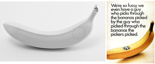
Now, that begets the question – Can a brand stand out and speak for itself despite the absence of any color? Possibly yes – proves Andrew Miller through his 100 day project called Brand Spirit.
The thought about “capturing the essence of a subject rather than its appearance” has apparently inspired him to come up with the idea for this 100 day project. Essentially for each day for 100 days he had painted a branded object white, stripping off its visual branding elements and reducing the object to its ‘purest’ form. The 100 day project came to an end on June 19 2012 while successfully triggering waves of discussions and debates from the online community during its course.
Each of the white ‘branded artifact’ is a fascinating commentary on product design, marketing, branding and our corresponding perceptions as consumers/users. Some of these objects are very recognizable on account of their iconic shapes like the Tabasco and the Coke bottles here.