One Like No Other

Did you hear of 1 Like No Other?

It’s a luxury apparel brand riding on the wave of exclusivity. Each piece of ‘1 Like No Other’ shirt is produced in numbers that are just a handful assuring the wearer of its super exclusivity. Result: A business model that effortlessly commands a price premium for its products.

Lifestyle brands occasionally try their hand at evoking this tendency in us – of possessing (or collecting) something that we deem worthy or representative of ‘our unique self’. Enter product concepts that are a mash up of ‘uniqueness’ and ‘exclusivity’.

Absolut is known for its limited editions. This year it has taken this concept to a whole new level with Absolut Unique. A story of carefully orchestrated randomness powered by 35 different colors, 51 different pattern types all governed by algorithms meticulously devised to induce a method to this madness of design. Result: A first of its kind design spectacle at a massive scale resulting in over 4 million bottles where no two bottles are alike.

These bottles are now lined up for a global launch during September/October 2012.

Another recent example of a product that mashes up the concept of uniqueness with exclusivity is ‘The Cameo Ring’.

On the face of it wedding rings can just be a bunch of fancy, pricey rings. But for many people these rings are actually pieces of jewelry wrapped with a tremendous amount of emotional and symbolic value. Fired up by this insight Russell Greenberg set out to create the most personal ring in the world. Cameo by RUX.

Essentially each ring is custom designed based on the photograph of the person who is to wear it. The unique curves of the individual’s silhouette are then replicated to constitute the contours of this unique and exclusive ring.

This leads to the creation of custom jewelry that one can’t help but fall in love with because the ring is literally a part of him/her. In fact it ‘is’ the person in many ways.

As the designer puts it, this results in intimate art objects that are “beautifully discreet and timeless in design”. Interestingly he has now extended this concept to design custom baby rattles with ends shaped like profiles of the baby’s mom and dad! 

While these concepts are innovative and interesting owing to their ingenious design principles, what could be even more interesting is the consumer insight that they are based upon. Try to think of it for a moment. What is actually being sold here? What are you actually paying for?

The Good, The Bad and The Ugly – Skeuomorphs

What is common among (most) cigarette filters, copper rivets on jeans, the UI of iCal in Mac and the 89-metre pylons at each end of the Sydney Harbour Bridge?

They have design elements that serve no practical purpose.

  • Cigarette filters are printed to look like cork — an allusion to an era of carefree smoking, when the biggest worry women smokers had was smeared lipstick.
  • Most rivets that you see on jeans are just decorative and functionally useless (some even covering the functional rivets underneath).
  • The UI of iCal as seen on Macs has references to functionally useless design elements like leather stitching, torn paper etc.
  • And believe it or not, the twin 89-metre pylons at each end of the Sydney Harbour Bridge  do not support anything; they are functionally useless. They are there only to frame the structure for aesthetic reasons.

These are examples of what are called as ’Skeuomorphs‘ (pronounced SKEW-a-morphs). In simple terms, Skeuomprph is an approach to design that uses design elements which serve no specific function but are purely ornamental/emotional/metaphorical in their roles.

This S-word apparently is one of the most debated trends currently in design. The interesting thing about Skeuomorphs is that, once you are aware of them, they start popping out from everywhere around like:

  • Physical Skeuomorphs: fake windows and vents that don’t open, the hubcaps on car wheels that have no functional relevance,
  • Digital Skeuomorphs: the Folder icons on your desktop, the iBooks & iCal UI in Macs,
  • ‘Experiential’ Skeuomorphs: digital page turning that mimics the physical experience, and
  • Aural Skeuomorphs: theshutter release sound in a digital compact camera, the recorded sound clip that gets played each time you Empty Trash on mac, etc

Apparently most things Apple are very infamous examples of the Skeuomorphic design philosophy. Designers who hate Skeuomorphs do so as they find them distracting, and gimmicky often limiting real innovation. Proponents of Skeuomorphs however argue that they create familiarity and build a human element in our interaction.

I tend to take both sides of the argument. While I definitely am not a big fan of designs that limit possibilities in new mediums on account of their outdated references, I tend to believe that when executed well, Skeumorphs can play a very meaningful role in fostering an effortless level of user (or viewer) interaction (or perception).

My 3 favorite Skeumorphic design examples:

1. The concept of a Shopping Cart in e-commerce sites: While this is obviously a reference from (a bygone?) era of brick and mortar shopping, it nevertheless makes us easy to understand and relate to what we are doing. Can you think of any other simple, logical and a more compelling way of designing this element ‘in tune with the times’? I can’t.

2. Nest Thermostat: Touted to be the most innovative thing that ever happened to thermostats, its design is based on a deceptively simple yet alluring concept of the analog knobs. Do they necessarily need to have the ‘knob’ interface? No. But do they serve any specific purpose? You bet! See the  video here:

And lastly – my most favorite example:

3. Skeuomorphs as a powerful metaphor in advertising: In 2009, Transitions – the first company to commercialize and manufacture plastic photochromic lenses –  had a 30s TV spot. See below.

Do I get it? May be yes/May be no.

Now in early 2012, they introduced what they called as ‘Adaptive Lens Technology’ through a 30s ad. See below.

Do I get it? Hell yes! The concept of a ‘control knob’ is a brilliant metaphor that drives the point home with merciless clarity, engages me and potentially persuades me in just 30s- all this because I… I just get it! I understand how exactly these lenses feel like. Thanks to the obvious Skeuomorph!

Can you think of any other brilliant/ bad examples of Skeuomorphs?

PS: I agree, they should have thought a simpler word for this 🙂

Minimalism and Apple

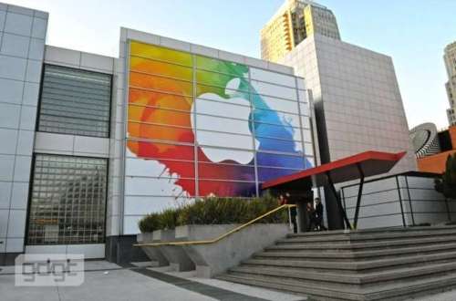
As I write this, Gizmodo shares an update that the latest version of the iPad could actually be called as the iPad HD (as opposed to iPad 3 or iPad 2S). I refresh my browser a number of times as I try to get all updates from the live blogs from gizmodo, wsj, cnet etc that are chronicling the event as it unfolds.

OK, the iPad HD (or is it?) release is just a couple of minutes away and I know that by the time anyone reads this post, the new iPad and a host of the other products from the Apple Stable would be announced by Tim Cook.

An observation that I have on the eve of the announcement:

This is one of those ‘new product announcements’ from Apple in the run up to which, there had always been a near synchronous, peaceful and a calm prediction on what could this next big thing be, from a number of expected sources. Relative to the previous events at this famous Yerba Buena Center for Arts, this is one event regarding which there has been very little debate, argument, disagreement, flight of wild fantasies etc on the shape and form of the things to come.

This is not to say that there is little excitement or any less eager sense of anticipation from the market, media and the consumers. This is one event that would be watched, dissected, analysed and evaluated on various counts – How would Tim Cook carry this off? How much more would the Apple Share price grow? To what greater degree would the traditional business models like books, TV, Cable be affected? Who are the new partners? And finally and more importantly for how much and when can I get my new iPad?

But, this definitely would be remembered as a launch event that was devoid of the kind of buzz, noise and the crazy and sometimes hysterical levels of anticipation that normally precede the actual event. I have always believed that it was this eclectic and testosterone charged set of rumour mills, discussion forums, blog posts, twitter feeds, photo shopped predictions regarding the next big thing that had actually stoked the fanaticism that only kept growing for the brand exponentially – event after event. It was these word of mouth, PR, earned and owned media components that have helped grow and build the brand equity of Apple event after event – duly supported and sustained by the product quality of these products.

Now, if these levels of ‘near stoicism’ and ‘no-brainer predictions’ prevail in the subsequent product launches too, I am afraid if the turbo charged growth engine – that Apple brand has been so far – would run out of its much needed fuel to get its share price touch $ 1000.

Neither Apple as a brand or its product experiences are to be blamed for any of this dumbed down levels of  mass hysterics. In fact all of these products are known to duly stand up to or often out pace the consumer expectations giving them sheer pleasure of usage. However there is one thing that is to be blamed. And that ironically is..

Apple’s Minimalism!

This post, is one of the truly fantastic and insightful commentaries on why Apple’s gospel of minimalism could actually constrain the brand in the long term. The iPad 2 is a minimalist in its design and so was the original iPad. So for any subsequent relaunches of the iPad, given that Apple has an all encompassing design ethic that  spans across every single gadget, it would be a philistine to itself if it dramatically changes its fundamental design strokes that define and characterizes its products. Result: a set of design tweaks that are extremely conservative and again minimalistic in degree. Besides, given the prominence and the centrality that ‘the screen’ has (for good) in most Apple products, the actual real estate available for the designers to play around with is dramatically on the decline. The result: innovations that are mostly under the hood coupled with minimal physical changes that are often millimeters or centimeters in their definition. This had been the case with the iPhone 4S release too and could possibly repeat itself at different instances in the future.

I am very eager to see the ‘real next generation product’ launches from a brand like Apple as opposed these incremental improvements it makes riding on the Moore’s Law.

Bonus read: Speaking of minimalism and Apple, I couldn’t resist myself from posting this link. Check out the minimalist designs of the popular PIXAR Characters. Do read this nice piece of commentary here praising the genius of the designer Wonchan Lee.

From Feeling Beauty to Capturing ‘Living Pictures’

I had always thought to myself sitting in a theater as the lights slowly fade out making way for the picture on the screen to come alive – “this is just brilliant!” I never knew why, but somehow I liked the idea of the lights slowly and pleasantly fading out, rather than getting switched off/on abruptly. This was and obviously still is being used in most cinemas around the world. Why am I writing about this here?

Because of Richard Seymour. The co-founder of Seymourpowell – A ‘global design & innovation company’.

I chanced upon his TED talk here and was reminded of this incredibly subtle and  pleasurable sensation of ‘warmth’, a feeling of ‘wow’ whenever I see the lights getting off slowly. And that’s exactly what he starts his TED talk with: BMW car designed in such a way that whenever the door is closed, as opposed to the lights getting on/off abruptly, it takes exactly 6 secs for the lights to get off…slowly. Exactly 6 seconds. Each time. And he goes about to deconstruct the fundamental set of feelings/responses it evokes and makes his main point. He brilliantly sums it all when he finally says ‘Form IS function’ and that, a new lens with which design has to be viewed is asking if a design is ‘emotionally functional’. This video along with these 2 key takeouts were incredibly insightful to me and set me thinking about so many brilliant things that we see, experience, feel, smell, taste etc that strike ‘that’ chord of rapport with us instantly and evoke responses and reactions that could sometimes be difficult to rationalise or codify.

On the same tangent, I discovered that there is a fast developing, parallel school of thought evolving in the world of design, something that taps into frontiers of neuroscience, behavioral economics, cognitive psychology and anthropology, neuro-marketing and neuro-linguistic programing. This is called as ‘Persuasive Design’. Though the concept of ‘emotionally functional’ design and ‘persuasive design’ can sometimes mean different things and can potentially go about serving different purposes, for me, it is clear that they all speak about very similar things: Of design speaking to our sub-conscious and making ‘that’ impact, evoking ‘that’ response/reaction in just micro seconds long before we even ask ourselves ‘why’.

A very recent example of a refreshing design is Lytro – a camera that introduces a paradigm shift in the way we look at photography.

Even for a moment, if we were to forget the fact that this magical camera enables re-focusing of photos after they have been shot, at a fundamental level, the very shape and design of this piece of optical machinery seems suddenly so commonsensical, so inuitive, and somehow evokes a ‘this-is-how-a-camera-is-supposed-to-be’ kind of response. While there is no doubt about the sheer brilliance and mastery of optics that must have gone into the conceptualisation and development of this game changing technology of ‘light field optics’, I am sure that the work that must have gone into the design/form of this piece of ‘optical magical cuboid’ could nothing be short of genius. A persuasive design example? I bet it is. Is it an example where ‘form Is the function’? I bet it is. Is it emotionally functional? Hell it is!

As cliched an example as it has become over time, Apple usually score high on these design ethos. Hence it is so refreshing to see, for a change, a horse from a different stable all set to rock the derby in the race to engage, delight and win over consumers. And perhaps also redefine an entire market on its way?

Of trucks, specs and monopolies

Buri nazar wale, tera mooh kala

Sounds familiar? It losely means:you with the evil eye, may your face turn black. Does this remind you of anything? I guess for Indians the question should be how many such phrases do you remember?

HORN OK PLEASE/AWAZDO/HUM DO HAMARE DO/and most common ‘JAI HIND’

I am sure that the list could be endless with a gazillion kinds of messages having tones that are quirky, humourous, funny, cunning, spiteful, romantic, ambitious, fanatic, patriotic and sometimes absolutely ‘WTF kinds’! And I am talking about the messages that are painted on the back of trucks in India

See here, for a good detailing of some history behind some of the most popular write ups on the back of trucks. A infotainment indeed.

Besides my realisation of the obvious ‘service’ that they do to the roads by lighting up moods, igniting conversations and sometimes even helping drivers stay awake, what was interesting for me is the phenomenal reach and the audience that each truck (or even an autorickshaw in a city) has in India.

It is in this context that I felt a creative to be hitting on the ‘desi cool’ theme.

Brand Titan Eye+ (clock here for a larger view of the picture below)

Though the creative is interesting and has a real ‘desi cool’ ethic, I am not sure how impactful or even relevant that would be for the kind of consumers that Titan Eye + wants to speak to (why? that’s a different post altogether). Unless this is part of a larger 360 campaign that spans across all relevant touch points, I am sceptical about its success (of this single medium) in delivering results as claimed above.

While reading about trucks in India, another interesting thing that I came across is this new ‘genre’ of monoploy game that the popularity of trucks has spawned.

Truckopoly, as the game is called as per the designer Shantanu Suman, is adapted and designed on the basis of the truck industry of India. The objective of the game is to become the wealthiest truck owner through buying, renting and selling property and goods across the country. The game involves various rules that have to be followed by the truck drivers while transporting goods from one city to another. The challenge is to stay on the top while incurring losses in the form of fines and penalties.

A cool idea that can be translated to the digital realm and marketed as the desi farmville’s of the world. Has there been any popular online Indian game that has captured the imagination of kids and adults alike in the new milieu? Good ideas, seeded through the right channels with decent funding and some innovative marketing is all that it could take to make it big. Hmm.. some food for thought there?