The Allure Of Being Limited: Part 2/2

Quick Read: Value as a concept to a consumer has 2 key dimensions: perceived benefit and perceived cost of a product. But the moment a third dimension called ‘availability’ is introduced, the equation becomes intriguing and interesting, especially when the former is limited – in reach or time.

Imagine someone unboxing a case of 20 blind boxes – each box contains a sealed wrapper that holds a mystery toy within.

For each foil he unwraps and realises the actual toy within – a miniature character –  he lets out an exclamatory ‘aah’. The look and feel of this miniature character makes him marvel at the detail and the exquisite craftsmanship that must have gone into its make, while he also makes a mental note to himself regarding its probable name and where it fits in the larger family of its ‘toy clan’.

And this goes on for each of the 20 blind boxes containing a mystery miniature character within.

Box after box.

And did I tell you that he is an adult in his 30s?

Difficult to imagine, right?

No worries.  For there are thousands of videos here showing this very story unfold. Box after box.

This video here is a good representative version. (strongly recommended dose of some infotainment before you read further)

What did we just see?

Adults –  acting like kids on a christmas morning, unable to contain their excitement as they hold their breath while they unwrap a foil to discover a pretty little toy character within.

Welcome to the world of Urban Vinyl and Designer Toys – a world where toys become prized possessions and collectibles because of two reasons: 

  1. They are works of art designed by prominent international pop culture and graffiti artists.
  2. They are produced in limited quantities  – some as few as 10 to a maximum of 2000 – thereby becoming some of the rarest toys of that kind to be ever made.

Qee series produced in Hong Kong by Toy2R,  Be@rbrick from Japan and the Dunny series produced by Kidrobot are some of the most prominent examples of Designer Toys and Urban Vinyl.

Let’s take Kidrobot – known to be the Mecca of Designer Toys enthusiasts – founded in the US in 2002 by Paul Budnitz. It calls its limited edition Designer Toys as an innovative cross between sculpture and conceptual art, offering not only a powerful medium for today’s international fashion designers, illustrators and graffiti artists, but also the creative canvas for emerging street trends and pop art.

And due to these toys being ‘limited edition’ in design and make they retail anywhere from $5 to $25,000, and many appreciate in value over time. (source)

Kidrobot Dunny(At the intersection of Art and Cult –  The Kidrobot Dunny, Source)

A few more fascinating details regarding Kidrobot and its Dunny Series Designer Toys:

  • Packaging: Each Dunny Designer Toy comes in a foil wrapped inside a blind box. These blind boxes are identical in every way to any other box in a given set so nobody knows which toy is inside. A foil is used to wrap the toy so nobody can open the box and peek inside. (also shown in the unboxing video above)
  • Product Assortment: While the outer case would have some indication of what characters to expect inside, not all of them can be expected to be contained within. Each toy character would have an odds ratio indicating its probability of occurrence within a set. Interestingly there are some characters called ‘chases’ with unknown odds called out as ‘?/??’, while a few are shown mysteriously only in silhouettes. Occasionally, they also include ‘super mystery figures’ that aren’t even indicated on the box, which tend to be some of the rarest ever made of the kind!

Kidrobot Official Dunny Series 2012 Checklist & Ratios(The odds ratios as printed on the cases of Dunny Series 2012, Source) 

  • Kidrobot’s approach to marketing is anything but ordinary: Read here a short interview with Paul Budnitz where he reveals how he has taken a marketing approach opposite to that of most companies.
  • How Kidrobot manages its creative capital: Kidrobot’s approach to distribution of decision making power within the company, its open source design strategy, and how it regularly commissions rock star designers rather than in house artists in order to let a sort of ‘fluidity’ permeate the entire company makes for a fascinating read.
  • Tie ups and Partnerships: Given the cult level popularity and the artistic appeal of Kidrobot’s limited edition toys, it naturally makes for a very coveted partner. For e.g., in Jan 2014 CES, Samsung Galaxy partnered with Kidrobot to land the message about the brand being a new touch point in artistic expression.

samsung_kidrobot_0235wtmk-1280x878(Samsung partners with Kidrobot in CES 2014, Pic source: Slash Gear)

And so it goes on – a fascinating story of how a bunch of unassuming tiny vinyl toys have grown to become icons of pop culture that regularly pull in rabid fans and ardent collectors, who neither mind queuing up for hours outside its stores nor forking out hundreds or even thousands of dollars to buy these designer toys while making its company a multi million dollar brand that it is today.

And when one reads this, sometimes all one can manage to say could be …

…while perhaps even wondering on a wishful note to oneself  damn! where can I get one myself!!”

(Featured Image: Set of Huck Gee’s Night & Day Raku 8” Dunny released in 2011.These were a limited edition of just 500 sets.source)

The Allure Of Being Limited: Part 1/2

Quick Read: Value as a concept to a consumer has 2 key dimensions: perceived benefit and perceived cost (of a product). But the moment a third dimension called ‘availability’ is introduced, the equation becomes intriguing and interesting, especially when the former is limited – in reach or time.

Value is an interesting concept. It can be defined as  the consumer’s perceived benefit derived from a product in relation to its perceived cost, and can be represented by the equation:

Value = Benefit / Cost 

What generates value? Dial up the benefit and/or dial down the cost of your product for the consumer. Simple. Isn’t it? But that is conventional.

Let’s take the concept of Limited Availability. When something becomes limited in availability, the concept of value can become a bit unconventional and even compelling – almost as intriguing and compelling as the concept of turbulence is for physicists.

Don’t believe me? Let’s take 3 examples.

What if the sun were to become limited edition?

Difficult to imagine, right? But for the 3,300 odd people living in the small Norwegian town of Rjukan they don’t have to. Because sunlight for them is literally limited – to just 6 months in an year. The towering peaks that surround the town rise to almost 2,000 meters above sea level and block out the sunlight for 6 months, meaning Rjukan residents live in a permanent shadow from September to March. Every year.

So in October 2013, the town of Rjukan created history by getting sunlight to shine on the town.

And the day that happened, the town square was reportedly abuzz with cheering families, delighted children, sun loungers doning shades and drinking cocktails while waving Norwegian flags as TV cameras flocked from around the world. It was almost like a spectacle, an epochal moment for the town.

How did they do it? 

NORWAY/(Giant mirrors reflecting sun light into the Town Square of Rjukan. Source)

Giant mirrors.

At a  cost of 5 million Norwegian kroner, they installed giant mirrors on a mountainside to reflect the sun into the town. Using computer controlled technology, these mirrors, called heliostats are powered to shift every 10 seconds to track the movements of the sun and reflect sunlight into the town square throughout the day.

Regardless of the cost involved per capita for Rjukan, this unique solar project stands out as a sculpture, an installation that makes us think about the value that we attribute to something as fundamental as sun especially when it becomes limited. Limited in reach and time. 

An insanely irritating game with bad graphics = a viral hit?

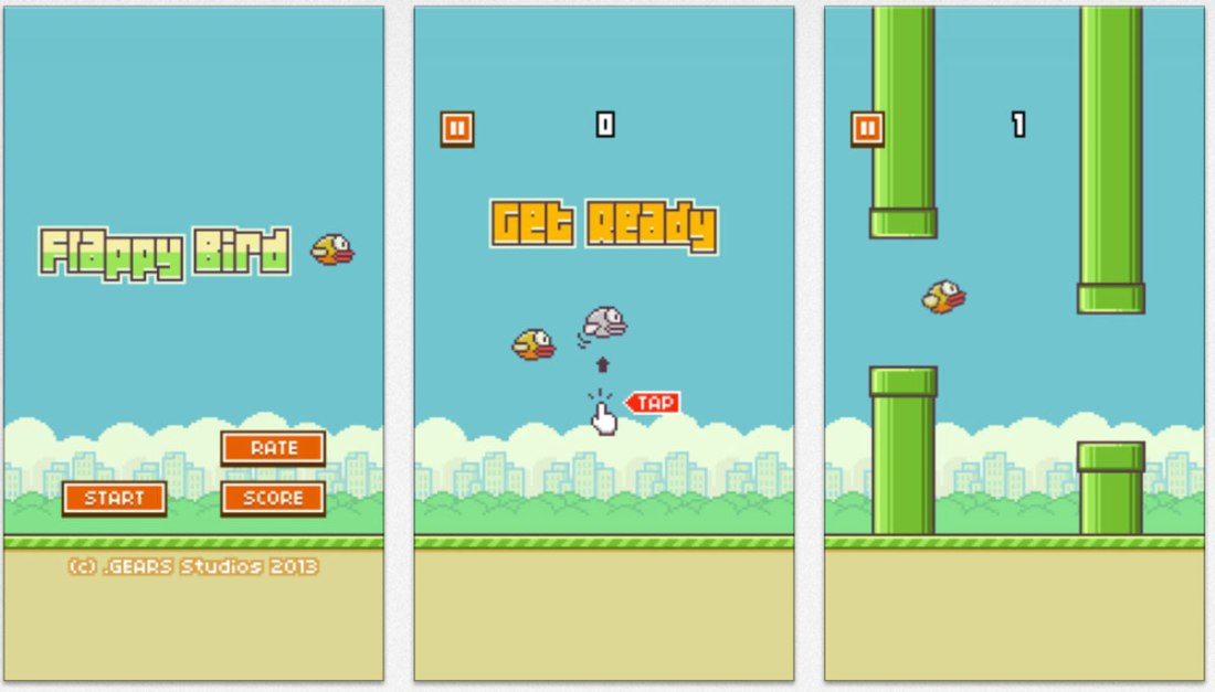
Flappy Bird is a 2013 game developed by Dong Nguyen – a Vietnam based developer. For the uninitiated, the following lines from this Verge article can give you a quick sneak view into the ‘Flappy Bird Phenomenon’:

..the game goes as follows: you tap the screen to propel a tiny, pixelated bird upwards. If you hit any of the green pipes on your way … the game is over. The goal is simply to accumulate the highest score possible. The catch? You’ll very likely spend an hour even reaching a score of five. The app has been downloaded 50 million times, and has accumulated over 47,000 reviews in the App Store — as many as apps like Evernote and Gmail. Mobile games studios generally spend months coding up deliberately addictive and viral titles, but Nguyen did it by spending a few nights coding when he got home from work.

See the video of the game play here:

But for many gaming industry experts Flappy Bird is an enigma. Huffington Post described it as “insanely irritating, difficult and frustrating game which combines a super-steep difficulty curve with bad, boring graphics and jerky movement”. Despite that by early 2014 it was  one of the top free games on the App Store and Google Play in the US and the UK and was touted as “the new Angry Birds.” And was reportedly earning around $50,000 a day in revenue through its in game advertising. But that’s not the most interesting part.

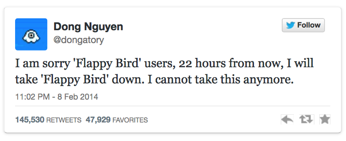
On the 8th of Feb, when Flappy Birds was soaring past stratospheric heights in popularity and cult status, Dong Nguyen tweeted the following.

Flappy Bird

With this single tweet (dutifully reported by the likes of The Wall Street Journal, Guardian, Forbes, Reuters etc. and aided by the existing popularity of his game) Dong was instantly catapulted to a status of cult guru trying to pull an act of ‘Limited Edition’ to his game.

This promnise of limited availability has unleashed an instant panic in the gamers, fuelled debates among gaming experts globally and even invited suspcisions that this could just be a marketing stunt.

Not surprisingly, the game was taken down on App Store and Google Play within the next day while the whole phenomenon has become a viral hit globally. And spectacularly, following the removal, many media outlets reported that several merchants on eBay were offering phones that had the app pre-installed for US$1499 or more, with some receiving bids of over $90,000!! (source 1,2, 3)

As mind blowing as this might prove to be, the story nevertheless tells us two things:

  1. That Flappy Bird is proof that no one really knows what the audience wants. (Do read this article by the same name)
  2. And that the promise of limited availability can sometimes stretch the definition of the word irrationality or insanity (depending upon who you are)

So that’s two examples so far on how compelling the perception of value can turn out to be when driven by a promise of limited availability.

The third example is my personal favorite and deserves a seperate blog post.

To be continued..

When Sub Cultures Influence Brands

Quick Read: There are several fascinating Sub Cultures and Urban Tribes around the world that could give us insights and compelling perspectives into consumer behaviour by way of their unique shared values and behaviours. In each such instance they exemplify how anthropology can influence advertising and vice versa. The Floggers in Argentina and The Sapeurs in Congo are two cases in point.

As a Youth sub culture, THE FLOGGERS originated in Argentina at the end of 2004 and have become popular through their unique fashion and went on to popularise the concept of picture sharing via photo blogs.

Essentially the floggers have two key characteristics:

  • They are dressed up in unique style: Floggers wear bright coloured unisex clothing – commonly tight trousers , V-neck T-shirts and canvas trainers and have dyed hair with long emo side fringes which cover their eyes and lip piercings. They have even developed a particular way of dancing to electro/techno music called Electro. 
  • They share their pics on Fotologs: Floggers take photos of themselves and friends and post them on photo blogs. Among FloggersFotolog.com is one such popular platform and lists more than 5.5 million users in Argentina, which is one of the two biggest markets for the site (Chile is the other). Here users comment on one another’s photos. The more comments, the more famous the flogger. (source)

floggers09(Flogging Frenzy, Source –  The Argentina Independent)

As a sub culture, if you come to think of it, the Floggers represent an interesting niche that are at the intersection of fashion, photography, social media, music and dance. Elite members of such a unique urban tribe naturally become trend setters in fashion and are the de facto voice of their generation cutting across class, creed and hierarchy.

Augustina Vivero a.ka. Cumbio is one such Flogger. She has a fotolog site that is said to be the most viewed Internet sites in Argentina logging 36 million visits in a single year alone! She is known to be the most popular and by many accounts the most influential flogger in the world and by age 17 has catapulted herself to stardom and unexpected affluence by transforming her Internet fame into marketing muscle –  signing modeling contracts, promoting dance clubs and writing a book about her life. (source)

Not surprisingly Nike enlisted her for a three month campaign including a giant sneaker-shaped slide that the floggers could slide down while posing for pictures.

cumbio(Agustina Vivero a.k.a Cumbio holding a NIKE poster featuring her, Source)

 Active members of sub cultures like the Floggers being ‘extreme users’, make for a rich minefield of emerging trends, attitudes, values and vibes of a whole generational cohort for the marketers. Thus they make for an interesting case study on how Anthropology influences Advertising (and arguably vice versa).

The Gentlemen of Bacongo

Take the Sapeurs – one of the world’s most exclusive fashion clubs in a city that you least expect – Congo.

SAPE – which loosely translates to The Society of The Elegant Persons of Congo – are a group of people whose life is not defined by occupation or wealth, but by respect, a moral code and an inspirational display of flair and creativity by way of their stylish dressing.

SAPE(Of Style and Swagger – The Sapeur. Picture by Daniele Tamagni. Also a cover page of his book)

In the words of Hector Mediavilla – who photographed the Sapeurs in his outstanding project, the SAPE can be considered to be the most interesting anthropological phenomenon for several reasonsDespite being surrounded by poverty and civil war the Sapeurs:

  • Dream on and survive the harsh reality.
  • Bring joy to those around them by way of their clothing and
  • Are required at funerals, parties and other celebrations to bring a touch of stylishness to these events.

Essentially, while everybody knows their elegance is just a façade but nevertheless, they perform an important social function for their fellow citizens. And in journalist Tom Downey’s words “when men dress as Sapeurs they become different people. Their gait, their gestures, and their manner of speaking are all transformed. The clothes are the gateway into a whole other way of being in the world.”

No wonder, the Sapeurs have inspired some fascinating photography projectsbooks and even music videos. More recently Guinness has brilliantly weaved the sartorial sub culture of the Sapeurs into their latest campaign, as part of which they enlisted Hector Mediavilla to shoot an inspiring documentary and a TVC.

Don’t miss this 5 mins documentary and the TV Spot.

Sapeurs Documentary

Guinness Sapeurs TV Ad, Agency AMV, BBDO London

For me, the connect between Guinness as a brand and Sapeurs as a spirit is a creative masterstroke truly befitting the flair and the flamboyance of ‘The SAPE Spirit’.

Do you know of any other marketing initiative that has sought to tap into a sub culture or an urban tribe

(Featured Image:  Sapeurs of Congo, Hector Mediavilla, Source.)

Video Games As Disruptive Innovation?

Quick Read: Today’s video games like Grand Theft Auto V, are more than just stunning life like gaming experiences. We could have some exciting possibilities here – where experiential & interactive branding can be embedded in games. And more interestingly, a world where video games can be virtual beta testing grounds for new product and UX design. These could be potential disruptive innovations for fields like Market Research and Product Design. 

Visit Los Santos & Blaine County – where plastic surgery, bad movies and big sharks rule the roost – see for yourself.

So says the landing page of Grand Theft Auto V – the super hit block buster action adventure video game that has been rated as the fastest selling entertainment product in world history.

It broke industry sales records by earning US $800 million in the first 24 hours of its release, and US $1 billion within its first three days.

gta-5-grand-theft-auto-99

One of the key features of the game is that it has an Open World game level design – i.e., a world where a player can roam freely through the fictional city of Los Santos and is given considerable freedom in choosing how or when to approach objectives. So as a character in the game you have the freedom to spend your time pursuing adventure sports, lounge about by the beach, go shopping, visit the local artisan, enjoy music and other such entertainment options.

Los Santos(The Landing Page of GTA-V that lists the possibilities and features of Los Santos city and Blaine County)

But Fernando Pereira Gomes – a street photographer by passion and a game enthusiast who went to the midnight launch of the game and played the night away, noticed something even more interesting.

He noticed that the characters in the game had phones with cameras at all times during the game play. This means the players can practically take pictures from within the game(!) and upload these. So with this new tool, and the huge world of Los Santos and its streets, he started experimenting with the camera and went on to take some truly stunning photographs that he has started to share on his blog. Ever since its launch, his blog and the pictures have been rapidly climbing up the popularity charts – thanks to the ingenuity of his idea and the beauty he captures from within the game’s landscape. See a demo video on how he does it here. Now that is Street Photography taken to a completely new level!

He goes on to say..

What I found was remarkable. The game is so realistic that it felt like being in the streets outside, running around for shots, anticipating passersby’s movements and reactions. In a way, it was also incredibly frightening that these algorithms could look so real, or is it that we ourselves are becoming ever more algorithmic?

StreetPhotoV(Los Santos Street Photo by Fernando Pereira Gomes sourced from his blog)

On first look this is fascinating for two reasons:

  1. For the GTA V’s rich media, content and the game design that enables such  interesting possibilities (makes a definitive commentary on the evolution of game design).
  2. And for the creativity and ingenuity of someone like Fernando Gomes who has ventured beyond the apparent possibilities in the game and went on to make a mark for himself.

On second look, and from a marketer’s and a product designer’s stand point, I thought there could be even more compelling possibilities dormant here waiting to be realised. Two things I could think of:

In Game Experiential Branding

In game branding is nothing new. But how about adding an experiential / interactive angle to this ‘in game branding’? More specifically, how about, say a brand like Samsung, tying up with the game franchise and embedding its full camera functionality in the game’s camera phone? Wouldn’t it be an interesting way to let the gamers – many of whom tend to be tech’s early adopters and thereby potential customers of “the latest phone out there” –  try out the phone’s exciting new features?

The opportunities of ‘customer involvement’ here could be limitless – almost life like with little risk involved while affording an almost first person experience of the phone and/or its camera to the user. The best part is the free marketing that these early adopters could do for the brand if and when they share these pics on their social network.

A Virtual Beta Testing Ground For The Upcoming Wearables  

Let’s take Google Glass as an example  (one among the most awaited wearables in the market for 2014). As we speak now, it is in its Beta testing phase with some early adopters signing up to use, explore, develop and test new possibilities. In fact an Android developer Mike DiGiovanni looking to test the concept of using Glass as a second screen, has managed to capture Grand Theft Auto’s crucial in-game GPS interface, beaming it to the player’s Google Glass eyepiece in real time (source).

But how about embedding the functionality of  something like Google Glass within the game and let the players use it and explore its possibilities by themselves? I would guess something like this could give a treasure trove of real time feedback and insights to the product designers in order for them to refine its design and functionality.

Google Glass

Implications

Ben Hammersley  in his must read WIRED article on Wearables as the 3rd wave of computing, rightly says that when it comes to something like Google Glass, how our social progress plays out will be just as interesting as the technology itself. The social component of the implications would probably need to be tested and tried in real life, but the technology component and its possibilities can perhaps be tested in the game’s ‘reel’ life already today.

And may be when the game design becomes so smart to be able to reflect life like social dynamics – a not so unlikely prospect in the near future –  we might not even need the good old focus group or the hordes of beta testers!

Now, that could be a disruptive innovation for market research and product design!

Market research agencies and product designers of the world – hope you are investing in video games. No?

(Featured Image: Source, Fernando Pereira Gomes Street Photography on the streets of Los Santos within the game Grand Theft Auto V)

The Business of Belief

Quick Read: Every business that we know of can be said to be in the ‘business of belief’. While a majority of these business thrive on building and sustaining our beliefs, there are also ones that thrive on breaking down and challenging our beliefs. 

Arguably every business that we can think of can be said to be in the Business of Belief.

While most businesses that we see around can prove this point, RIEDEL glasses are a very straight forward example.

RIEDEL is an expensive line of glassware designed to deliver the wine’s ‘message’ via the carefully crafted form of the receptacle. In other words, Riedel has built a thriving business of glassware by driving a belief that the shape of their glasses can make wines test better!

Skeptical? The story goes that even experts and wine critics were – several of them skeptical of this seemingly implausible claim.

And yet today, hundreds of wine experts, and thousands of customers now swear it’s true. Taste tests throughout Europe and the U.S. were said to have proven time and again that wine — expensive or inexpensive — tasted better in Riedel glasses.

riedelo

Except it’s not true. At least not empirically. (source)

When subjected to double-blind testing that doesn’t let the taster know the shape of the glass, people found no detectable difference in taste between glasses. Objectively, the shape of the glass just doesn’t matter.

But subjectively, when belief in the story and the experience of the glass are added back in the mix, it matters. And the wine does taste better to these people. Today some Riedel glasses sell for more than 100 dollars each and people covet these over other lower priced glass ware!

Therefore, sensing a branding opportunity that is waiting to be leveraged, Coke has recently tied up with Riedel to come up with a glass that “is designed to enhance the drinking experience”. The Coke site goes on to explain..

Shaped by trial and error by a panel of industry experts and Coca-Cola lovers, this form captures the distinct spices, aroma, and taste of Coca-Cola and creates a magical sensorial experience… A unique glass for a taste like no other.

RIEDEL+Coke(Riedel + Coke, Source)

While this ‘glass act’ by Coke drew myriad views from the F&B industry, it nevertheless makes for an interesting commentary on Riedel as a company that has thrived by systematically building a business of belief.

Meanwhile elsewhere…

Interestingly there also exist businesses that build a following for precisely the opposite reason – by belying beliefs and tearing down expectations each single time they offer something to the consumer.

Take The Art of Dining – a business that sets up theme based pop up dining experiences – as an example.

As part of their model, Ellen Parr and Alice Hodge, put on theme-based pop up restaurants mostly in London. The venues – always unusual and unexpected – have so far included a 16th century mansion, an eel and pie shop, the Victorian Dalston Boys Club, and the army barracks on City Road while the themes range from wartime rationing to the Food of Love. The whole experience is like eating within an interactive art installation. Each of their dining event is thus an experience that belies conventional expectations and common beliefs on what is to come.

A Night With The Mistress(Themed as ‘A Night With The Mistress’, guests were required to put on a blind fold when they ate, Picture Source)

Their recent series called Say Cheese – the photography of Martin Parr in five courses, is the duo’s latest example on how they have cemented their expertise in their signature experiential model – Set up expectations, evoke the guests’ pre conditioned beliefs and pull the rug off their feet as they take the plunge. 

This is how it works:

  • You enter a typical English café setting: gingham table cloths, plastic flowers on the table, pictures of Lady Diana and Mrs Tatcher, copies of the Sun etc
  • The waiting staff are mostly English, wearing floral pinnies
  • And this is where it starts to get interesting -You don’t get a conventional menu, but a set of 5 photos by Martin Parr – the legendary photographer
  • And here is the twist: the food looks just like the images but tastes completely unlike what you expect.
  • For eg. An English tea cup is filled with a tea coloured liquid, poured from a tea pot, which turns out to be a delicious Tom Yam Soup. A doughnut is actually a South Indian savoury, made from lentils and served with a coconut chutney. And it goes on

Martin Parr(Each of the five courses saw Martin Parr’s pictures come to life in bizarrely unexpected ways. Compilation of pictures from here)

See the short video here to get an idea on the actual execution

http://vimeo.com/69361520

Say Cheese! The World of Martin Parr in 5 Courses from GOLIGA on Vimeo.

This pop up experience was also offered in Tokyo in 2013 and as per Time Out Tokyo, the tickets costed  ¥12,000 per person, and were limited to 50 people per night. Food, it says, doesn’t get much more high-concept than this.

Now that’s a business that is actually built on belying beliefs!

(Featured Image, Of Wine Glasses and Beliefs. The Riedel Wine Glass Company Brochure, Source)

Commodities and Fakes. Branded

Can fakes be branded? 

Can fakes be differentiated and charged a premium for? Two recent examples show they bloody well can be!

1. Fakes with an accompanying personal escort flying first class  

A 24 hour escort is the norm for valuable paintings when they are transferred between museums. But a set of forged paintings have been recently extended security arrangements that rival that of the originals. Why?

Because these are not just any other fakes. They are imitation paintings by the world’s most notorious forger Han van Meegren the world war II era painter and master forger – who so well replicated the styles and colours of the legendary artists that the best art critics and experts of the time regarded his paintings as genuine and sometimes exquisite. His wikipedia page says that he is considered to be one of the most ingenious art forgers of the 20th century, so much so that his paintings including his signature have been subsequently forged as well!

Van_Meegeren_signatures(Source, Wikipedia. A collection of genuine and fake signatures of Han van Meegeren)

Today his forged paintings are a brand on to themselves and are treated as prestigious artworks that require the same measures of security as the authentic ones.

2. 3D printers being used to fake Vincent van Gogh 

Now this time, the story to brand the fakes of none other than the works of Vincent van Gogh comes with  its own coined term and a trade mark! Introducing Relievo™

Relievo

(Source: PDF on the Relievo Collection by the van Gogh Museum)

Interestingly this initiative to develop and sell the fakes of the legendary artist is being led by none other than the official van Gogh museum.  Accordingly to this post, the museum is hoping to increase access to pictures which, if they were sold, would go for tens of millions of pounds to Russian oligarchs or American billionaires.

The replicas, called Relievos, are being created by the museum in partnership with Fujifilm, with which it has had an exclusive deal for three years. Such is the complexity of the technology, known as Reliefography, that it has taken more than seven years to develop. It combines a 3D scan of the painting with a high-resolution print. The “super-accurate” reproduction even extends to the frame and the back of the painting. Every Relievo is numbered and approved by a museum curator. And best of all – there is a limited edition of 260 copies per painting.

A limited edition of fakes with each copy uniquely numbered and approved by the curator!! 

Clearly, some fakes are more equal than others!

Commodity Branding 

On a related note, even among commodity products, some brands can be more equal than others. And when they are, as always they make for an interesting marketing case study.

Double A – the paper brand for office supplies and photocopiers has an understandable challenge. Drive user preference in an extremely commoditised category.

So how did they do it? The recent ad campaign by Double A is a case in point. Read the full story here and see all the 4 featured ads in the post by L.Bhat. My favourite 25s spot below. (For email subscribers the URL to the video here)

(Turn on closed captions for subtitles)

So, a paper is a paper? Or is it? 

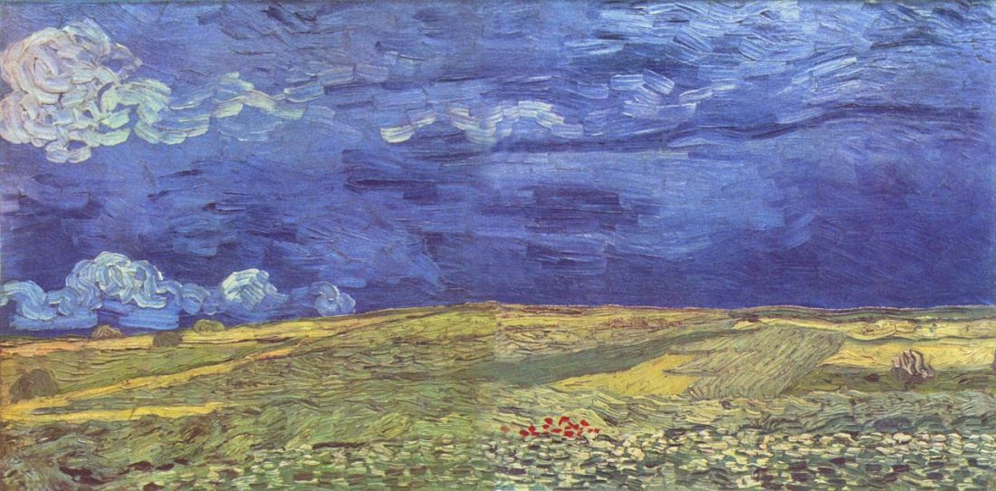
[Featured Image: Wheatfield Under Clouded Sky by Vincent van Gogh. One of the paintings to be reproduced using the 3D printing technique Relievo™]

Remarkable And What Lies Beyond

When you look at a photograph, read a novel or eat at a good restaurant what do you expect?

A good capture of a single moment in time, a nice story and a decent meal. Right?

What if these expectations are messed up and you need to discover for yourself a whole new experience in consuming these products/services? Let’s start with Stephen Wilkes.

The Photograph

Each photographer tends to have an area of interest. i.e., a fascination of architecture or people or nature etc. But what if as a photographer, you are fascinated by architecture and people and cities and also nurture a love of ‘shooting history’? Stephen Wilkes is one such guy and has a way of going about it.

  • He starts at a vantage point that can afford a panoramic view of the location of an iconic land mark
  • Then he shoots what he calls the ‘naked plate’ – a shot of the land mark with absolutely no one in it – in other words  a completely deserted landscape of the location
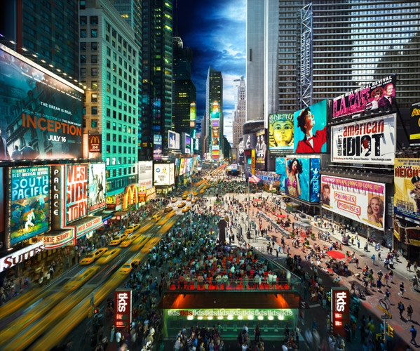
  • Then over a span of over 12 to 15 hours from dawn to dusk in a day, he takes nearly 1,500 pictures of the same location from the same angle, while also taking mental notes of the shifting landscape and the random events unfolding below him
  • After this action at the location, he then selects about 50 final shots from which to over lay the final composite picture that seamlessly merges the action that had unfolded between dawn and dusk at that single place in a single shot!

Result – pictures of a place that are panoramas in ‘Day to Night’ that can throw your brain off the hook. Each picture in this series can look like a magical landscape suspended along a tapestry of time. Don’t believe me? Then let his pictures from his newest body of work titled ‘Day to Night‘ do the talking.

Shanghai

(Stephen Wilkes, Source, Shanghai, Bund)

Times Square

(Stephen Wilkes, Source, Times Square)

The November 25 Edition of TIME features a photo essay based on Stephen’s work. As the article puts it,

A lot can happen between sunrise and sunset especially when Stephen Wilkes is photographing it. 

The Novel

OK, so this is going to be difficult. For how do I write about a book that redefines the very experience of a book?

S. – a novel by JJ Abrams and Doug Dorst, released on Oct 29th 2013 is a first of its kind experiment in book design, layout, narratives and structure. It is a book that stands out because of its unprecedented ambition, creativity and inventiveness.

For the first time you might actually feel a need for a ‘guide’ on how to read a novel! There are three enmeshing story lines in S. :

  • First you have the story in this book by name “Ship Of Theseus”
  • Second you have the mystery about the fictional author of this book by name V.M. Straka
  • And third you have the dialogue between the two readers of this book by name Jennifer and Eric, who communicate to each other via hand written notes along the margins and inserts

Designed by the New York-based design firm Melcher Media, this is a book that can easily be an inspiration for a generation of designers, writers, novelists, publishers and marketers to come for years! Read this FastCompany article for more details.

As the article says..

It’s difficult to decide exactly how to start reading S.–a sort of 3D Infinite Jest with a pop sensibility–and nearly impossible to imagine how it ever got written.

See this video to get a feel of what is inside the book

Trying to explain this book is like trying to explain the plot of ‘Inception‘ and raving about the genius of its concept. The only way to appreciate the ingenuity of this art form is to get a book and start reading. I – for one – cannot wait to begin my magical adventure with S. and discover a whole new experience of consuming a novel!

The Restaurant

Earlier this month, DiverXo has become just the eighth Spanish restaurant to win an unbeatable third Michelin star. With an unassuming kitchen that measures just 30 square meters, it is the only establishment in the Spanish capital to hold the honour. But that’s not the big deal.

The big deal is how DiverXo – led by the Spanish chef David Munoz – turns every single convention on its head as a restaurant.

  • For starters, upon entering, every diner is given a one page manifesto on how to best enjoy the food in the restaurant. All they need is to surrender every preconceived notion and suspend judgement and just do as they are told
  • Once seated, DiverXo offers a choice between a ‘short menu’ (7 dishes,  €95, lasting 2.5 hrs) and a ‘long menu’ (11 dishes,  €140, lasting 4 hrs).  Both menus are exquisitely choreographed as unprecedented gastronomic experiences by the chefs
  • For e.g., as per TripAdvisor,when a dish arrives on the table prepare to be instructed to eat with even a spatula!
  • And as per this AFP article, no sooner do you dig into say – a raw cod fillet drizzled with boiling olive oil and accompanied by potato skins and pickled chilies, don’t be shocked if a cook bursts in to you and lays on hot mayonnaise
  • Later, as you chew more another chef could arrive with a cream of cod and sea urchin

And the shocks and surprises continue.

rp-diverxo-1

(DiverXo, Artful dishes that push the limits of fusion cuisine, Source)

Besides, as per this AFP article ..

  • Even the design of the food can tend to defy expectation. For e.g., a fiendish ketchup of chili and tabasco makes the dish of duck dumplings and fried ducks’ tongues resemble a blood-splattered murder scene
  • The menu lists not ingredients but rather sensations: sweet, sour and, in the case of one star dish, the “Hannibal Lecter”, sharp

As the article says..

The self-proclaimed “brutal” approach of this tiny eatery, where the cooks rush to add ingredients to diners’ plates mid-bite, has made it one of the most unusual restaurants ever to join the world’s gastronomic elite.

In summary DiverXo is a first of its kind restaurant where the rules are simple: Come with an open mind, trust the chefs, expect to be shocked and prepare to be surprised as you embark on a culinary adventure like never before.

May be food is almost besides the point here. Or may be it’s all about the magically shocking experience of what a restaurant has never been yet!   

All about experiences that redefine the product, category and consumer expectations

So the next time when we think of ‘elevating consumer experience’, it could be worthwhile to remind ourselves of these extra ordinary examples that go beyond this ‘elevating the experience’ mould. Three brave, ingenious and creative examples where the very experience of the product has been redefined, our expectations as consumers defied and all norms of the category disbanded.

So now you know. What lies beyond remarkable?

Magic –  after all –  could indeed be serious business!

Soundscapes And Sonic Tapestries: Part 2/2

What do Cyborg Artists, Automobile Engineers, Game Designers and Branding Specialists have in common?

At least those featured in this blog post, that is. Surprise, surprise… all these have sound at the core of what they do!

See the part 1 of this thread here. In part 2, let me share some fascinating examples whereby sound and our ability to decode sound waves is complementing and supplementing our perceptual experience in truly astounding ways!

Sound As A Complement To Our Perceptual Experience

Sound (and its design) can be deployed in a very strategic manner to compliment our perceptual experience. Two compelling examples:

(1) Soundscaping In Product design: We know that there are armies of designers and engineers that work towards designing and developing  a car – it’s mechanics, electronics, aesthetics, thermodynamics, fluid dynamics etc. But did  you know that car companies  also employ sound experts to design the noise of a car? Read here a fascinating account of how GM makes a car sound like what a car is supposed to sound like. On that note meet Kara Gordon  – GM Noise & Vibration Performance Development Engineer who has designed the quietest Chevy.

(2) Sonic Logos In Branding/AdvertisingSonic Branding is big today. Think about the sound of ‘Intel Inside’, a call on Skype, the default ring/message tones on your phones and you’d get the idea. In fact Audi’s heart beat logo is said to be one of the most recognized sonic logos in the world today.  By the way did you know that after 14 years of using this sonic logo, BMW in March 2013, has changed it to this? This change didn’t get many fans by the way.

Sound As A Supplement To Our Perceptual Experience

Sound (and our ability to decode sound) can potentially also supplement our perceptual experience in new and interesting ways. Two examples again:

(1) Audio Games: What would happen if someone wanted to take the “video” out of video games and make users rely solely on their other senses?

At first the idea of Audio only games might sound like just another lateral marketing -isque variant (of video game formats).  But when you read about Deep Sea,  or about  Vanished you’d see that we are at the cusp of another revolution in game design and experience. These games are some of the best (if not the first) of its kind that explore the frontiers of what sound  (and our ability to decode sound) are truly capable of.

For e.g., Vanished – an iOS game as of Oct 2013 –  uses the iPhone’s internal compass and accelerometer to recreate a person’s movement. Players hold their phone in the direction they want to travel and touch the screen to walk. When in danger, they shake the phone to attack. All exploration is done with the help of audio only cues; as players move, the world “rotates” and provides different sounds.

Vanished

(iPhone Screenshot of Vanished – The Audio Game, Source)

(2) Hearing Colors: They say that you can see sound, but can you hear a color? Apparently Neil Harbisson can!  His profile on TED says this.

Artist Neil Harbisson was born completely color blind, but these days a device attached to his head turns color into audible frequencies. Instead of seeing a world in grayscale, Harbisson can hear a symphony of color — and yes, even listen to faces and paintings.

So there we have – some truly  fascinating examples from the recent past on how sound (and our ability to make sense of sound waves) is being leveraged in some truly exciting ways.

The next time you remind yourself to pause for a moment to appreciate the scenery and to ‘smell the flowers’, don’t forget that you could also take in the richness of the surrounding soundscapes in all their aural splendor.

All you need to do is incredibly simple. Listen.

(Featured image source)

Soundscapes And Sonic Tapestries: Part 1/2

See: Visualize :: Hear: (?)

Can you believe that there is officially no word in the English language that can encapsulate this? Doesn’t exactly do justice to our ability to invoke our mind’s ear to identify, create, re-create and remix sounds and thereby trigger emotions, memories and associations within us. No wonder, the aural realm remains an under exploited, and in some cases, under appreciated dimension to inform and enrich our perceptual experience. Take two of our most common habitats:

(1) Our Constructed Spaces (Architecture)  

So far the practice and purpose of architecture was anchored by the ‘eye’ and for the ‘eye’. Ears – apparently – were compelled to take a back seat and thereby had limited influence over design decisions (unless we speak about amphitheaters). Result –  offices, schools, homes, malls, restaurants and the list goes on, that are so poorly designed so much so that they actually do us more harm than any possible good! Not entirely convinced? See this TED video by Julian Treasure:

(2) Nature  

There was a time when wild soundscapes were considered just some exotic/charming artifacts of nature. But as it turns out,every habitat is believed to have its own unique sound signature – a sonic tapestry that can potentially convey an incredible amount of information about the present state and the future fate of any given place/habitat.

First a quick dose of general knowledge. A soundscape is made up of three basic sources:

  1. Geophony: these are non-biological sounds that occur in any given habitat, e.g., wind, water, waves etc.
  2. Biophony: these are sounds  generated by organisms in a given habitat at a given time and place.
  3. Anthrophony: these are sounds that we humans generate. e.g., our music, noise from machinery, automobiles etc.

So at any given point in time and place, anything that we hear is composed of these three kinds of sounds, and can be graphically represented in a Spectrogram – a graphic illustration of sound with time represented from left to right and sound frequencies represented from the bottom to the top, lowest to highest.

In an incredibly ‘earopening’ TED talk that is insightful, shocking, profound, inspiring and immensely thought provoking, Bernie Krause – a natural sounds expert –  proves that while a picture may be worth 1,000 words, a soundscape is worth 1,000 pictures. If there is one TED video that you need to see this week, let this one be the one – a must see:

In many ways these two talks could be said to be a call to action for us to resist our ‘natural’ instinct of zoning out most of the sound that reaches our ears and to start appreciating our faculty of hearing for how it can enrich our perceptual experience.

On a related note, let me submit my following hypothesis:

I started off by saying that in the English language we don’t seem to be having a word that can effortlessly fit in the following context

See: Visualize :: Hear: (?)

My guess would be that there might be some language out there (Chinese? Japanese? Korean? etc) that might have just the apt word for it. If so, my hypothesis would be that, such a country/culture must be having sonically richer traditions, must be producing relatively higher number of music prodigies and must be having general public with greater appreciation of sound and our faculty of hearing. And as an extension, I would also risk a bet that people from such a culture would also be adept at living in the now and here and appreciating everything about it.

Does your language have a word for this?

To Be Continued…

(Featured Image, Source)

Adjacencies and Algorithms

30.56 degrees Celsius.

That’s the temperature at which fungus is normally known to thrive. Now, since fungus is the staple diet for termites, even in the scorching heat of Sub Saharan Africa, they are known to meticulously maintain this constant level of temperature within their mounds.  But how do they pull this off?

The answer for this question has been the inspiration for the design and construction of Zimbabwe’s largest commercial complex – The Eastgate Centre. Designed to be ventilated and cooled by entirely natural means, it was probably the first building in the world to use natural cooling to this level of sophistication.

During a Formula 1 race, a car sends hundreds of millions of data points to its garage for real-time analysis and feedback. So why not use this detailed and rigorous data system elsewhere, like … at children’s hospitals?

These tangents of thought are some of the several examples that stand out for the power of combining seemingly different ideas to  arrive at breakthrough concepts and revolutionary designs.  Frans Johansson calls this The Medici Effect in his insightful book by the same name – a must read for anyone fascinated by the world of creativity, innovation and ideas. This is very similar to the concept of The Adjacent Possible that Steven Johnson speaks about in his book Where Good Ideas Come From.  

Essentially it is about two things:

  1. Identifying seemingly different or intuitively unrelated ideas and
  2. Combining them together in new and unexpected ways to yield  actionable insights or practical – yet unforeseen –  solutions to existing problems.

One related concept of The Adjacent Possible is what could possibly be called as Meaningful Adjacencies.

Two very interesting ways in which the application of this concept has panned out in the recent past. One in the field of stylometry and the other in ‘commemorative design’.

(1) The Algorithm that declared “It’s J.K. Rowling” 

When The Cuckoo’s Calling – a detective story was released earlier this year, the novel has received lavish praise and the writer one Robert Galbraith was marked as someone to watch out for. But, reportedly The Sunday Times believed that Robert Galbraith was just a pen name for an author who could possibly be a bit more familiar. So on July 11, Professor Patrick Juola received an interesting mail from The Sunday Times. The task? To verify that Ms. Rowling was indeed the author of The Cuckoo’s Calling!

So what did Prof Juola – the stylometry expert do do?  He deployed a computer program called the Java Graphical Authorship Attribution Program (JGAAP) that he had designed to recognize writing styles undetectable by human readers.  He loaded the e-version of The Cuckoo’s Calling into JGAAP, along with several other texts, including The Casual Vacancy, J.K.Rowling’s post-Potter novel, set the program running and sat back to watch the fun.

Essentially, the JGAAP algorithm works by comparing the following variables in each of the book within the comparison set:

  • Word-length distribution
  • The use of common words like “the” and “of”
  • Recurring-word pairings and
  • The distribution of “character 4-grams,” or groups of four adjacent characters, words, or parts of words.

While the first two variables are more distribution and frequency related, the last two are adjacency related. Now this was an insight for me-

– that a set of adjacent words / characters / or even part of words can potentially have a unique pattern of their own so much so that they constitute a distinctive signature of their own and can thereby possibly bring out unique attributions to a specific author!

So in just 30 mins, Prof Juola’s JGAAP did confirm J.K.Rowling as the ‘suspected’ author and to his delight the conclusion was later confirmed by Rowling herself!

The interesting question that this now begets is – Should we teach literature students how to analyse texts algorithmically! Well, if an author’s literary signature is hidden deep within the recess of adjacent characters and words and if algorithms can squeeze out meaning from these adjacencies – then, I’d say Why Not?

(2) The ‘Commemorative Calculus’ Of The 9/11 Memorial

Nearly 3,000  men, women, and children were said to have been killed in the attacks of September 11, 2001, and February 26, 1993 on the Twin Towers.  In order to commemorate them, the 9/11 memorial has a very unique feature – the names of every person killed inscribed into bronze parapets surrounding the 9/11 Memorial’s twin pools.

National-9.11-Memorial-4a-Credit-Amy-Dreher

(Image Source)

As Michael Arad – an architect of the memorial puts it “(the idea of having the names of all the 3,000 men, women and childen) allows families’ and friends’ stories to be told.” He says “the river of names, without other identification (like age or title or company affiliation), was meant to convey simultaneously a sense of individual and collective loss.”

But it’s here that it gets interesting. These names on first look, would seem to be randomised in their grouping.

However on deeper inspection it becomes apparent that this grouping has been the result of some truly complex set of algorithms based on the concept of Meaninful Adjacencies – whereby each name has been meticulously mapped to each other on the basis of specifics like location, floor, company of a person and laid out in relation to other people based on relevant relationship contexts .

The result?  An intricate mapping of names that commemorates those laid to rest in a deeply compelling way by reflecting thousands of complex interpersonal relationships among them – and thereby telling a story with a real emotional impact.

193921

(Image, Source)

So there we have it – an analytical process that brings in a new twist to the adjacencies of words inherent in an author’s writings and a design paradigm that is predicated on bringing out narratives based on adjacencies of the underlying elements. 

So the next time when someone tells you that new ideas thrive at the intersection/adjacency of seemingly different concepts, tell them that it can literally be the case.

(Featured Image, Termite Mound in Namibia, Source)