Remarkable And What Lies Beyond

When you look at a photograph, read a novel or eat at a good restaurant what do you expect?

A good capture of a single moment in time, a nice story and a decent meal. Right?

What if these expectations are messed up and you need to discover for yourself a whole new experience in consuming these products/services? Let’s start with Stephen Wilkes.

The Photograph

Each photographer tends to have an area of interest. i.e., a fascination of architecture or people or nature etc. But what if as a photographer, you are fascinated by architecture and people and cities and also nurture a love of ‘shooting history’? Stephen Wilkes is one such guy and has a way of going about it.

  • He starts at a vantage point that can afford a panoramic view of the location of an iconic land mark
  • Then he shoots what he calls the ‘naked plate’ – a shot of the land mark with absolutely no one in it – in other words  a completely deserted landscape of the location
  • Then over a span of over 12 to 15 hours from dawn to dusk in a day, he takes nearly 1,500 pictures of the same location from the same angle, while also taking mental notes of the shifting landscape and the random events unfolding below him
  • After this action at the location, he then selects about 50 final shots from which to over lay the final composite picture that seamlessly merges the action that had unfolded between dawn and dusk at that single place in a single shot!

Result – pictures of a place that are panoramas in ‘Day to Night’ that can throw your brain off the hook. Each picture in this series can look like a magical landscape suspended along a tapestry of time. Don’t believe me? Then let his pictures from his newest body of work titled ‘Day to Night‘ do the talking.

Shanghai

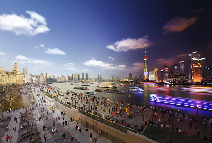
(Stephen Wilkes, Source, Shanghai, Bund)

Times Square

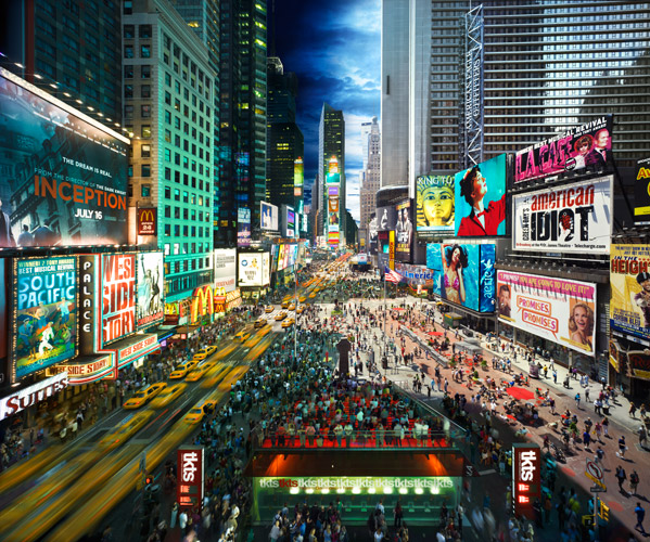
(Stephen Wilkes, Source, Times Square)

The November 25 Edition of TIME features a photo essay based on Stephen’s work. As the article puts it,

A lot can happen between sunrise and sunset especially when Stephen Wilkes is photographing it. 

The Novel

OK, so this is going to be difficult. For how do I write about a book that redefines the very experience of a book?

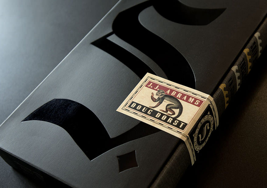
S. – a novel by JJ Abrams and Doug Dorst, released on Oct 29th 2013 is a first of its kind experiment in book design, layout, narratives and structure. It is a book that stands out because of its unprecedented ambition, creativity and inventiveness.

For the first time you might actually feel a need for a ‘guide’ on how to read a novel! There are three enmeshing story lines in S. :

  • First you have the story in this book by name “Ship Of Theseus”
  • Second you have the mystery about the fictional author of this book by name V.M. Straka
  • And third you have the dialogue between the two readers of this book by name Jennifer and Eric, who communicate to each other via hand written notes along the margins and inserts

Designed by the New York-based design firm Melcher Media, this is a book that can easily be an inspiration for a generation of designers, writers, novelists, publishers and marketers to come for years! Read this FastCompany article for more details.

As the article says..

It’s difficult to decide exactly how to start reading S.–a sort of 3D Infinite Jest with a pop sensibility–and nearly impossible to imagine how it ever got written.

See this video to get a feel of what is inside the book

Trying to explain this book is like trying to explain the plot of ‘Inception‘ and raving about the genius of its concept. The only way to appreciate the ingenuity of this art form is to get a book and start reading. I – for one – cannot wait to begin my magical adventure with S. and discover a whole new experience of consuming a novel!

The Restaurant

Earlier this month, DiverXo has become just the eighth Spanish restaurant to win an unbeatable third Michelin star. With an unassuming kitchen that measures just 30 square meters, it is the only establishment in the Spanish capital to hold the honour. But that’s not the big deal.

The big deal is how DiverXo – led by the Spanish chef David Munoz – turns every single convention on its head as a restaurant.

  • For starters, upon entering, every diner is given a one page manifesto on how to best enjoy the food in the restaurant. All they need is to surrender every preconceived notion and suspend judgement and just do as they are told
  • Once seated, DiverXo offers a choice between a ‘short menu’ (7 dishes,  €95, lasting 2.5 hrs) and a ‘long menu’ (11 dishes,  €140, lasting 4 hrs).  Both menus are exquisitely choreographed as unprecedented gastronomic experiences by the chefs
  • For e.g., as per TripAdvisor,when a dish arrives on the table prepare to be instructed to eat with even a spatula!
  • And as per this AFP article, no sooner do you dig into say – a raw cod fillet drizzled with boiling olive oil and accompanied by potato skins and pickled chilies, don’t be shocked if a cook bursts in to you and lays on hot mayonnaise
  • Later, as you chew more another chef could arrive with a cream of cod and sea urchin

And the shocks and surprises continue.

rp-diverxo-1

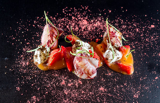
(DiverXo, Artful dishes that push the limits of fusion cuisine, Source)

Besides, as per this AFP article ..

  • Even the design of the food can tend to defy expectation. For e.g., a fiendish ketchup of chili and tabasco makes the dish of duck dumplings and fried ducks’ tongues resemble a blood-splattered murder scene
  • The menu lists not ingredients but rather sensations: sweet, sour and, in the case of one star dish, the “Hannibal Lecter”, sharp

As the article says..

The self-proclaimed “brutal” approach of this tiny eatery, where the cooks rush to add ingredients to diners’ plates mid-bite, has made it one of the most unusual restaurants ever to join the world’s gastronomic elite.

In summary DiverXo is a first of its kind restaurant where the rules are simple: Come with an open mind, trust the chefs, expect to be shocked and prepare to be surprised as you embark on a culinary adventure like never before.

May be food is almost besides the point here. Or may be it’s all about the magically shocking experience of what a restaurant has never been yet!   

All about experiences that redefine the product, category and consumer expectations

So the next time when we think of ‘elevating consumer experience’, it could be worthwhile to remind ourselves of these extra ordinary examples that go beyond this ‘elevating the experience’ mould. Three brave, ingenious and creative examples where the very experience of the product has been redefined, our expectations as consumers defied and all norms of the category disbanded.

So now you know. What lies beyond remarkable?

Magic –  after all –  could indeed be serious business!

Twitter and Condoms

Two companies. Two successful IPO debuts in the same week. But two different stories.

Let’s start with Twitter.

Twitter shares surged 73% at market debut this week, and closed at $44.90, after hitting $50 at one point – or almost double its $26 offer price. Financial Times reports that at that level, Twitter was more valuable than market heavyweights such as Time Warner and Yahoo! In fact, by some reports, there is also a sentiment that by pricing its  shares at only $26, Twitter has ended up leaving an awful lot of money – nearly $1.3bn –  on the table!

[Amidst heaps of articles out there currently on Twitter, if there is one article that you need to read this week, this would be  it – Bloomberg Businessweek’s cover story on the ‘Surprising Sophistication of Twitter’.  

Twitter Businessweek

(Cover Page, Bloomberg Businessweek, November 11 – 17, 2013)

A small teaser from the article:

Millennia from now an intelligence coming across a single tweet could, like an archaeologist pondering a chunk of ancient skull, deduce an entire culture.

Deducing an entire culture from a single tweet? Do read the full post to appreciate the wealth of data that gets encapsulated in each tweet that we send out and its implications.]

For hints on how Twitter could possibly go about driving growth and revenue, one just need to look at these two statistics:

  • 77% of current Twitter users are from outside the United States. And given the potential swing of the demographics in many Asian economies in the coming years, Twitter’s target user base in these markets is expected to grow at a sustainable pace.
  • However while the advertising revenue that Twitter currently realises from every 1,000 interactions from the US is $2.58, this figure is only 36 cents for the other 77% of the interactions. (source)

These clearly underscore the tremendous growth potential that Twitter has in several Asian markets.  No wonder then Twitter has started to strengthen its focus in markets like India over the last 1 month.

Meanwhile on the other side of the world earlier this week…

Karex, a Malaysian company – the world’s largest maker of condoms –  has debuted on the Kuala Lumpur Stock Exchange with a 30% surge in share value on day one. The company, which supplies to prominent global brands like Durex besides also selling its own brand Carex, has nearly 10% global market share in condoms. (source)

Carex_Condoms_Firefly(Carex Condoms, Agency: Grey Group, Kula Lumpur, Source)

Today by Karex’s own estimates it cranks out almost 10 times more condoms than Trojan – the key condom brand in the U.S. Karex’s IPO was a tremendous success amidst analysts’ forecast that greater awareness of family planning in developing Asian countries will spur demand for condoms.

So while one company that went public this week has a story of exponential growth expected from the ‘powerhouse’ Asian markets, another company that went public during the same week from the other side of the world has a story that counts on the contrary – family planning and control in population growth in the Asian markets!

Couldn’t help noticing the contrasts.

Two companies. Two successful IPO debuts in the same week. But two slightly different stories.

(Featured Image, Source)

Adjacencies and Algorithms

30.56 degrees Celsius.

That’s the temperature at which fungus is normally known to thrive. Now, since fungus is the staple diet for termites, even in the scorching heat of Sub Saharan Africa, they are known to meticulously maintain this constant level of temperature within their mounds.  But how do they pull this off?

The answer for this question has been the inspiration for the design and construction of Zimbabwe’s largest commercial complex – The Eastgate Centre. Designed to be ventilated and cooled by entirely natural means, it was probably the first building in the world to use natural cooling to this level of sophistication.

During a Formula 1 race, a car sends hundreds of millions of data points to its garage for real-time analysis and feedback. So why not use this detailed and rigorous data system elsewhere, like … at children’s hospitals?

These tangents of thought are some of the several examples that stand out for the power of combining seemingly different ideas to  arrive at breakthrough concepts and revolutionary designs.  Frans Johansson calls this The Medici Effect in his insightful book by the same name – a must read for anyone fascinated by the world of creativity, innovation and ideas. This is very similar to the concept of The Adjacent Possible that Steven Johnson speaks about in his book Where Good Ideas Come From.  

Essentially it is about two things:

  1. Identifying seemingly different or intuitively unrelated ideas and
  2. Combining them together in new and unexpected ways to yield  actionable insights or practical – yet unforeseen –  solutions to existing problems.

One related concept of The Adjacent Possible is what could possibly be called as Meaningful Adjacencies.

Two very interesting ways in which the application of this concept has panned out in the recent past. One in the field of stylometry and the other in ‘commemorative design’.

(1) The Algorithm that declared “It’s J.K. Rowling” 

When The Cuckoo’s Calling – a detective story was released earlier this year, the novel has received lavish praise and the writer one Robert Galbraith was marked as someone to watch out for. But, reportedly The Sunday Times believed that Robert Galbraith was just a pen name for an author who could possibly be a bit more familiar. So on July 11, Professor Patrick Juola received an interesting mail from The Sunday Times. The task? To verify that Ms. Rowling was indeed the author of The Cuckoo’s Calling!

So what did Prof Juola – the stylometry expert do do?  He deployed a computer program called the Java Graphical Authorship Attribution Program (JGAAP) that he had designed to recognize writing styles undetectable by human readers.  He loaded the e-version of The Cuckoo’s Calling into JGAAP, along with several other texts, including The Casual Vacancy, J.K.Rowling’s post-Potter novel, set the program running and sat back to watch the fun.

Essentially, the JGAAP algorithm works by comparing the following variables in each of the book within the comparison set:

  • Word-length distribution
  • The use of common words like “the” and “of”
  • Recurring-word pairings and
  • The distribution of “character 4-grams,” or groups of four adjacent characters, words, or parts of words.

While the first two variables are more distribution and frequency related, the last two are adjacency related. Now this was an insight for me-

– that a set of adjacent words / characters / or even part of words can potentially have a unique pattern of their own so much so that they constitute a distinctive signature of their own and can thereby possibly bring out unique attributions to a specific author!

So in just 30 mins, Prof Juola’s JGAAP did confirm J.K.Rowling as the ‘suspected’ author and to his delight the conclusion was later confirmed by Rowling herself!

The interesting question that this now begets is – Should we teach literature students how to analyse texts algorithmically! Well, if an author’s literary signature is hidden deep within the recess of adjacent characters and words and if algorithms can squeeze out meaning from these adjacencies – then, I’d say Why Not?

(2) The ‘Commemorative Calculus’ Of The 9/11 Memorial

Nearly 3,000  men, women, and children were said to have been killed in the attacks of September 11, 2001, and February 26, 1993 on the Twin Towers.  In order to commemorate them, the 9/11 memorial has a very unique feature – the names of every person killed inscribed into bronze parapets surrounding the 9/11 Memorial’s twin pools.

National-9.11-Memorial-4a-Credit-Amy-Dreher

(Image Source)

As Michael Arad – an architect of the memorial puts it “(the idea of having the names of all the 3,000 men, women and childen) allows families’ and friends’ stories to be told.” He says “the river of names, without other identification (like age or title or company affiliation), was meant to convey simultaneously a sense of individual and collective loss.”

But it’s here that it gets interesting. These names on first look, would seem to be randomised in their grouping.

However on deeper inspection it becomes apparent that this grouping has been the result of some truly complex set of algorithms based on the concept of Meaninful Adjacencies – whereby each name has been meticulously mapped to each other on the basis of specifics like location, floor, company of a person and laid out in relation to other people based on relevant relationship contexts .

The result?  An intricate mapping of names that commemorates those laid to rest in a deeply compelling way by reflecting thousands of complex interpersonal relationships among them – and thereby telling a story with a real emotional impact.

193921

(Image, Source)

So there we have it – an analytical process that brings in a new twist to the adjacencies of words inherent in an author’s writings and a design paradigm that is predicated on bringing out narratives based on adjacencies of the underlying elements. 

So the next time when someone tells you that new ideas thrive at the intersection/adjacency of seemingly different concepts, tell them that it can literally be the case.

(Featured Image, Termite Mound in Namibia, Source)

Gyotaku And The Trailer

What is common between Gyotaku and Movie Trailers?

Gyotaku Trailer

1. Both are traditionally forms of ‘advertisements’ of another art form

2. And both have evolved into specialized art forms unto themselves

Let’s start with Gyotaku

Gyotaku is the traditional Japanese art of fish printing dating back to the mid 1800s. Before you read any further, you might want to begin with this fabulous TEDEd video to get a quick introduction on this fascinating art form.

As you can see, the purpose of the early Gyotaku print was to serve as an advertisement and proof of the fisherman’s skills as reflected by the quality of his catch.  The emphasis was thereby to capture just the basic proof of the size and species of the fisherman’s “trophy fish” and to record this permanently.

Now Gyotaku has become so popular around the world that it has dedicated competitions, hobby clubs, instruction classes, museums, books, textile prints etc;  and has currently evolved to the point where the actual activity of fishing is almost besides the point.  The craft has now become a unique representational art of Japanese Culture that honors realism and story telling.

The insight for me here is that,

A good piece of Gyotaku art captures a moment in the ocean and not just a piece of dead fish.

Gyotaku2

In other words each piece of Gyotaku tells a story where:

1. The narrative often comes from what you don’t see – the negative space: A good Gyotaku composition is known to make use of the negative space within the frame and brings to life the concepts like idea, flow and freedom of movement that come with the ocean.

2. Our minds are lead into the frame and then set free : A good Gyotaku ‘hand holds’ our mind by gently leading us into the exquisite form and finish of the fish. But a great Gyotaku takes it a step further by then carefully setting our imagination ‘free’ as it allows ample space for the mind to take the fish on its journey.

Moving on to Movie Trailers

Just like Gyotaku, the movie trailer has come a long way from being a plain advertisement (of a full length movie) to becoming a genre unto itself. Today it is a thriving industry that is almost as popular as that of the movies they’re teasing, with legions of fans following, dissecting, analyzing, reviewing and rating them on a regular basis even as they are feted out at forums like The Key Art Awards and The Golden Trailer Awards (the Oscars of movie trailers).

From being just a linear montage of title cards, voice-over, a few key scenes followed by a cast run-through, movie trailers today are part art, part marketing wizardry and part awesome creativity. Result: They can tease, titillate, shock, seduce, awe, thrill or even hypnotise us via subliminal messages, imagery, and music and lull us into the cinema for the actual full length fare.

The latest edition of the WIRED magazine has an insightful feature on the Art Of The Movie Trailer. Two insights that emerge from the construct of great trailers:

1.The narrative of the trailers doesn’t necessarily come from what you see, it comes from what you hear (the negative space of trailers = music): Trailers are all about rhythm, pacing, and feeling. That’s why music plays a vital role as a key narrative device and can more often than not make or break a trailer. Mark Woollen, the man behind the trailer for The Social Network shares a secret of how he came up with its music for an evocative narrative ..

I’d had “Creep” on my iTunes for five or six years kind of kicking around before the Social Network trailer…And then when this project came along, I started to consider that song. There are a couple of qualities to it that I thought could do a lot for the trailer. It was a fantastic piece of music—the build, the message, the flavor.

And the rest as they say is history – with the trailer going on to win both The Key Art Awards and The Golden Trailer Awards for 2011 for its outstanding achievement in advertising movies. See this trailer here:

2. Our minds are lead into the plot and then condemned to a free fall: A good trailer gently leads our minds and imaginations into the centre of the plot or the tension that is eventually created in the act 2 and then sets it on a free fall. E.g., Alfred Hitchcock’s trailer for Psycho (though being a tad bit long at ~ 6 mins) very gently teases us bit by bit till almost the end before throwing us off the cliff! See the iconic trailer here: (don’t miss the last 2.5 mins at least)

The trailer for Alien is another master piece that stands out for a similar reason.

So there you have it – Gyotaku and Movie Trailers:  two art forms that have begun to become bigger than the art forms that these are based upon, two powerful examples where creativity thrives despite the underlying constraints ; or probably examples where creativity thrives due to its underlying constraints.

Icons – The Visual Metaphors Of Our Culture

Ever wondered what could be the primary cause of our childhood fascination with cartoons? I did. Tons of times in fact. With little success very often.  Thankfully for me Scott McCloud in Understanding Comics gives a clear and a straightforward explanation for that.

Understanding Comics Pg 36

(Scott McCloud, Understanding Comics, Pg 36)

Essentially, he posits,  the mental picture that we we have of ourselves is simple and basic . Therefore, we are able to project ourselves into the ‘simple character’ but not the ‘complex one’.

The obvious lesson here that is applicable to advertising could be – if you want your audience to feel like they are the main character, make sure the character isn’t overly elaborate and detailed.

The classic iPod ads of 2001  have smartly taken this theory a step further by featuring just a set of male and female silhouettes.

iPod

(Image Source)

This abstraction of pictures from reality to icons is thus a powerful mode of expression that comics (and comic artists) have deliberately and meaningfully perfected over the years.  For, after all, (visually) quoting Scott..

Understanding Comics Pg 59

(Scott McCloud, Understanding Comics, Pg 59)

“There is no life in an icon except that which you give to it.”

While this insight forms the cornerstone of what constitutes the vocabulary of comics, it lends a very powerful commentary  that is relevant for our practical lives too. Let me explain.

Just like we are said to be exposed to thousands of marketing/ brand impressions per day, I’d wager that we are also exposed to as many (if not more) iconic impressions each day. While a brand’s logo – by definition – could also be called as an ‘icon’, my focus here is more on icons that constitute the typical signage/symbols that we are used to seeing all around us each day – e.g.,  traffic signage, safety signage, industrial signage, traveler signage etc.

dot_pictograms_full

(DOT Pictograms)

Since these signage icons have been around for years, most of us grow up intuitively accepting them as part of our unspoken language. Thereby they practically end up becoming the visual metaphors of our culture.

Armed with this insight – The Accessible Icon Project was born with a goal to  show a more humanized depiction of the differently abled in the International Symbol of Access.

Symbol of Access

I’ll let you read a comprehensive account of the project here, but the highlight of this guerrilla art project was that it succeeded in reorienting the visual focus of the symbol from the chair to the person, while replacing the rigid, static representation with something more dynamic and active.

Result: The idea has been gaining tremendous momentum around globally as we speak, with NYC becoming one of the first cities in the world to formalize and adopt this new symbol with many disability organizations around the world vehemently following suit.

Metaphors are said to have the power of influencing our ideas, challenging assumptions and creating new world views. And if a picture is worth a thousand words, the power of a visual metaphor like this new ‘access icon’ above can be said to be amplified a thousand fold in shaping our collective biases, informing our cultural opinions and influencing our societal attitudes as humanity.

That’s when things get interesting. Symbolically and literally.

Blood In The Gutter – On Smart Narratives

Cleverly disguised as an easy to read comic book, Understanding Comics is a masterpiece from Scott McCloud on what makes comics as a medium – tik. Called as “…one of the most insightful books about designing graphic user interfaces ever written..” by Andy Hertzfeld, the co-creator of the Mac, Understanding Comics bares fascinating insights on time, space, art and the cosmos. A must read for anyone with a curious mind and a willingness to have some fun along the way. Go get yourself a copy if you haven’t yet and it might as well turn out to the best gift you’d have given yourself in a long time.

Blood In The Gutter is the name of my favorite chapter from the book where Scott explains what constitutes the magic and the mystery of comics through a concept called ‘Closure’. Following are some panels from the chapter that explain this concept in lucid detail:

Blog UC 1

Blog UC 2

Blog UC 3

(Scott McCloud (1993), “Understanding Comics”, p. 66, 68, 63)

It is closure that makes Comics an immersive medium that they are. For e.g., unlike in say radio and film, the audience for comics are compelled to participate more because they are required to perceive the gaps between panels and fill in the missing content themselves. No wonder then, artists from different media (Literature, Photography, Film etc) have experimented and adopted the techniques of ‘closure’ as a compelling narrative style in their own works. Three examples where this technique of closure has been adopted in 3 different media: literature, photography and film below:

Closure in Literature: One Day

One Day is a novel by David Nicholls published in 2009. While it is essentially a ‘When Harry Met Sally‘ kind of genre, the unique feature of the book is its narrative. Each chapter covers the lives of the protagonists on exactly the same day (15 July) every year for twenty years.

One Day Movie_book

This literary technique of ‘closure’ as adopted by David Nicholls in One Day had its expected results with the book being praised as a ‘persuasive’, ‘ fast’, ‘absorbing’ and ‘smart’ and went on to be named 2010 Galaxy Book of the Year. Nicholls adapted his book into a screenplay; the feature film, also titled One Day, was released in August 2011. 

As with comics, closure –  when executed well in any media – facilitates smooth and seamless transitions in time and space and establishes a tightly symbiotic relationship between the reader’s imagination and the narrative.

Closure in Photography: The Whale Hunt

The Whale Hunt is a story telling experiment by Jonathan Harris who spent nine days living with a family of Inupiat Eskimos in Barrow, Alaska, the northernmost settlement in the United States. He documented their traditional whale hunt with a plodding sequence of 3,214 photographs, taken at five-minute intervals for seven days, and at even higher frequencies in moments of high adrenaline.  He then developed a framework for experiencing this story, allowing the viewer to rearrange the photographic elements of the story to extract multiple sub-stories focused around different people, places, topics, and other variables. (Source)

Go to the WhaleHunt page and experience the story unfold along different dimensions and see the cadence of closure engage your curiosity, senses and imagination.

The Whale Hunt

Closure in Film: I Love Your Work

Using a similar narrative style as used in The Whale Hunt, Harris now steps into a bold new territory by holding the spotlight on the world of lesbian porn.

Called as I Love Your Work, the project in Harris’ words “is an interactive documentary about the realities of those who make fantasies.It is a raw and intimate portrait of the everyday lives of nine young women who make lesbian porn.It consists of 2,202 10-second video clips, taken at five-minute intervals over 10 consecutive days.There is an interactive environment for exploring this material (around six hours of footage).”

What’s revealed through this tapestry of video clips separated by 5 min time intervals is an intimate portrait of a community opening up about topics like sex, gender politics, and their daily grind in a way that’s downright real and some times hard hitting.

I Love Your Work

Read this Fast Company article for a more detailed account of the project.

This powerful concept of closure (as it pans out in comics or in experiments like the ones shown above) seems to suggest one thing for certain. In order to engage, captivate and involve our minds and senses, the narrative of a story need not be continuous or seamless.

In fact what could work better in capturing and sustaining our attention spans can just be fragments of the story that are disjointed enough to let our imagination do the ‘connecting-the-dots’ drill and joint enough to let us feel that we are smart indeed!

Speak about the power of ‘smart narratives’.

Our perception of ‘reality’ is an act of faith, based on mere fragments.

Scott McCloud, Understanding Comics (1993)

2 Executions, 5 Years Of Life

5 Years of life. 

Gripping narratives around this same thing but contextualized against two different ends of the ‘consumer & life spectrum’.

Every year about 2 million children under the age of 5 die of infections like diarrhoea and pneumonia. A lot of these deaths can be prevented by the simple act of washing hands with soap. How do you translate this statistic and message into something real, personal and powerful? Lifebuoy‘s brilliant campaign called helpachildreach5 shows how:

(Agency: Lowe Lintas + Partners)

Over 30 percent of today’s children are obese due to physical inactivity. If action isn’t taken, one billion people will be affected less than two decades from now. Nike’s DesignedToMove campaign lands this through a shockingly powerful message.

(Agency: Wieden + Kennedy)

Two iconic brands, selling two completely different kinds of products, targeting two different sets of consumers with two different ‘need stages’ (w.r.t Maslow’s Hierarchy of Needs) but with one unmissable similarity: using ‘5 years of life’ as a frame of reference to pack a powerful punch.

The ‘contrasts’ are as compelling as the ‘similarities’ are in these hard hitting campaigns. Just couldn’t resist from juxtaposing them together for their unmissable power of story telling and sheer brilliance of executions anchored around one central tenet – 5 years of life.

(Source for header picture)