I always wondered why I haven’t come across many (or any for that matter) beer brands that bottle their beer in clear bottles as opposed to brown or green tinted ones. I know there are some practical issues involved in this – like the beer loosing its freshness and character (if I may call it so) if it is directly exposed to sun. But I have always felt that this could be a great opportunity for any brand to capitalize upon as they can potentially use it as a strong differentiating point in terms of packaging – if they can somehow succeed a workaround for the physics and the chemistry of the beer formulation and come up with clutter breaking clear bottled packaging.
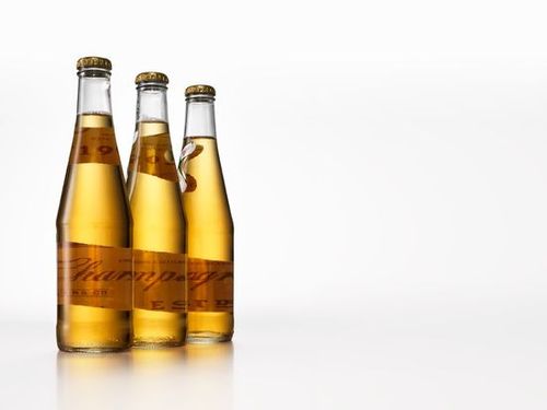
Finally today I stumble upon what looks like a solution to this (sub-conscious) quests of mine. I learnt about Millers High Life Beer and have learnt why it is called as the “Champagne of the beers”. I learnt that it’s packaging has been redesigned. (By Landor) And better still, it comes in clear bottle packaging 🙂

Read the article here.
I read the above article in conjunction with the following extract from wikipedia and that helped me connect some dots.
“Miller High Life—This beer was put on the market in 1903 and is Miller Brewing’s oldest brand. High Life is grouped under the pilsner category of beers and is 4.7% ABV. The prevailing slogan on current packaging is “The Champagne of Beers”, an adaptation of its long standing slogan “The Champagne of Bottle Beers”. Accordingly, this beer is noted for its high level of carbonation, making it a very bubble-filled beverage, like champagne. It was originally available in miniature champagne bottles and was one of the premier high-end beers in the country for many years. Except for a brief period in the 1990s, High Life bottles have always been quite distinctive, as they have a bright gold label and are made of a clear glass that has a tapered neck like a champagne bottle. High Life has brought back its “Girl in the Moon” logo, which features by today’s standards a modestly dressed young lady that, by legend, is company founder Frederick Miller’s granddaughter. The “Girl in the Moon” logo was originally painted in the early 1900’s by an unknown artist and has since been re-painted by Nebraskan artist Mike Hagel, who added his own unique touch to it. High Life beat out 17 other contestants to take home the gold medal in “American-style Lagers” category at the 2002 World Beer Cup. High Life has enjoyed a resurgence recently, using its humorous “Take Back the High Life” campaign—which features a common sense-wielding deliveryman removing beer from non-High Life locations—to position the brand as “a good honest beer at a tasty price.”“
Some snippets of the design:


