Soundscapes And Sonic Tapestries: Part 1/2

See: Visualize :: Hear: (?)

Can you believe that there is officially no word in the English language that can encapsulate this? Doesn’t exactly do justice to our ability to invoke our mind’s ear to identify, create, re-create and remix sounds and thereby trigger emotions, memories and associations within us. No wonder, the aural realm remains an under exploited, and in some cases, under appreciated dimension to inform and enrich our perceptual experience. Take two of our most common habitats:

(1) Our Constructed Spaces (Architecture)  

So far the practice and purpose of architecture was anchored by the ‘eye’ and for the ‘eye’. Ears – apparently – were compelled to take a back seat and thereby had limited influence over design decisions (unless we speak about amphitheaters). Result –  offices, schools, homes, malls, restaurants and the list goes on, that are so poorly designed so much so that they actually do us more harm than any possible good! Not entirely convinced? See this TED video by Julian Treasure:

(2) Nature  

There was a time when wild soundscapes were considered just some exotic/charming artifacts of nature. But as it turns out,every habitat is believed to have its own unique sound signature – a sonic tapestry that can potentially convey an incredible amount of information about the present state and the future fate of any given place/habitat.

First a quick dose of general knowledge. A soundscape is made up of three basic sources:

  1. Geophony: these are non-biological sounds that occur in any given habitat, e.g., wind, water, waves etc.
  2. Biophony: these are sounds  generated by organisms in a given habitat at a given time and place.
  3. Anthrophony: these are sounds that we humans generate. e.g., our music, noise from machinery, automobiles etc.

So at any given point in time and place, anything that we hear is composed of these three kinds of sounds, and can be graphically represented in a Spectrogram – a graphic illustration of sound with time represented from left to right and sound frequencies represented from the bottom to the top, lowest to highest.

In an incredibly ‘earopening’ TED talk that is insightful, shocking, profound, inspiring and immensely thought provoking, Bernie Krause – a natural sounds expert –  proves that while a picture may be worth 1,000 words, a soundscape is worth 1,000 pictures. If there is one TED video that you need to see this week, let this one be the one – a must see:

In many ways these two talks could be said to be a call to action for us to resist our ‘natural’ instinct of zoning out most of the sound that reaches our ears and to start appreciating our faculty of hearing for how it can enrich our perceptual experience.

On a related note, let me submit my following hypothesis:

I started off by saying that in the English language we don’t seem to be having a word that can effortlessly fit in the following context

See: Visualize :: Hear: (?)

My guess would be that there might be some language out there (Chinese? Japanese? Korean? etc) that might have just the apt word for it. If so, my hypothesis would be that, such a country/culture must be having sonically richer traditions, must be producing relatively higher number of music prodigies and must be having general public with greater appreciation of sound and our faculty of hearing. And as an extension, I would also risk a bet that people from such a culture would also be adept at living in the now and here and appreciating everything about it.

Does your language have a word for this?

To Be Continued…

(Featured Image, Source)

Block By Block – A Consumption Focused Design Paradigm

It took more than a 100 years for inkjet printers to become commercially viable. The reason?

Severe interdependence of the components and underlying systems. 

For e.g., even with the slightest change in the chemistry of the ink, the composition of the resistors had to be changed, and this potentially impacted the physical layout of the circuits and so on.  The solution for this?  Modularity of design. 

Wikipedia defines modularity as ..

 the degree to which a system’s components may be separated and recombined.

Today most tools, gadgets, processes, systems, structures, designs that we interact with on a daily basis have modularity built from deep within. Right from the nuts and bolts of a system to the way it has possibly been put together on an assembly/production line, modularity is all pervasive.

In fact it is almost accepted wisdom now among designers and manufacturers that the speed at which an innovation can be commercialized is directly proportional to the speed at which the underlying design (of the system) and the process (of the assembly or integration) is standardized and modularized.

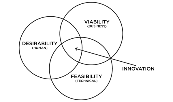
Now consider the above statement in conjunction with the following self explanatory paradigm of Design Thinking evangelized by IDEO, called the Desirability – Viability – Feasibility triad of innovation design. 

IDEO

Based on the above two, my hypothesis is the following:

While modularity in the context of production has almost proven itself to be a pre-requisite for establishing technical feasibility and – in many cases – for driving business viability of a given innovation , modularity in the context of consumption – if done right – can have far reaching implications in seeding the attributes of human desirability for the same.  

Three recent examples that seem to suggest the compelling potential for modularity in the context of consumption as a design paradigm:

(1) Phoneblok: Most of us, by now, would have seen this short video on the idea of building a phone with modular detachable blocks. This  presents the idea of Phonebloks –  hailed as a radical vision of what tech could be. The idea for me, is sheer ingenuity and insight. The possibilities  of such a consumer focused modularity in design seem to be truly empowering and liberating.

(2) NoFlo – A Flow Based Development Environment: The philosophy of Modular Programming is the default standard in most coding systems. But this modularity was mostly – for lack of a better term – limited to the realm of abstraction and ideation, since the corresponding code nevertheless lends itself as ‘strings of spaghetti’ and presents challenges for debugging compilation and logic errors.   With NoFlow as a development environment, modularity can be made more tangible and actionable in order to help inform, structure, design, test, debug and implement a complete software package.  The following is the video put together by the team for their Kickstarter campaign to raise funds (the funding was successful!).

(3) Modularity in content consumption: Unleashing the power of modularity in the domain of content consumption is in fact the name of the emerging game. Platform agnosticism is one of the many ways in which modularity lends itself in the consumption context for services like Amazon, Youtube and now Dropbox.  The latest edition of WIRED in fact features a fantastic story on  Dropbox’s radical plan for a future where “the gadgets are dumb, the features are smart, and data trumps devices.”

Dropbox

So there we have, emerging examples of modularity in the context of consumption (as opposed to only production) and how they promise to pan out in mobile, software design environments and cloud based architectures. Something for the technology powerhouses to sit up and take note? In fact in a recent interview with Forbes Clayton Christensen worries about Apple saying Modularity Always defeats Integration! 

Even in life as usual as we know it, no matter what we do from fixing a meal, concocting a cocktailassembling a piece of furniture, to laying out our Google Newsfeed, there’s always been a sense of joy, an inexplicable sense of desirability that we had for our stuff, for after all, it was our creation.  Step by step. Block by block. Isn’t it?

(Source for the featured image)

Adjacencies and Algorithms

30.56 degrees Celsius.

That’s the temperature at which fungus is normally known to thrive. Now, since fungus is the staple diet for termites, even in the scorching heat of Sub Saharan Africa, they are known to meticulously maintain this constant level of temperature within their mounds.  But how do they pull this off?

The answer for this question has been the inspiration for the design and construction of Zimbabwe’s largest commercial complex – The Eastgate Centre. Designed to be ventilated and cooled by entirely natural means, it was probably the first building in the world to use natural cooling to this level of sophistication.

During a Formula 1 race, a car sends hundreds of millions of data points to its garage for real-time analysis and feedback. So why not use this detailed and rigorous data system elsewhere, like … at children’s hospitals?

These tangents of thought are some of the several examples that stand out for the power of combining seemingly different ideas to  arrive at breakthrough concepts and revolutionary designs.  Frans Johansson calls this The Medici Effect in his insightful book by the same name – a must read for anyone fascinated by the world of creativity, innovation and ideas. This is very similar to the concept of The Adjacent Possible that Steven Johnson speaks about in his book Where Good Ideas Come From.  

Essentially it is about two things:

  1. Identifying seemingly different or intuitively unrelated ideas and
  2. Combining them together in new and unexpected ways to yield  actionable insights or practical – yet unforeseen –  solutions to existing problems.

One related concept of The Adjacent Possible is what could possibly be called as Meaningful Adjacencies.

Two very interesting ways in which the application of this concept has panned out in the recent past. One in the field of stylometry and the other in ‘commemorative design’.

(1) The Algorithm that declared “It’s J.K. Rowling” 

When The Cuckoo’s Calling – a detective story was released earlier this year, the novel has received lavish praise and the writer one Robert Galbraith was marked as someone to watch out for. But, reportedly The Sunday Times believed that Robert Galbraith was just a pen name for an author who could possibly be a bit more familiar. So on July 11, Professor Patrick Juola received an interesting mail from The Sunday Times. The task? To verify that Ms. Rowling was indeed the author of The Cuckoo’s Calling!

So what did Prof Juola – the stylometry expert do do?  He deployed a computer program called the Java Graphical Authorship Attribution Program (JGAAP) that he had designed to recognize writing styles undetectable by human readers.  He loaded the e-version of The Cuckoo’s Calling into JGAAP, along with several other texts, including The Casual Vacancy, J.K.Rowling’s post-Potter novel, set the program running and sat back to watch the fun.

Essentially, the JGAAP algorithm works by comparing the following variables in each of the book within the comparison set:

  • Word-length distribution
  • The use of common words like “the” and “of”
  • Recurring-word pairings and
  • The distribution of “character 4-grams,” or groups of four adjacent characters, words, or parts of words.

While the first two variables are more distribution and frequency related, the last two are adjacency related. Now this was an insight for me-

– that a set of adjacent words / characters / or even part of words can potentially have a unique pattern of their own so much so that they constitute a distinctive signature of their own and can thereby possibly bring out unique attributions to a specific author!

So in just 30 mins, Prof Juola’s JGAAP did confirm J.K.Rowling as the ‘suspected’ author and to his delight the conclusion was later confirmed by Rowling herself!

The interesting question that this now begets is – Should we teach literature students how to analyse texts algorithmically! Well, if an author’s literary signature is hidden deep within the recess of adjacent characters and words and if algorithms can squeeze out meaning from these adjacencies – then, I’d say Why Not?

(2) The ‘Commemorative Calculus’ Of The 9/11 Memorial

Nearly 3,000  men, women, and children were said to have been killed in the attacks of September 11, 2001, and February 26, 1993 on the Twin Towers.  In order to commemorate them, the 9/11 memorial has a very unique feature – the names of every person killed inscribed into bronze parapets surrounding the 9/11 Memorial’s twin pools.

National-9.11-Memorial-4a-Credit-Amy-Dreher

(Image Source)

As Michael Arad – an architect of the memorial puts it “(the idea of having the names of all the 3,000 men, women and childen) allows families’ and friends’ stories to be told.” He says “the river of names, without other identification (like age or title or company affiliation), was meant to convey simultaneously a sense of individual and collective loss.”

But it’s here that it gets interesting. These names on first look, would seem to be randomised in their grouping.

However on deeper inspection it becomes apparent that this grouping has been the result of some truly complex set of algorithms based on the concept of Meaninful Adjacencies – whereby each name has been meticulously mapped to each other on the basis of specifics like location, floor, company of a person and laid out in relation to other people based on relevant relationship contexts .

The result?  An intricate mapping of names that commemorates those laid to rest in a deeply compelling way by reflecting thousands of complex interpersonal relationships among them – and thereby telling a story with a real emotional impact.

193921

(Image, Source)

So there we have it – an analytical process that brings in a new twist to the adjacencies of words inherent in an author’s writings and a design paradigm that is predicated on bringing out narratives based on adjacencies of the underlying elements. 

So the next time when someone tells you that new ideas thrive at the intersection/adjacency of seemingly different concepts, tell them that it can literally be the case.

(Featured Image, Termite Mound in Namibia, Source)

Now In Stock – Packaged Chunks Of Epiphany

You awake suddenly, and find yourself trapped inside a ship. A greenish fog hangs in the air, and the soft rocking back and forth feels as if the ship is breathing.  A low groan echoes in the hull – Looking across the dimly lit room, you see that you are alone. Somehow, you know the ship’s destination is the afterlife, and when it arrives you will die. Can you solve all the mysteries, and escape with your life?

So says the copy of an invitation for one of the most popular and the latest edition of the Real Escape Game (REG) held in Singapore in July 2013.

Escape from the haunted ship

This is how it works: buy an entry ticket for around 25 bucks, bring along your brains, wits and teammates, get locked up in a room, and find your way out of that by solving numerous puzzles and riddles. The deal: well nothing! After all, everyone is let out of the room anyway.

But this is where it gets interesting. While there are several editions of REGs around the world and while they can possibly differ from each other in terms of nuances like game play, level of challenges, themes etc, most of them – if not all – have 2 things in common:

  1. Thousands of people pay over 25$ to spend a panicked, claustrophobic hour trying to win a game for which there is no prize!
  2. These sessions typically tend to be sold out!!

And this is just one among the many franchises/editions of a business idea that is steadily gaining steam with increasing levels of popularity around the world. While a Japanese company called SCRAP Entertainmen started the concept of the ‘Real Escape Game’ there are many other parallel off shoots around the world that operate along similar lines like the ones listed below: (list source)

  • Parapark with more than 30 rooms in Budapest and many more in Hungary
  • Hinthunt with rooms in Hungary and UK
  • AdventureRooms – a Swiss company, with offerings in Bern
  • FreeingHK in Hong Kong
  • Escape Hunt that opened its first room in Bangkok in July 2013
  • Real Escape Games (Scrap Entertainment) now have a franchise in San Francisco and have become a huge hit
  • and HintQuest – a very recognized live escape game in Munich, Germany

On first look the concept of Real Escape Games (REGs or the likes of it) might sound similar to that of The Crystal Maze – the 90s Channnel 4 smash hit that was said to  have attracted between 4 and 6 million viewers at its height (source). But on second look it becomes apparent that with the REGs of the world today we are at the cusp of a different ball game all together: from the product package, proposition, consumer base, distribution model, pricing, to the end consumer pay off – that spans emotional, mental, intellectual and social realms.

This can easily be one of the latest and arguably the most interesting examples of how the playing field is rife with rich possibilities at the top level of The Maslow’s Hierarchy Of Needs (Self Actualization).  So now we have dedicated puzzle masters that spend months constructing a carefully orchestrated series of aha moments, little sub mysteries that let players come so close to solving the mystery and get commensurate highs of making discoveries – large and small, and professional game designers that are adept at staging REGs (or the likes of it) at venues as large as the Tokyo Dome to those as small as a locked room with space for just 10 players. 

Introducing the newest offering at your local supermarket aisle –  chunks of epiphany –  sealed in an air tight pack (pun intended) – now available in a handy 1 hour time capsule best enjoyed with a bunch of friends.

For a ‘virtual’ taste of such games, try your hand at The Google Puzzle (the result of a collaboration between Google Japan and Scrap Entertainment). And yes do drop me a note if you manage to crack the 5th stage in the puzzle 🙂

(H/T to Valentin Valov for suggesting HintQuest)

The Wabi Sabi Edge

The Ise Grand Shrine – a Shinto Shrine – in Ise, Mie prefecture in Japan has been preserved exactly like it was around 2,000 years ago. Despite such a rich legacy, the UNESCO has refused to list the shrine in its list of historic places.

Why?

Shinto Shrine

(Shinto priests walking beside the Ise Grand Shrine, Japan. Source)

This is because the shrine is not built of a ‘permanent structure’. The ISe Grand Shrine is built of wood and hence it  gradually loses its structural integrity over years. So the Shinto priests have a solution;  every 20 years they tear down the structure and rebuild another – in an adjacent plot –  in exactly the same specifications as the original using the wood from the same forest that the original structure was built from. Result: the shrine  is  forever new,  ancient and original! The present structure, dating from 1993, is the 61st iteration to date and is scheduled for rebuilding in 2013!

A centuries old Shinto belief of death and renewal of nature and the transience  of all things called Wabi- Sabi underscores the philosophical and artistic significance of this shrine. To quote the wiki  page ….

Wabi Sabi nurtures all that is authentic by acknowledging three simple realities: nothing lasts, nothing is finished, and nothing is perfect.

Burning Man

Further to the west, in northern Nevada US is the Black Rock Desert –  an open swathe of desert land where a week long annual cultural festival called Burning Man is held every August/September. This iconic event is described as an annual experiment in community, art, radical self-expression, and radical self-reliance – a week long celebration of extreme creativity, art, spirituality and innovation. Often compared to TED for its potential to provoke, inspire, connect, indulge or just ‘let be’, Burning Man regularly attracts stalwarts like the Google founders, Eric Schmidt, Chip Conley among many many others. But what makes Burning Man stand out as an exceptional event is the fact that it is transient by nature. The whole venue, the structures and the shelters for the event are practically built from scratch and again torn to dust without leaving a trace at the end of the week!

See below the time lapse video of 2011 Burning Man to appreciate the ‘dust to dust’ cycle typical of the Burning Man.

As Business Strategy

Transience as a method, an approach or a strategy is not just  an expressionist arts style or some exotic charm of a shrine.  It also has far reaching implications on contemporary business strategy. The June 2013 edition of Harvard Business Review features an interesting article by Rita Gunther McGrath on what she calls as Transient Advantage. She argues that  in a world where competitive advantage often evaporates in less than a year, companies can’t afford to spend months at a time crafting a single long-term strategy. She introduces what she calls as The Wave of Transient Advantage and explains its ‘curve’ (below). Companies possessing this edge constantly start new strategic initiatives, build, exploit, re configure and if need be even actively disengage from an initiative as a means to reprioritise, reinvent and renew their approach to growth.

Transient Advantage

(Wave of Transient Advantage, Source)

She posits that the thinking in this field “has reached an inflection point” leading to an acknowledgment from a multitude of strategy practitioners that “Sustainable competitive advantage is now the exception, not the rule. Transient advantage is the new normal.”

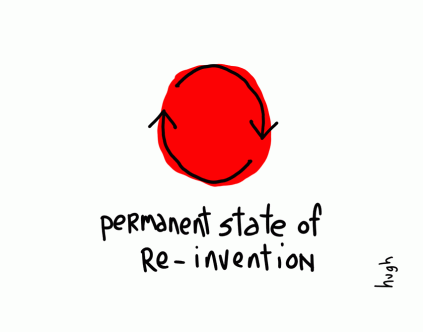
The latest post in the Gaping Void newsletter by Hugh Mac­Leod pays an artistic tribute to this concept through this delightful piece of ‘office art’.

permanent_state

(You must subscribe to his newsletter, sure to make your day!)

Essentially from which ever perspective you look at it – artistic, personal, emotional, professional or even strategic, the ability to accept transience as the new normal, the ability to let go of the status quo to rethink, re-invent and renew our  approach forms the bedrock of the new competitive edge – The Wabi Sabi Edge.

The Last Of Us And The McWrap

What is common between the latest PS3 game The Last Of Us and the recent McDonald’s addition to its menu The Premium McWraps?

Stealth.

Let’s first take The Last Of Us

If you still haven’t heard of this survival horror video game, you must be hiding under an abandoned bunker in a post apocalyptic zombie infested world.

The-Last-of-Us-key-art

At least that’s how you might feel once the brilliance of this creation hits you. Declared as a masterpiece, for its choice-enabling gameplay, realistic action, emotional depth in the plot, sound design, and environments, The Last Of Us has been the biggest video game launch of 2013 so far, selling over 1.3 million units in its first week after its worldwide release on June 14, 2013  (source)

A key innovation that underpins the genius of this game’s design is its AI system called as Balance Of Power. This enables realistic combat situations and enriches stealth attack tactics to what it calls as Dynamic Stealth.

Dynamic Stealth: While Stealth is not particularly new as a gameplay tactic, the genius of Dynamic Stealth lies in how it makes the player own the consequences of his actions in real time. For example:

  • If you’re infiltrating a secured building and see two guards at the entrance,  you create a distraction, split them up, and take out one of them when he’s off in the shadows. In other stealth games, the second guard would stoically continue to be on the watch as if nothing had happened.  But with Dynamic Stealth he starts to wonder where his buddy went, gets panicky and might even call for extra cover and back up.
  • the game doesn’t pause when the player  is accessing their inventory and assembling weaponry (loading guns, crafting a molotov cocktail etc), so the player’s stealth tactics are governed by real life like rules of space and time.

Instead of  just bombarding the player with a constant stream of actions resulting in cookie clutter shoot and swear sequences, the Dynamic Stealth system lets the user set the pace of his own survival experience and make him fully own the consequences of his decisions and actions. And that for me is the big insight in interaction or use case design from The Last of Us: 

If the system is designed in such a way that it allows the user to own the consequences of his decisions and actions, they’d willingly embrace all its resulting outcomes – both positives and negatives.

Now let’s move over to The Premium McWrap

mcdonalds_mcwrap

Launched on April 1 2013 after 2 years of R&D and a blockbuster like pre-launch fan fare, the marketing mix of this newest addition to the McDonald’s menu can be summarized  as follows: (Source)

Product: The McWrap is a 10-inch, white-flour tortilla wrapped around 3 ounces of chicken (grilled or crispy), lettuce, spring greens, sliced cucumbers, tomatoes, and cheddar jack cheese topped with ranch, sweet chili, or creamy garlic dressing.

Proposition: “The Subway Buster”

Target Group: Millenials, 18-32, who are looking for healthier and tastier alternatives to their fast food.

Packaging:  The PKG design requires the customers to tear off the top half of the container. “The packaging was a very big, big idea,” says Kasey Short, director of menu innovation in the U.S. “When you unzip the product, there was more excitement.” It’s also designed to fit easily in a standard cup holder; 65% of McDonald’s customers order at the drive-through.

Price:  At $3.99, it’s four times the cost of a McChicken.

Service: Assembled in 60 seconds, the lettuce and chicken peek out of the top, suggesting farm-to-table freshness.

Ingredients:  After lot of R&D, testing and negotiations with the suppliers, McDonald’s managed to add one new ingredient to the McDonald’s arsenal: the English cucumber. That might not seem like a big change, but when the chain added sliced apples to its menu, it immediately became one of the largest buyers of apples in the country! So this addition has a huge implication on the supply chain of cucumbers around the world.

As an analyst sums it up “It’s the best piece of total marketing we’ve seen out of them in a long time. It’s convenient, healthy, fresh, good-tasting, and filling”.  While reading about these specific elements of the mix was definitely interesting, the big reveal for me came towards the end in this Businessweek article:

… the McWrap serves another stealth purpose…..customers may come into restaurants with healthy intentions but fall short of their aspirations…. With salads and now the McWrap on the menu, customers may forgive themselves a little more for showing up at McDonald’s. And if they skip the wrap at the final moment and get a Big Mac and fries instead they don’t blame the restaurant.”

Now that’s a tremendous AHA moment for me in stealth marketing – almost like a Dynamic Stealth tactic in gaming.

As they say – It’s a reality of the fast-food business that what can be ordered in a few words, served up in seconds, and consumed in minutes is often the product of years of research and testing. Because the battlefield here is not in the restaurants, it’s not in the ingredients, it’s not in the fields where the ingredients are grow, it is after all in our minds. 

No wonder then you have battlefield tactics like stealth meant to lure you not just into making a decision but also into owning it.  How’s that for some food for thought?

Gyotaku And The Trailer

What is common between Gyotaku and Movie Trailers?

Gyotaku Trailer

1. Both are traditionally forms of ‘advertisements’ of another art form

2. And both have evolved into specialized art forms unto themselves

Let’s start with Gyotaku

Gyotaku is the traditional Japanese art of fish printing dating back to the mid 1800s. Before you read any further, you might want to begin with this fabulous TEDEd video to get a quick introduction on this fascinating art form.

As you can see, the purpose of the early Gyotaku print was to serve as an advertisement and proof of the fisherman’s skills as reflected by the quality of his catch.  The emphasis was thereby to capture just the basic proof of the size and species of the fisherman’s “trophy fish” and to record this permanently.

Now Gyotaku has become so popular around the world that it has dedicated competitions, hobby clubs, instruction classes, museums, books, textile prints etc;  and has currently evolved to the point where the actual activity of fishing is almost besides the point.  The craft has now become a unique representational art of Japanese Culture that honors realism and story telling.

The insight for me here is that,

A good piece of Gyotaku art captures a moment in the ocean and not just a piece of dead fish.

Gyotaku2

In other words each piece of Gyotaku tells a story where:

1. The narrative often comes from what you don’t see – the negative space: A good Gyotaku composition is known to make use of the negative space within the frame and brings to life the concepts like idea, flow and freedom of movement that come with the ocean.

2. Our minds are lead into the frame and then set free : A good Gyotaku ‘hand holds’ our mind by gently leading us into the exquisite form and finish of the fish. But a great Gyotaku takes it a step further by then carefully setting our imagination ‘free’ as it allows ample space for the mind to take the fish on its journey.

Moving on to Movie Trailers

Just like Gyotaku, the movie trailer has come a long way from being a plain advertisement (of a full length movie) to becoming a genre unto itself. Today it is a thriving industry that is almost as popular as that of the movies they’re teasing, with legions of fans following, dissecting, analyzing, reviewing and rating them on a regular basis even as they are feted out at forums like The Key Art Awards and The Golden Trailer Awards (the Oscars of movie trailers).

From being just a linear montage of title cards, voice-over, a few key scenes followed by a cast run-through, movie trailers today are part art, part marketing wizardry and part awesome creativity. Result: They can tease, titillate, shock, seduce, awe, thrill or even hypnotise us via subliminal messages, imagery, and music and lull us into the cinema for the actual full length fare.

The latest edition of the WIRED magazine has an insightful feature on the Art Of The Movie Trailer. Two insights that emerge from the construct of great trailers:

1.The narrative of the trailers doesn’t necessarily come from what you see, it comes from what you hear (the negative space of trailers = music): Trailers are all about rhythm, pacing, and feeling. That’s why music plays a vital role as a key narrative device and can more often than not make or break a trailer. Mark Woollen, the man behind the trailer for The Social Network shares a secret of how he came up with its music for an evocative narrative ..

I’d had “Creep” on my iTunes for five or six years kind of kicking around before the Social Network trailer…And then when this project came along, I started to consider that song. There are a couple of qualities to it that I thought could do a lot for the trailer. It was a fantastic piece of music—the build, the message, the flavor.

And the rest as they say is history – with the trailer going on to win both The Key Art Awards and The Golden Trailer Awards for 2011 for its outstanding achievement in advertising movies. See this trailer here:

2. Our minds are lead into the plot and then condemned to a free fall: A good trailer gently leads our minds and imaginations into the centre of the plot or the tension that is eventually created in the act 2 and then sets it on a free fall. E.g., Alfred Hitchcock’s trailer for Psycho (though being a tad bit long at ~ 6 mins) very gently teases us bit by bit till almost the end before throwing us off the cliff! See the iconic trailer here: (don’t miss the last 2.5 mins at least)

The trailer for Alien is another master piece that stands out for a similar reason.

So there you have it – Gyotaku and Movie Trailers:  two art forms that have begun to become bigger than the art forms that these are based upon, two powerful examples where creativity thrives despite the underlying constraints ; or probably examples where creativity thrives due to its underlying constraints.

Toothbrush, Vitamins And Pain Killers

Starting from 2001, Google has made 127 mergers and acquisitions till date.

Which makes it nearly 6 acquisitions for every 7 months over the last 12.5 years. It is expected now that this M&A rate is further going to accelerate with Google – for the first time –  considering forging alliances with private-equity firms to help it structure deals.

During the recent Bloomberg Next Big Thing Summit, speaking about how Google evaluates a potential M&A target, Don Harrison –  Google’s mergers and acquisitions chief said

“We apply something called the toothbrush test, which is we ask ourselves, ‘Is this something people use once or twice a day and does it solve a problem?’”

Thanks to its immensely sticky nature (and aided by the current  rock star status of Google), this toothbrush analogy has seemed to have gained an instant global popularity and is shooting to newer heights in terms of recorded “interest over time” as we speak. I did a quick sense check myself  by entering  “the toothbrush test”  as the search term and this is what I see on Google Trends:

ToothBrush Test

(Click to see larger image)

While this sounded to me like a fascinating analogy that brings a powerful idea to life, the concept of The Toothbrush Test somehow didn’t quite fit in within the schema of what I had in my mind regarding so many things that Google does today.  For e.g., I began to wonder –  Is Google+ a ‘toothbrush’? i.e., does it solve a problem and is it something that people use once of twice a day? Or is Sparrow (acquired by Google in July ’12) a ‘toothbrush’?

May be it  is. Or  may be it isn’t. But probably for me there’s a missing piece to the jigsaw here.

That’s when I hit upon this very useful question that VCs are known to ask entrepreneurs. (source)

Is your product like candy, vitamins, or pain-killers for your market?

2806-940x626

(Image Source)

To elaborate:

  • Candy = a product that is a nice-to-have, that people enjoy and can be wildly successful if it becomes a fad (like Beanie Babies)
  • Vitamins = a product that is a nice-to-have and serves an emotional need, used to augment and improve things but sometimes harder to quantify and has an unknown market
  • Pain Killers = a product that is a need-to-have and serves an obvious need, or solves critical problems that need to be alleviated and has a quantifiable market and thereby immediately monetizable

While it might probably take a ‘marketing master stroke on steroids’ to sustain a successful company based on ‘candies’ alone, many product ideas can probably be placed in the continuum between ‘vitamins’ and ‘pain killers’.

Vitamin Painkiller

(Image Source)

In this context, as someone who blogs at the intersection of  psychology, technology, and business –  Nir Eyal at the Stanford Graduate School of Business posits that successful companies are known to be so good at embedding/implementing hooks in their products that they travel along the above continuum from being vitamins for ‘pleasure seeking’ consumers to becoming pain killers for their pain alleviation as they cement enduring habits in them.

In other words, a ‘cleverly designed vitamin product experience’ hooks the consumers and becomes so important in their lives that – because it becomes a habit, it becomes a pain relieving product.  Flip through the following presentation by Nir to get a more comprehensive view on his theory of  Hooked – The Psychology Of How Products Engage Us.

That’s when the insight stuck me:
For any well designed product/ experience the question is not IF it passes The Toothbrush Test.
The question is WHEN.
Don’t believe me? Ask the largest cigarette makers in the world who are currently making a gold rush to acquire/ develop e-cigarettes and they will tell you.

On Looking Back To The Future

Have you ever thought about looking back to the future?

This is not about the acclaimed 1985 Academy Award winning American Science Fiction Comedy directed by Robert Zemeckis and produced by Steven Spielberg – which by the way is a must see.  The question is whether you have ever thought about the notion of ‘looking into the future’ as akin to that of looking back.

Let’s talk about the Aymaras

Apparently this tribe of indigenous people in South America called the Aymara have an unusual way of referring to the future – when they talk about the past, they point to the space in front of them and when they talk about the future, they point behind them. Wonder why?

As Austin Kleon succinctly puts it …

The reason they point ahead of them when talking about the past is because the past is known to them — the past has happened, therefore it’s in front of them, where they can see it.The future, on the other hand, is unknown, it hasn’t happened yet, so it’s behind them, where they can’t see it.

A very thought provoking concept if one begins to think about it.

After embarking upon a mini thought + search experiment, I have come to appreciate that looking back to the future can be more than just a conceptual metaphor of the Aymara’s. My three riffs on this concept:

1. First a relatively straight forward one –  in a very practical sense, the notion of looking back into the future can be said to be closely related to the concept of Retro Innovation. Think about it. Isn’t it? More about it here.

2. We have heard about Chris Anderson‘s concept of The Long Tail. Of comparable significance is Bill Buxton‘s concept of The Long Nose of Innovation – a must read for anyone fascinated by the world of Innovation and Design. Flip through the following slide deck to get a gist of what he meant by this in just under 50 – 60s.

He makes a strong case that – any technology that is going to have significant impact over the next 10 years is already at least 10 years old. And thereby says The Future Is History and goes to conclude with the advice –  “Use history to evaluate new concepts and ideas instead of only gut feel”.
So may be next time we ideate within a category/segment for innovation ideas, it might be worthwhile to look for trends that go back to nearly 10 years from now for a change.

3. Lastly, in many ways the concept of looking back to the future could also be related to the idea of photography as time travel.

Irina Werning was a virtually unknown photographer till she embarked on a project called Back To The Future in 2010 (and subsequently in 2011) and the rest as they say is history, with her photographs going hugely viral – even becoming Internet Memes and her project becoming a big sensation. Read more about Irina’s obsession as a photographer to take her subjects back and forth in time through her unique project here. Enjoy the behind the scenes video of the project here.

I find the idea of looking back to the future hugely fascinating and as Austin Kleon says, the Aymara’s way of referring to the future continues to blow my mind no matter how long I think about it.

And you thought History and Innovation make strange bedfellows?

Icons – The Visual Metaphors Of Our Culture

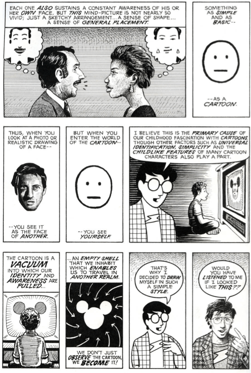
Ever wondered what could be the primary cause of our childhood fascination with cartoons? I did. Tons of times in fact. With little success very often.  Thankfully for me Scott McCloud in Understanding Comics gives a clear and a straightforward explanation for that.

Understanding Comics Pg 36

(Scott McCloud, Understanding Comics, Pg 36)

Essentially, he posits,  the mental picture that we we have of ourselves is simple and basic . Therefore, we are able to project ourselves into the ‘simple character’ but not the ‘complex one’.

The obvious lesson here that is applicable to advertising could be – if you want your audience to feel like they are the main character, make sure the character isn’t overly elaborate and detailed.

The classic iPod ads of 2001  have smartly taken this theory a step further by featuring just a set of male and female silhouettes.

iPod

(Image Source)

This abstraction of pictures from reality to icons is thus a powerful mode of expression that comics (and comic artists) have deliberately and meaningfully perfected over the years.  For, after all, (visually) quoting Scott..

Understanding Comics Pg 59

(Scott McCloud, Understanding Comics, Pg 59)

“There is no life in an icon except that which you give to it.”

While this insight forms the cornerstone of what constitutes the vocabulary of comics, it lends a very powerful commentary  that is relevant for our practical lives too. Let me explain.

Just like we are said to be exposed to thousands of marketing/ brand impressions per day, I’d wager that we are also exposed to as many (if not more) iconic impressions each day. While a brand’s logo – by definition – could also be called as an ‘icon’, my focus here is more on icons that constitute the typical signage/symbols that we are used to seeing all around us each day – e.g.,  traffic signage, safety signage, industrial signage, traveler signage etc.

dot_pictograms_full

(DOT Pictograms)

Since these signage icons have been around for years, most of us grow up intuitively accepting them as part of our unspoken language. Thereby they practically end up becoming the visual metaphors of our culture.

Armed with this insight – The Accessible Icon Project was born with a goal to  show a more humanized depiction of the differently abled in the International Symbol of Access.

Symbol of Access

I’ll let you read a comprehensive account of the project here, but the highlight of this guerrilla art project was that it succeeded in reorienting the visual focus of the symbol from the chair to the person, while replacing the rigid, static representation with something more dynamic and active.

Result: The idea has been gaining tremendous momentum around globally as we speak, with NYC becoming one of the first cities in the world to formalize and adopt this new symbol with many disability organizations around the world vehemently following suit.

Metaphors are said to have the power of influencing our ideas, challenging assumptions and creating new world views. And if a picture is worth a thousand words, the power of a visual metaphor like this new ‘access icon’ above can be said to be amplified a thousand fold in shaping our collective biases, informing our cultural opinions and influencing our societal attitudes as humanity.

That’s when things get interesting. Symbolically and literally.