Toothbrush, Vitamins And Pain Killers

Starting from 2001, Google has made 127 mergers and acquisitions till date.

Which makes it nearly 6 acquisitions for every 7 months over the last 12.5 years. It is expected now that this M&A rate is further going to accelerate with Google – for the first time –  considering forging alliances with private-equity firms to help it structure deals.

During the recent Bloomberg Next Big Thing Summit, speaking about how Google evaluates a potential M&A target, Don Harrison –  Google’s mergers and acquisitions chief said

“We apply something called the toothbrush test, which is we ask ourselves, ‘Is this something people use once or twice a day and does it solve a problem?’”

Thanks to its immensely sticky nature (and aided by the current  rock star status of Google), this toothbrush analogy has seemed to have gained an instant global popularity and is shooting to newer heights in terms of recorded “interest over time” as we speak. I did a quick sense check myself  by entering  “the toothbrush test”  as the search term and this is what I see on Google Trends:

ToothBrush Test

(Click to see larger image)

While this sounded to me like a fascinating analogy that brings a powerful idea to life, the concept of The Toothbrush Test somehow didn’t quite fit in within the schema of what I had in my mind regarding so many things that Google does today.  For e.g., I began to wonder –  Is Google+ a ‘toothbrush’? i.e., does it solve a problem and is it something that people use once of twice a day? Or is Sparrow (acquired by Google in July ’12) a ‘toothbrush’?

May be it  is. Or  may be it isn’t. But probably for me there’s a missing piece to the jigsaw here.

That’s when I hit upon this very useful question that VCs are known to ask entrepreneurs. (source)

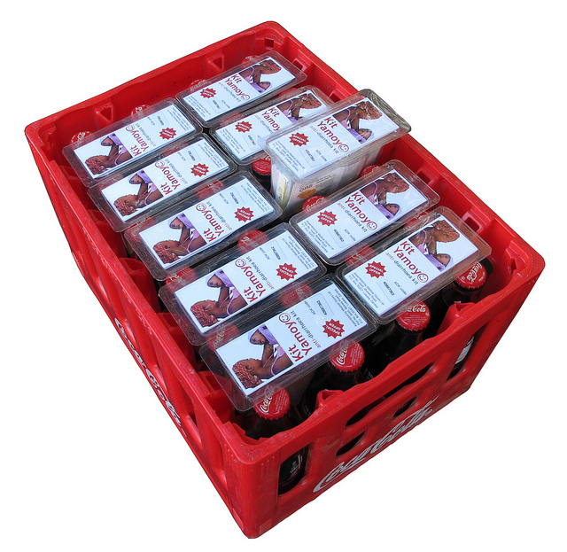
Is your product like candy, vitamins, or pain-killers for your market?

2806-940x626

(Image Source)

To elaborate:

  • Candy = a product that is a nice-to-have, that people enjoy and can be wildly successful if it becomes a fad (like Beanie Babies)
  • Vitamins = a product that is a nice-to-have and serves an emotional need, used to augment and improve things but sometimes harder to quantify and has an unknown market
  • Pain Killers = a product that is a need-to-have and serves an obvious need, or solves critical problems that need to be alleviated and has a quantifiable market and thereby immediately monetizable

While it might probably take a ‘marketing master stroke on steroids’ to sustain a successful company based on ‘candies’ alone, many product ideas can probably be placed in the continuum between ‘vitamins’ and ‘pain killers’.
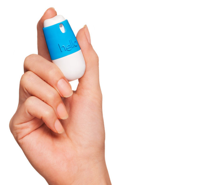
Vitamin Painkiller

(Image Source)

In this context, as someone who blogs at the intersection of  psychology, technology, and business –  Nir Eyal at the Stanford Graduate School of Business posits that successful companies are known to be so good at embedding/implementing hooks in their products that they travel along the above continuum from being vitamins for ‘pleasure seeking’ consumers to becoming pain killers for their pain alleviation as they cement enduring habits in them.

In other words, a ‘cleverly designed vitamin product experience’ hooks the consumers and becomes so important in their lives that – because it becomes a habit, it becomes a pain relieving product.  Flip through the following presentation by Nir to get a more comprehensive view on his theory of  Hooked – The Psychology Of How Products Engage Us.

That’s when the insight stuck me:
For any well designed product/ experience the question is not IF it passes The Toothbrush Test.
The question is WHEN.
Don’t believe me? Ask the largest cigarette makers in the world who are currently making a gold rush to acquire/ develop e-cigarettes and they will tell you.

On Looking Back To The Future

Have you ever thought about looking back to the future?

This is not about the acclaimed 1985 Academy Award winning American Science Fiction Comedy directed by Robert Zemeckis and produced by Steven Spielberg – which by the way is a must see.  The question is whether you have ever thought about the notion of ‘looking into the future’ as akin to that of looking back.

Let’s talk about the Aymaras

Apparently this tribe of indigenous people in South America called the Aymara have an unusual way of referring to the future – when they talk about the past, they point to the space in front of them and when they talk about the future, they point behind them. Wonder why?

As Austin Kleon succinctly puts it …

The reason they point ahead of them when talking about the past is because the past is known to them — the past has happened, therefore it’s in front of them, where they can see it.The future, on the other hand, is unknown, it hasn’t happened yet, so it’s behind them, where they can’t see it.

A very thought provoking concept if one begins to think about it.

After embarking upon a mini thought + search experiment, I have come to appreciate that looking back to the future can be more than just a conceptual metaphor of the Aymara’s. My three riffs on this concept:

1. First a relatively straight forward one –  in a very practical sense, the notion of looking back into the future can be said to be closely related to the concept of Retro Innovation. Think about it. Isn’t it? More about it here.

2. We have heard about Chris Anderson‘s concept of The Long Tail. Of comparable significance is Bill Buxton‘s concept of The Long Nose of Innovation – a must read for anyone fascinated by the world of Innovation and Design. Flip through the following slide deck to get a gist of what he meant by this in just under 50 – 60s.

He makes a strong case that – any technology that is going to have significant impact over the next 10 years is already at least 10 years old. And thereby says The Future Is History and goes to conclude with the advice –  “Use history to evaluate new concepts and ideas instead of only gut feel”.
So may be next time we ideate within a category/segment for innovation ideas, it might be worthwhile to look for trends that go back to nearly 10 years from now for a change.

3. Lastly, in many ways the concept of looking back to the future could also be related to the idea of photography as time travel.

Irina Werning was a virtually unknown photographer till she embarked on a project called Back To The Future in 2010 (and subsequently in 2011) and the rest as they say is history, with her photographs going hugely viral – even becoming Internet Memes and her project becoming a big sensation. Read more about Irina’s obsession as a photographer to take her subjects back and forth in time through her unique project here. Enjoy the behind the scenes video of the project here.

I find the idea of looking back to the future hugely fascinating and as Austin Kleon says, the Aymara’s way of referring to the future continues to blow my mind no matter how long I think about it.

And you thought History and Innovation make strange bedfellows?

Icons – The Visual Metaphors Of Our Culture

Ever wondered what could be the primary cause of our childhood fascination with cartoons? I did. Tons of times in fact. With little success very often.  Thankfully for me Scott McCloud in Understanding Comics gives a clear and a straightforward explanation for that.

Understanding Comics Pg 36

(Scott McCloud, Understanding Comics, Pg 36)

Essentially, he posits,  the mental picture that we we have of ourselves is simple and basic . Therefore, we are able to project ourselves into the ‘simple character’ but not the ‘complex one’.

The obvious lesson here that is applicable to advertising could be – if you want your audience to feel like they are the main character, make sure the character isn’t overly elaborate and detailed.

The classic iPod ads of 2001  have smartly taken this theory a step further by featuring just a set of male and female silhouettes.

iPod

(Image Source)

This abstraction of pictures from reality to icons is thus a powerful mode of expression that comics (and comic artists) have deliberately and meaningfully perfected over the years.  For, after all, (visually) quoting Scott..

Understanding Comics Pg 59

(Scott McCloud, Understanding Comics, Pg 59)

“There is no life in an icon except that which you give to it.”

While this insight forms the cornerstone of what constitutes the vocabulary of comics, it lends a very powerful commentary  that is relevant for our practical lives too. Let me explain.

Just like we are said to be exposed to thousands of marketing/ brand impressions per day, I’d wager that we are also exposed to as many (if not more) iconic impressions each day. While a brand’s logo – by definition – could also be called as an ‘icon’, my focus here is more on icons that constitute the typical signage/symbols that we are used to seeing all around us each day – e.g.,  traffic signage, safety signage, industrial signage, traveler signage etc.

dot_pictograms_full

(DOT Pictograms)

Since these signage icons have been around for years, most of us grow up intuitively accepting them as part of our unspoken language. Thereby they practically end up becoming the visual metaphors of our culture.

Armed with this insight – The Accessible Icon Project was born with a goal to  show a more humanized depiction of the differently abled in the International Symbol of Access.

Symbol of Access

I’ll let you read a comprehensive account of the project here, but the highlight of this guerrilla art project was that it succeeded in reorienting the visual focus of the symbol from the chair to the person, while replacing the rigid, static representation with something more dynamic and active.

Result: The idea has been gaining tremendous momentum around globally as we speak, with NYC becoming one of the first cities in the world to formalize and adopt this new symbol with many disability organizations around the world vehemently following suit.

Metaphors are said to have the power of influencing our ideas, challenging assumptions and creating new world views. And if a picture is worth a thousand words, the power of a visual metaphor like this new ‘access icon’ above can be said to be amplified a thousand fold in shaping our collective biases, informing our cultural opinions and influencing our societal attitudes as humanity.

That’s when things get interesting. Symbolically and literally.

Blood In The Gutter – On Smart Narratives

Cleverly disguised as an easy to read comic book, Understanding Comics is a masterpiece from Scott McCloud on what makes comics as a medium – tik. Called as “…one of the most insightful books about designing graphic user interfaces ever written..” by Andy Hertzfeld, the co-creator of the Mac, Understanding Comics bares fascinating insights on time, space, art and the cosmos. A must read for anyone with a curious mind and a willingness to have some fun along the way. Go get yourself a copy if you haven’t yet and it might as well turn out to the best gift you’d have given yourself in a long time.

Blood In The Gutter is the name of my favorite chapter from the book where Scott explains what constitutes the magic and the mystery of comics through a concept called ‘Closure’. Following are some panels from the chapter that explain this concept in lucid detail:

Blog UC 1

Blog UC 2

Blog UC 3

(Scott McCloud (1993), “Understanding Comics”, p. 66, 68, 63)

It is closure that makes Comics an immersive medium that they are. For e.g., unlike in say radio and film, the audience for comics are compelled to participate more because they are required to perceive the gaps between panels and fill in the missing content themselves. No wonder then, artists from different media (Literature, Photography, Film etc) have experimented and adopted the techniques of ‘closure’ as a compelling narrative style in their own works. Three examples where this technique of closure has been adopted in 3 different media: literature, photography and film below:

Closure in Literature: One Day

One Day is a novel by David Nicholls published in 2009. While it is essentially a ‘When Harry Met Sally‘ kind of genre, the unique feature of the book is its narrative. Each chapter covers the lives of the protagonists on exactly the same day (15 July) every year for twenty years.

One Day Movie_book

This literary technique of ‘closure’ as adopted by David Nicholls in One Day had its expected results with the book being praised as a ‘persuasive’, ‘ fast’, ‘absorbing’ and ‘smart’ and went on to be named 2010 Galaxy Book of the Year. Nicholls adapted his book into a screenplay; the feature film, also titled One Day, was released in August 2011. 

As with comics, closure –  when executed well in any media – facilitates smooth and seamless transitions in time and space and establishes a tightly symbiotic relationship between the reader’s imagination and the narrative.

Closure in Photography: The Whale Hunt

The Whale Hunt is a story telling experiment by Jonathan Harris who spent nine days living with a family of Inupiat Eskimos in Barrow, Alaska, the northernmost settlement in the United States. He documented their traditional whale hunt with a plodding sequence of 3,214 photographs, taken at five-minute intervals for seven days, and at even higher frequencies in moments of high adrenaline.  He then developed a framework for experiencing this story, allowing the viewer to rearrange the photographic elements of the story to extract multiple sub-stories focused around different people, places, topics, and other variables. (Source)

Go to the WhaleHunt page and experience the story unfold along different dimensions and see the cadence of closure engage your curiosity, senses and imagination.

The Whale Hunt

Closure in Film: I Love Your Work

Using a similar narrative style as used in The Whale Hunt, Harris now steps into a bold new territory by holding the spotlight on the world of lesbian porn.

Called as I Love Your Work, the project in Harris’ words “is an interactive documentary about the realities of those who make fantasies.It is a raw and intimate portrait of the everyday lives of nine young women who make lesbian porn.It consists of 2,202 10-second video clips, taken at five-minute intervals over 10 consecutive days.There is an interactive environment for exploring this material (around six hours of footage).”

What’s revealed through this tapestry of video clips separated by 5 min time intervals is an intimate portrait of a community opening up about topics like sex, gender politics, and their daily grind in a way that’s downright real and some times hard hitting.

I Love Your Work

Read this Fast Company article for a more detailed account of the project.

This powerful concept of closure (as it pans out in comics or in experiments like the ones shown above) seems to suggest one thing for certain. In order to engage, captivate and involve our minds and senses, the narrative of a story need not be continuous or seamless.

In fact what could work better in capturing and sustaining our attention spans can just be fragments of the story that are disjointed enough to let our imagination do the ‘connecting-the-dots’ drill and joint enough to let us feel that we are smart indeed!

Speak about the power of ‘smart narratives’.

Our perception of ‘reality’ is an act of faith, based on mere fragments.

Scott McCloud, Understanding Comics (1993)

2 Executions, 5 Years Of Life

5 Years of life. 

Gripping narratives around this same thing but contextualized against two different ends of the ‘consumer & life spectrum’.

Every year about 2 million children under the age of 5 die of infections like diarrhoea and pneumonia. A lot of these deaths can be prevented by the simple act of washing hands with soap. How do you translate this statistic and message into something real, personal and powerful? Lifebuoy‘s brilliant campaign called helpachildreach5 shows how:

(Agency: Lowe Lintas + Partners)

Over 30 percent of today’s children are obese due to physical inactivity. If action isn’t taken, one billion people will be affected less than two decades from now. Nike’s DesignedToMove campaign lands this through a shockingly powerful message.

(Agency: Wieden + Kennedy)

Two iconic brands, selling two completely different kinds of products, targeting two different sets of consumers with two different ‘need stages’ (w.r.t Maslow’s Hierarchy of Needs) but with one unmissable similarity: using ‘5 years of life’ as a frame of reference to pack a powerful punch.

The ‘contrasts’ are as compelling as the ‘similarities’ are in these hard hitting campaigns. Just couldn’t resist from juxtaposing them together for their unmissable power of story telling and sheer brilliance of executions anchored around one central tenet – 5 years of life.

(Source for header picture)

Marketing Nostalgia – Retro Innovation

The first thing you notice about Paperman – an Academy Award nominee for Best Animated Short Film (2012) –  is how different it seems from most modern cartoons.

paperman_title

See the full 6mins version here. It has a distinct retro black & white look not just because it is a story based out of 1940s Manhattan, but also because it clearly feels like as if real people have drawn it  it on a piece of paper as opposed to say – like machines creating it on computers.  The result of Disney’s new in-house software called Meander, it seamlessly  blends the best of ‘hand drawn cartoon kinda’ look with CGI animation in a way the animation industry has never seen before; a game changing animation style so distinctive, innovative and beautiful that WIRED magazine even bills it as the future of animation as a whole!

This can be called out as an example of a unique kind of innovation – new technologies, new products or experiences that are designed around connecting us with the past that is nostalgic. Something that  calls as Retro Innovation.  In this FastCompany article he writes that Retro Innovations roughly fall into three categories:

  1. Innovations that authentically mimic a product or experience of the past to transport the user back into a gone era.
  2. Innovations that use a nostalgic format to meet a new need.
  3. Innovations that use a new format to meet an old need.

Read the whole article here and get a dose of some 10 emerging examples of Retro Innovations. My favorite example is Moleskine, regarding which he says..

The Italian paper notebook maker MDleskine, whose recent IPO was valued at more than $600 million, is a stunning anachronism in a business environment that glorifies tech startups and digital business models.

There are reams of case studies out there that extol the brilliance of Moleskine’s branding. But the best example of its retro innovation is its Moleskine Evernote Smart Notebook that bridges the digital and the analog world.

The key insight on which most successful retro innovations thrive on is brilliantly articulated in this Washington Post article that says..

With the rise in computing power, there has been an acceleration of the rate in which we build on new information technologies, leaving us clutching awkwardly for things we recognize from the past. The pace of change at times seems so overwhelming that it’s no wonder that sometimes we want to be transported back to an earlier era.

Think about this insight and you could possibly have explanations for things like:

  • The emergence of  a ‘modern retro’ trend in the  retro gaming culture.
  • The popularity of Mad Men – the only basic cable series to win Emmy Award for Outstanding Drama Series besides 14 other Emmys and 4 Golden Globes. (source)
  • Brands like Adidas and Puma having a dedicated innovation pipeline specially meant for their retro line ups: Adidas Originals and Puma Classics. In fact by many accounts, Adidas Originals can be considered to be a top of the pyramid brand in terms of their positioning and price points. Besides, the corporate logo of Adidas is distinctive from that of Adidas Originals recognizing the unique appeal and potential of this retro innovation line up from the sports brand.
  • The popularity of classics that are remastered to the new digital world – Jurassic Park 3D anyone?

And  in extreme case it might possibly even explain the rationale behind the existence of Skeuomorps – which might be a different discussion altogether!

While the jury is still out to argue whether the ‘retro trend’ actually cripples innovation, a few venture capitalists do concede that  retro innovation is indeed the most lucrative kind. After all, if innovations are about elevating and enriching human experiences, there would always be a market that values a more traditional notion of this experience and that’s where Retro Innovations kick in.

What other examples of Retro Innovations can you think of?

Sustainability Inc – A Case For Profitability In Charity

Can ‘Marketing’ and thereby a monetary value exchange  have a major role to play in non profits, NGOs and charities?  2 recent examples seem to prove a point.

Once Again

Once Again is a Bangalore based NGO that stands out for two reasons:

1. It accepts donations only in the form of old items. Not money.

2. It uses social media in a unique, relevant and a compelling way to trigger ‘action’ for its cause.

See its case study here:

The brilliance of their social media campaign to rake in donations notwithstanding, the big idea for me here is their fundamental business model: It collects items people don’t use anymore, and instead of donating these to the needy, it sells them at a  price (although minimal) to the underprivileged and uses this money for the empowerment of their community.

The exchange of monetary value in this equation triggers a chain reaction from ‘donation of the giver‘ to the ‘dignity of the receiver‘ while making the whole model sustainable. 

Cola Life

Can a crate of Coke save life? Most Likely – proves ColaLife, whose concept can be explained in 100 words as:

“You can buy a Coca-Cola virtually anywhere in developing countries but in these same places 1 in 9 children die before their 5th birthday from simple, preventable causes like dehydration from diarrhoea.

ColaLife, an independent non-profit, is working with Coca-Cola to open their distribution channels in developing countries to carry ‘social products’ – oral rehydration salts and Zinc supplements – to save children’s lives.”

Get a low down on its business model here.

The big idea for me here is two fold:

1. The design of AidPods: The oral rehydration salts (ORS) in the ColaLife network are distributed in specially designed packs called as AidPods. These are  wedge-shaped containers that are designed to fit within the unused space of a coke crate, i.e., between the necks of the bottles. The design of the AidPod also serves as a contaier for the salts, as a measure for water, as a storage device and as a cup for drinking the ORS. No wonder it won the Product Design of the Year Award for 2013.

Yamoyo Kit

2. The ‘Social Marketing’ Model: At the heart of ColaLife is its ‘Social Marketing Model’ –  in which users value the product more because they pay for it. (ORS products are typically provided free of charge by medical centres in Africa, but are frequently unavailable and misused as there is virtually no monetary exchange taking place at any stage of the value chain). As this FT article says,

“the idea was to copy Coca-Cola’s model, which includes giving financial in­cen­tives along the supply chain from factory to store in order to ensure that people at all stages are rewarded for getting the drink to the customer. By turning a public health commodity – the salt and sugar mix – into a branded consumer product and using marketing to create demand, everyone would benefit, and help make the project sustainable.”

These are just a few of several recent examples out there that have one point to prove:  ‘Marketing’ and thereby a monetary value exchange do and should have a major role to play in non profits, NGOs, humanitarian agencies and charities  in order to remain sustainable and have truly far reaching consequences to the needy.

In his recent TED talk, Dan Palotta  nails it when he says: “Business will move the mass of humanity forward, but will always leave behind that 10% of the most disadvantaged and unlucky- which is why we need philanthropy and nonprofits. But the non profit sector as we know it doesn’t seem to be working.”

And that begets the question – couldn’t the nonprofit sector use the same strategies as the businesses to sustainably serve the needy?   

The Best Topical Ad I’ve Ever Seen

This just nails it. Period!

Guardian-Thatcher

Hats off again Marmite and the team behind it!

(Related post on BranedNoise: Marmite, Mouthwash and Microsoft.)

Growing The Core – Innovating With Constraints

In his latest book called Grow The Core, David Taylor makes a definitive case for companies to bring back  focus to their ‘core’ business and thereby SMS (Sell More Stuff that is already being made). He identifies 3 key drivers for this ‘core growth’:

  • Distinctiveness: Creating a distinctive marketing mix for the core to strengthen and drive brand salience
  • Distribution: Boosting distribution / ‘go to market’ via new and relevant channels
  • Core Range Extension: Launching value added extensions to the core-offering

This ‘back to basics’ exposition has been featured as cover story in the latest edition of Market Leader magazine. Don’t s miss it.

Grown Not Made

Successful companies are seen to be doing this really well. For example Kethcup & Sauces with sales of more than $5 billion globally (FY ’12) constitute the ‘core category’ for Heniz (source). In the 2012 Annual Report William R. Johnson CEO of Heinz proudly states (as if to prove the theoretical underpinnings of ‘Grow The Core’ framework)

Notably, we are proving that Heinz® Ketchup is far from mature after 136 years. In Fiscal 2012, our Global Ketchup business delivered excellent sales growth of 9.7% through innovation, increased distribution and continued expansion in Emerging Markets. 

Implication for Innovation 

The key insight for me here is about the possible implication that this “Focus & Grow The Core” strategy has for ‘innovation’. I guess focusing on the core and driving its growth needs an innovation strategy that is driven by tough and uncompromising choices. Tough choices based on questions like:  “What should we stop doing?”, “What should we further strip away from our new offerings in the pipeline”, etc. This might require what is called as “Innovation with Constraints”.

2 Examples:

1. Lego 

lego-story

A decade ago, Lego‘s balance sheet was in ‘red’ and part of their problem was doing too much – Lego had over diversified by moving into theme parks and clothing. And the once primary coloured bricks now came in a palette of 100 colors.

In 2005, one of the first questions the new CEO Jorgen Vig Knudstorp asked was,“What should we stop doing?” Lego sold the Legoland theme parks and halved the number of colours of bricks they were making. They began asking their designers to innovate with constraints, but to leverage those to become even more creative. Lego returned to profitability that same year. (source)

2. The Economist

With the advent of  iPad (and tablets) while many magazines were quick to launch their iPad Apps that were decidedly rich in their interactive multimedia possibilities (videos, hyperlinks, gifs, dynamic graphs, audio etc),  The Economist tok  a dramatically different approach to appeal to its target group – The Mass Intelligent.

They defined their strategy as Leanback 2.0 and went about designing a magazine App for iPad  that facilitates a real, simple, unfettered ‘Lean Back’ experience for its readers. What does it mean? Andrew Rashbass  –  CEO of The Economist Group says this meant  a conscious editorial decision to strip out even the their basic web innovations from their iPad App (let alone introducing something new).

The Economist(Source)

 Result: A reading experience that is more focused,  uncluttered and distraction free. Go through this insightful presentation by the CEO and read how radical simplicity and ‘finishability’ constitute the cornerstones of their Leanback 2.0 digital strategy.

Do you know of any other examples where a brand chose to focus on its core and made tough choices on its offerings or where a brand innovated within constraints to remain truthful to its core?

‘Method’ to say ‘Hello’ or ‘Help I am Horny’

There have been countless comparisons between how Microsoft ‘speaks’ via design and how Apple does.The best example is this classic  parody on Microsoft designing an iPod packaging.

Obviously neither of this is necessarily an always right/ always wrong approach to designing a pack or a pack  copy: as that depends upon many factors like the brand’s positioning, its design philosophy etc. But the key point here is that whenever any brand comes with a more inclusive/friendly/simple/’or whatever you chose to call it’  kind of positioning and design, it often breaks the ‘category codes’ and thereby creates a distinctive identity and appeal for itself. Sometimes it could even inspire the existing category codes and set new benchmarks (the recent redesign of Microsoft page for its Windows phone is the best example of how dramatically it is shifting away from its ‘past’ towards something that seems to be inspired by the Apple iPhone page)

Examples for this abound – even in categories like OTC Medication, Oral Care and Household Cleaning, where a handful of brands are slowly but certainly inspiring fresh category codes with their new positioning and design philosophy. A quick look at 3 such brands:

Over The Counter Medication:

Stripping away complexities that typical medicinal packaging bombards patients with, help positions itself as a simple medicine for simple health issues based on its “Take Less” philosophy

Take Less

Each package bears a “Help, I…” line of text, such as “Help, I can’t sleep” for a sleep aid, or “Help, I have a headache” for a package of acetaminophen.The simplicity of the packaging matches the promise of the products, which feature no dyes, coatings, and aim to use only the main chemical needed to treat the patient. By the way –  their recent product is called “Help I am Horny” and if you want to use it, you would “need to fill an application to convince them of your sexual superiority”!

Help

Oral Care: 

Imagine:  an army of germs marching  into ‘whatever it is’ only to be attacked by a flood of chemicals leading to a squeaky clean aftermath. Seems familiar? Interestingly, this imagery could be easily applicable to two diametrically opposite categories: Oral Care and (surprise, surprise..) toilet cleansers!

Armed with this insight about the oral care category increasingly assuming the codes of ‘toxic weaponry’ portraying themes of war going on inside your mouth– that need to be eliminated, destroyed & annihilated, Craig Dubitsky created hello– a ‘Seriously Friendly line of Oral Care Products’.

With packaging designed by BMW group’s creative consultancy DesignWorksUSA, hello is an accessible brand for the ‘average consumer’ with the entire mix designed towards one purpose: bring in a fresh breath of friendliness to Oral Care.

HELLO

Household Cleaning

Speak of detergents, dish washing & household cleaning – and it might not always be the  most inspiring conversation and might not always bring a sparkle to the eyes or flushes of joy and excitement.  In 2001, Eric and Adam set out to change this – by creating cleaning products that “people didn’t have to hide under their sinks” and went on to become one of the fastest growing companies in the category. Read their story here.

Method

Method with its stylish, eco-friendly products has not only inspired legions of people with its products (did you hear of MethodLust – an independent blog titled as: “one man’s unsupressed lust for all things method”) it has also inspired people to start companies along similar lines (Craig Dubitsky: founder of hello – profiled above – was a board member for Method).

Speak about enlivening some of the most prosaic categories in consumer marketing.