There have been countless comparisons between how Microsoft ‘speaks’ via design and how Apple does.The best example is this classic parody on Microsoft designing an iPod packaging.
Obviously neither of this is necessarily an always right/ always wrong approach to designing a pack or a pack copy: as that depends upon many factors like the brand’s positioning, its design philosophy etc. But the key point here is that whenever any brand comes with a more inclusive/friendly/simple/’or whatever you chose to call it’ kind of positioning and design, it often breaks the ‘category codes’ and thereby creates a distinctive identity and appeal for itself. Sometimes it could even inspire the existing category codes and set new benchmarks (the recent redesign of Microsoft page for its Windows phone is the best example of how dramatically it is shifting away from its ‘past’ towards something that seems to be inspired by the Apple iPhone page)
Examples for this abound – even in categories like OTC Medication, Oral Care and Household Cleaning, where a handful of brands are slowly but certainly inspiring fresh category codes with their new positioning and design philosophy. A quick look at 3 such brands:
Over The Counter Medication:
Stripping away complexities that typical medicinal packaging bombards patients with, help positions itself as a simple medicine for simple health issues based on its “Take Less” philosophy

Each package bears a “Help, I…” line of text, such as “Help, I can’t sleep” for a sleep aid, or “Help, I have a headache” for a package of acetaminophen.The simplicity of the packaging matches the promise of the products, which feature no dyes, coatings, and aim to use only the main chemical needed to treat the patient. By the way – their recent product is called “Help I am Horny” and if you want to use it, you would “need to fill an application to convince them of your sexual superiority”!

Oral Care:
Imagine: an army of germs marching into ‘whatever it is’ only to be attacked by a flood of chemicals leading to a squeaky clean aftermath. Seems familiar? Interestingly, this imagery could be easily applicable to two diametrically opposite categories: Oral Care and (surprise, surprise..) toilet cleansers!
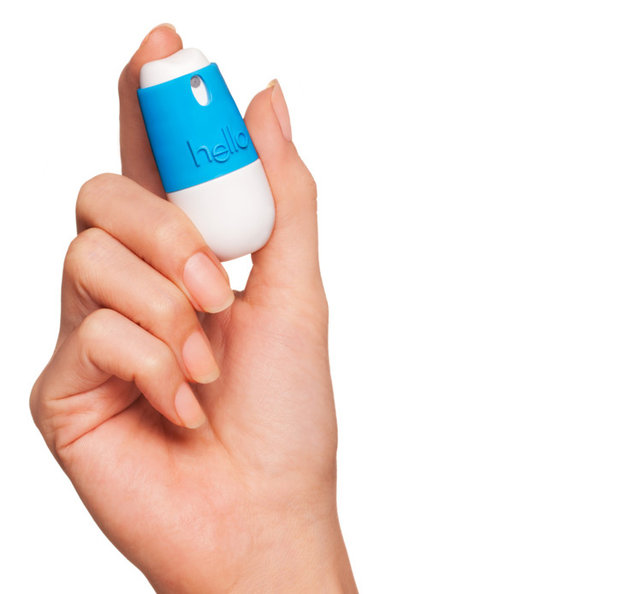
Armed with this insight about the oral care category increasingly assuming the codes of ‘toxic weaponry’ portraying themes of war going on inside your mouth– that need to be eliminated, destroyed & annihilated, Craig Dubitsky created hello– a ‘Seriously Friendly line of Oral Care Products’.
With packaging designed by BMW group’s creative consultancy DesignWorksUSA, hello is an accessible brand for the ‘average consumer’ with the entire mix designed towards one purpose: bring in a fresh breath of friendliness to Oral Care.
Household Cleaning
Speak of detergents, dish washing & household cleaning – and it might not always be the most inspiring conversation and might not always bring a sparkle to the eyes or flushes of joy and excitement. In 2001, Eric and Adam set out to change this – by creating cleaning products that “people didn’t have to hide under their sinks” and went on to become one of the fastest growing companies in the category. Read their story here.
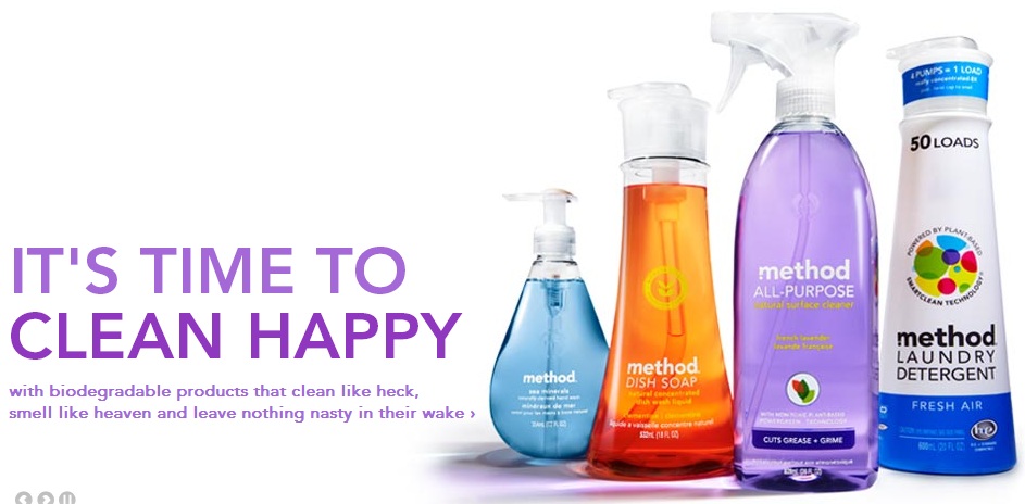
Method with its stylish, eco-friendly products has not only inspired legions of people with its products (did you hear of MethodLust – an independent blog titled as: “one man’s unsupressed lust for all things method”) it has also inspired people to start companies along similar lines (Craig Dubitsky: founder of hello – profiled above – was a board member for Method).
Speak about enlivening some of the most prosaic categories in consumer marketing.
