Marketing Nostalgia – Retro Innovation

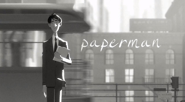
The first thing you notice about Paperman – an Academy Award nominee for Best Animated Short Film (2012) –  is how different it seems from most modern cartoons.

paperman_title

See the full 6mins version here. It has a distinct retro black & white look not just because it is a story based out of 1940s Manhattan, but also because it clearly feels like as if real people have drawn it  it on a piece of paper as opposed to say – like machines creating it on computers.  The result of Disney’s new in-house software called Meander, it seamlessly  blends the best of ‘hand drawn cartoon kinda’ look with CGI animation in a way the animation industry has never seen before; a game changing animation style so distinctive, innovative and beautiful that WIRED magazine even bills it as the future of animation as a whole!

This can be called out as an example of a unique kind of innovation – new technologies, new products or experiences that are designed around connecting us with the past that is nostalgic. Something that  calls as Retro Innovation.  In this FastCompany article he writes that Retro Innovations roughly fall into three categories:

  1. Innovations that authentically mimic a product or experience of the past to transport the user back into a gone era.
  2. Innovations that use a nostalgic format to meet a new need.
  3. Innovations that use a new format to meet an old need.

Read the whole article here and get a dose of some 10 emerging examples of Retro Innovations. My favorite example is Moleskine, regarding which he says..

The Italian paper notebook maker MDleskine, whose recent IPO was valued at more than $600 million, is a stunning anachronism in a business environment that glorifies tech startups and digital business models.

There are reams of case studies out there that extol the brilliance of Moleskine’s branding. But the best example of its retro innovation is its Moleskine Evernote Smart Notebook that bridges the digital and the analog world.

The key insight on which most successful retro innovations thrive on is brilliantly articulated in this Washington Post article that says..

With the rise in computing power, there has been an acceleration of the rate in which we build on new information technologies, leaving us clutching awkwardly for things we recognize from the past. The pace of change at times seems so overwhelming that it’s no wonder that sometimes we want to be transported back to an earlier era.

Think about this insight and you could possibly have explanations for things like:

  • The emergence of  a ‘modern retro’ trend in the  retro gaming culture.
  • The popularity of Mad Men – the only basic cable series to win Emmy Award for Outstanding Drama Series besides 14 other Emmys and 4 Golden Globes. (source)
  • Brands like Adidas and Puma having a dedicated innovation pipeline specially meant for their retro line ups: Adidas Originals and Puma Classics. In fact by many accounts, Adidas Originals can be considered to be a top of the pyramid brand in terms of their positioning and price points. Besides, the corporate logo of Adidas is distinctive from that of Adidas Originals recognizing the unique appeal and potential of this retro innovation line up from the sports brand.
  • The popularity of classics that are remastered to the new digital world – Jurassic Park 3D anyone?

And  in extreme case it might possibly even explain the rationale behind the existence of Skeuomorps – which might be a different discussion altogether!

While the jury is still out to argue whether the ‘retro trend’ actually cripples innovation, a few venture capitalists do concede that  retro innovation is indeed the most lucrative kind. After all, if innovations are about elevating and enriching human experiences, there would always be a market that values a more traditional notion of this experience and that’s where Retro Innovations kick in.

What other examples of Retro Innovations can you think of?

‘Method’ to say ‘Hello’ or ‘Help I am Horny’

There have been countless comparisons between how Microsoft ‘speaks’ via design and how Apple does.The best example is this classic  parody on Microsoft designing an iPod packaging.

Obviously neither of this is necessarily an always right/ always wrong approach to designing a pack or a pack  copy: as that depends upon many factors like the brand’s positioning, its design philosophy etc. But the key point here is that whenever any brand comes with a more inclusive/friendly/simple/’or whatever you chose to call it’  kind of positioning and design, it often breaks the ‘category codes’ and thereby creates a distinctive identity and appeal for itself. Sometimes it could even inspire the existing category codes and set new benchmarks (the recent redesign of Microsoft page for its Windows phone is the best example of how dramatically it is shifting away from its ‘past’ towards something that seems to be inspired by the Apple iPhone page)

Examples for this abound – even in categories like OTC Medication, Oral Care and Household Cleaning, where a handful of brands are slowly but certainly inspiring fresh category codes with their new positioning and design philosophy. A quick look at 3 such brands:

Over The Counter Medication:

Stripping away complexities that typical medicinal packaging bombards patients with, help positions itself as a simple medicine for simple health issues based on its “Take Less” philosophy

Take Less

Each package bears a “Help, I…” line of text, such as “Help, I can’t sleep” for a sleep aid, or “Help, I have a headache” for a package of acetaminophen.The simplicity of the packaging matches the promise of the products, which feature no dyes, coatings, and aim to use only the main chemical needed to treat the patient. By the way –  their recent product is called “Help I am Horny” and if you want to use it, you would “need to fill an application to convince them of your sexual superiority”!

Help

Oral Care: 

Imagine:  an army of germs marching  into ‘whatever it is’ only to be attacked by a flood of chemicals leading to a squeaky clean aftermath. Seems familiar? Interestingly, this imagery could be easily applicable to two diametrically opposite categories: Oral Care and (surprise, surprise..) toilet cleansers!

Armed with this insight about the oral care category increasingly assuming the codes of ‘toxic weaponry’ portraying themes of war going on inside your mouth– that need to be eliminated, destroyed & annihilated, Craig Dubitsky created hello– a ‘Seriously Friendly line of Oral Care Products’.

With packaging designed by BMW group’s creative consultancy DesignWorksUSA, hello is an accessible brand for the ‘average consumer’ with the entire mix designed towards one purpose: bring in a fresh breath of friendliness to Oral Care.

HELLO

Household Cleaning

Speak of detergents, dish washing & household cleaning – and it might not always be the  most inspiring conversation and might not always bring a sparkle to the eyes or flushes of joy and excitement.  In 2001, Eric and Adam set out to change this – by creating cleaning products that “people didn’t have to hide under their sinks” and went on to become one of the fastest growing companies in the category. Read their story here.

Method

Method with its stylish, eco-friendly products has not only inspired legions of people with its products (did you hear of MethodLust – an independent blog titled as: “one man’s unsupressed lust for all things method”) it has also inspired people to start companies along similar lines (Craig Dubitsky: founder of hello – profiled above – was a board member for Method).

Speak about enlivening some of the most prosaic categories in consumer marketing.

Art Of Making Noise. Perfected

How would you make branded noise without making any ‘noise’?

We might need to ask Selfridges, the high end department store chain in UK (which has been voted Best Department Store in the World in the Global Department Store Summit, Paris 2012).

As part of their recent drive called No Noise – Selfridges embarked on a bold new initiative to offer a unique experience to its shoppers that is de-cluttered, de-branded and ‘de-noiseified’.

1. De-cluttered: By featuring fashion/apparels/beauty products that are a ‘carefully curated edit’ of minimalist design from brands like Jil Sander, Uniform Wares etc.  

curated-edit

2. De-branded: By featuring flagship products from brands like Heinz, Levi’s, Beats by Dre, Marmite, Crème de la Mer & Clinique that are (surprise..surprise..!) stripped off their logos. As it says on the website

  “Some of the world’s most recognizable brands have taken the symbolic step of removing their logos in our exclusive collection of de-branded products.”

No Noise Assortment

and ..

3. De-Noise -ified:  by getting equipped with Headspace pods and a re-instated ‘Silence Room’ – dedicated oasis of silence and contemplation amidst the usual frenzy of brands and bargains where shoppers can get access to guided meditation modules  and an ambiance  to help calm busy heads.

This is how they explain the No Noise initiative on their website:

As we become increasingly bombarded with information and stimulation, the world is becoming a noisier place. In an initiative that goes beyond retail, we invite you to celebrate the power of quiet, see the beauty in function and find calm among the crowds.

A couple of thoughts on No Noise:

  1. The initiative sounds like a very unique (and a first of its kind?) anti-retail concept by a retail brand 
  2. Sounds like the high street fashion’s foray into the space of low-fi living – the recent lifestyle trend that is picking steam where less is said to be more
  3. And obviously, contrary to the stated purpose, these products with stripped off logos end up creating buzz and making the greatest magnitude of noise.  For, after all, any partially fleshed out visual element that only leaves out the name and yet succeeds in making the shopper recognize its identity in no uncertain terms is a clever way to trigger imagination, engage attention, and reinforce the shoppers’ memory structures about the brand’s visual identity.
  4. Finally and more importantly it is clearly a self bragging loud statement by these brands on the iconic status of their visual identity elements so much so that these ‘unbranded’ products are being offered as exclusive collector’s items (Selfridges has even debranded its own bag).

To sum it up, as Tim Nudd aptly notes in AdWeek:

Throw in all the communications surrounding “No Noise,” and it seems the company is making more noise than ever this year.

Talk about the next level of sophistication in making noise without making noise.

Reminded me of Andrew Miller’s experiment Brand Spirit in 2012  – check out my  related post.

The 12 Most Viewed Posts of 2012

tumblr_inline_mfqegiNdi41qa5woe

The following blog posts received the top 12 pageviews at BrandedNoise in 2012.

1. The Power of Imagination. Unleashed

2. The Best Touch Points for Marketing Fabric Conditioners in India

3. Colors

4. Minimalism and Apple

5. Marmite, Mouthwash and Microsoft

6. 100 Days of Branded White

7. The IKEA Effect

8. Pulling the Triggers on Behavior

9. The Most Iconic Photograph Ever –  On Perspectives

10. The Uninvited Design – Agencies Beware

11. The Job Hunt – Part 1/3

12. Targeted Sampling

Stories, Grommets and Epipheos

This is the latest in the series of cartoons by Hugh MacLeod as featured on his blog GapingVoid. While I totally agree with his point on how conversations change when the markets change, I want to add further to it or take the liberty of phrasing it in a slightly different way by saying “all evolutions in marketing are evolutions of stories, the narratives, or chronicles”.

KONY has been phenomenally viral. It is a story well told.

Charity Water tugs at your heart. It is a story well told.

Innocent makes you look at smoothie in a new light. It is a story well told.

Stories simplify, humanize and lend emotion to messages about products, services and causes and thereby make them unique and authentic for us. When a brand tells me its story, it plants its idea in my mind and thereby becomes more potent. When I know the story, I suddenly begin to care. That’s why more and more videos in Kickstarter are about a ‘story’, that’s why people go to ‘About Us’ page in most sites/blogs that they visit, that’s why you might find yourself intently reading the story of a restaurant as printed on the first page of its menu even before you get to the appetizers section, that’s why you might even relish and appreciate the coffee at your local coffee store. That’s why Facebook brand pages with a well designed timeline tend to come across as more interesting and humane narratives.

As a marketer I find this to be one of the most inspiring tenets of the practice. When I realize that it is all about story telling, things suddenly seem to take newer shapes of significance and bring newer things into perspective. It then begets questions from a consumer standpoint and demands for a spiel that a consumer can care about.  That I can relate and relate to as I share it with my friends. Branding as Story telling isn’t to be confused with some smartly concocted campaign ideas or executions. It is much more than that and encompasses all the elements of the mix and binds them to a unique, authentic core.

I am definitely not an expert at this but there are tons of resources available that offer help on the science and art behind branding as story telling. That said, let me highlight 3 interesting trends that are panning out in the realm of story telling in various realms.

1. Luxury brands are showing greater proclivity to adopt story telling strategies: Some examples: Vitra – the maker of master piece furniture is turning to story telling – read the story here. Read an account of Lady Dior Saga in this post on Luxury Story Telling.  And finally, the Chanel No5 film – need I say more!

2. Story telling at a personal branding level: For starters, I could argue that most brands in high involvement categories that you buy today, you do so with a conscious, painstaking thought and consideration on what story it could tell of you. As an other example read a trend briefing here regarding the shift from brands telling a story to brands helping consumers tell ‘status-yielding’ stories about themselves to other consumers.

3. Content consumption as story telling: Visual story telling is fast becoming a new standard in content curation and consumption. ‘Infographics’ are redefining this field rapidly. In fact it is said that over the past 2 years, infographic search volumes have increased by over 800%. There is even a site full of ‘visual summaries’ of this year’s SxSW event!

Obviously, story telling is no more about just making films, writing screenplays or devising plots. It is much much than that and the following 3 examples are a testimony to it:

Daily Grommet: This innovative site uses the art of story telling to sell a product a day. A new product is featured every day in a video with a story and an account on why this product has made the cut on this carefully curated video blog.

Epipheo: There is this ‘story telling studio’ that helps people/companies/brands tell stories about their new ideas, products or even technologies with what they call as ‘epipheos’. I would strongly urge you to see its video on Siri here and you would know why Epiheo has clients like Google, Facebook, etc.

And finally there is Get Storied that is all about teaching entrepreneurs how to tell their story. Never before was story telling so critical a part of pitching as business plans, revenue models and risk mitigation strategies had been for VCs and investors by budding entrepreneurs. Story telling is THE thing in pitching now.

Now, that begets the question – what is your story?