Context: I was recently invited by Ahmedabad University Centre for Heritage Management to deliver a “curtain raiser keynote” (had to look up what that meant) at their annual research conference – The 5th International Conference on Heritage Management Education and Practice. Organized between March 15 – 17 2024, the theme of this year’s conference was “Intersections of Heritage Economics and Digital Technologies”.
When I had first received the invite, I was pretty certain that there must have been some mistake, for I had/have no authority to speak on the subject. But long story short, I took up the challenge and delivered my keynote at the Ahmedabad University CHM research conference. And to my absolute surprise, the presentation ended up receiving very positive (and very kind) feedback from the attendees. So I thought I would put it out here on brandednoise to solicit further ideas/ inputs.
So here goes my presentation. This is the direct ‘slide by slide’ rundown along with my speaker notes. Barring extremely minor tweaks (that I have incorporated to aid readability of the content as a blog post), this is my keynote – as is, in full.

Esteemed leaders – current & soon to be – from academia, research, policy and the practitioner community. It is such a privilege to be here amidst you all, precisely because I belong to none of these groups wrt the domain of “Heritage Management Education and Practice”! At best, I may call myself an observer as I seek to soak in, participate and contribute to the topic of the conference today “Intersections of Heritage Economics and Digital Technologies“.

When I thought about the rapidly growing role of Digital Technologies in Heritage Management, I naturally thought about how the technologies of AR/VR, Artificial Intelligence & advances in Cloud Computing are transforming how we interface with Heritage & Art.
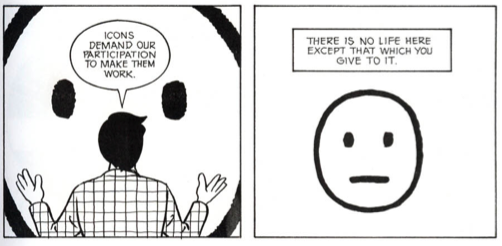
I thought I’d talk about Google’s platform where all this comes to the forefront – Google Arts & Culture. And how it uses technology to elicit user participation, engagement and drive co-creation of experiences wrt art & heritage.
But here’s the thing – that would be my “comfort zone”.
And I thought, this is a research conference – and one of its kind at that! And what is a research conference if we don’t step beyond our comfort zone – a slight bit. That zone where we do a bit of philosophising, theorising and some crystal ball gazing, if you will?
And that’s what I am going to do over the next few mins here. So indulge me here 🙂
My argument (or more precisely a premise) in a nutshell is as follows…
It is clear as daylight that digital technologies have incredible value wrt heritage management & practice.
But I’d be doing a disservice if I focus on just this aspect of technology – which is just the “tip of the iceberg” , For, if we do that we’d perhaps end up focusing on just a small subset of possibilities: i.e., digital technologies as just “techniques” to be used.

I am going to take a few more steps further and argue that Digital Technologies have an even more foundational role to play wrt the domain of heritage management. For, if you view Digital Technologies for what they truly are or what they truly can be, you could perhaps even see them as enablers of new ontological, epistemological and axiological perspectives of the domain.
So I’d say that Digital Technologies can have a lot to contribute to (even) the core philosophical foundations of heritage as a construct.
Let’s unpack that.
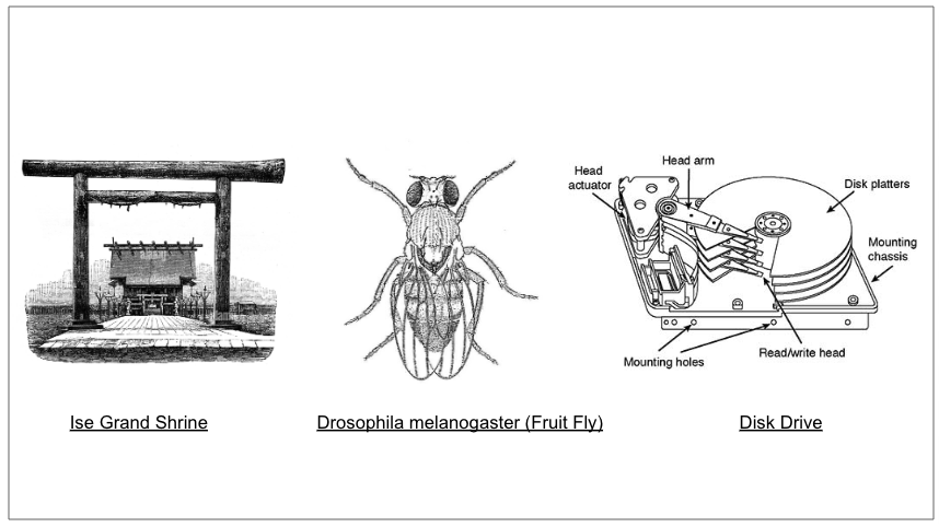
I’d like to start by asking a question. What is common amongst these three.
- A 2000 year old Japanese Shinto Shrine
- The Drosophila melanogaster a.k.a the “fruit fly”
- The hard disk drive
Have a think.
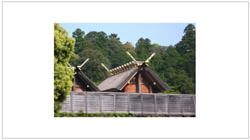
Let’s start with the Ise Grand Shrine – a.k.a .Ise Jingu
What can this 2000 year old Shinto shrine have to do with Heritage Management and Digital Technologies?
The Ise Grand Shrine – a Shinto Shrine – in Ise, Mie prefecture in Japan has been preserved exactly like it was around 2,000 years ago. Despite such a rich legacy, it doesn’t figure in the UNESCO world heritage list.
Why?
This is because the shrine is not built of a ‘permanent structure’. The Ise Grand Shrine is built of wood and hence it gradually loses its structural integrity over years.
So the Shinto priests have a solution; every 20 years they tear down the structure and rebuild another – in an adjacent plot – in exactly the same specifications as the original using the wood from the same forest that the original structure was built from.
Result: the shrine is forever new, ancient and original!

The Shrine is currently in its 62nd reconstruction, the next reconstruction will be in 2033.
Despite not being on the UNESCO’s World Heritage list, the Ise Jingu Shrine is one of the highest visited Shinto shrines in the world! Now that’s saying something about Heritage Economics 🙂
What can a 2000 year old Shinto shrine have in common with Digital Technologies?
It goes by the name “version control” / “generational cycle management”.

The definition of Heritage is anchored around the core concept of “generations”
- What qualifies to be called as ‘legacy’ by a generation?
- How does one generation view the legacies of an older generation?
- And what are the socio political cultural & economic imperatives that influence how a generation preserves its ‘legacy’ for its future generations?

And we can’t speak about generations without speaking about the Strauss Howe Generational Theory. What it essentially states is that history repeats itself and the sooner we understand the socio – political – cultural and economic contours of the same, we will be better served.
First a few building blocks of the theory:
- Let’s take the average human life span as approx. 80-90 years. This is called a Saeculum and consists of four periods of approximately 20-22 years each. Which are (1) Childhood (2) Young Adult (3) Midlife and (4) Elder hood.
- A generation – as we know – could be thought of as an aggregate of people born approximately every 20-22 years.
- Each generation experiences “four turnings” every 80-90 years. They are (1) High (2) Awakening (3) Unravelling and (4) Crisis.

In essence, the cyclical nature of these “four turnings” could be stated as follows:
- “Strong people” create “good times” (in general)
- “Good times” create “weak people”
- “Weak people” create “hard times”
- “Hard times” create “strong people”
- “Strong people” create “good times”
- and it goes on…

Throwing all these elements into one chart gives us a view like this one about American generational cohorts – where you can see this cyclicity emerge across generations punctuated by the four turnings. And at any given point in time we have multiple generations co-inhabiting the time space. And the interplay between these generations is what leads to the socio political and economic imperatives that we grapple with as a society.
And the world around us – here and now – is this ‘laboratory’ where one can study this theory play out across generational cohorts.
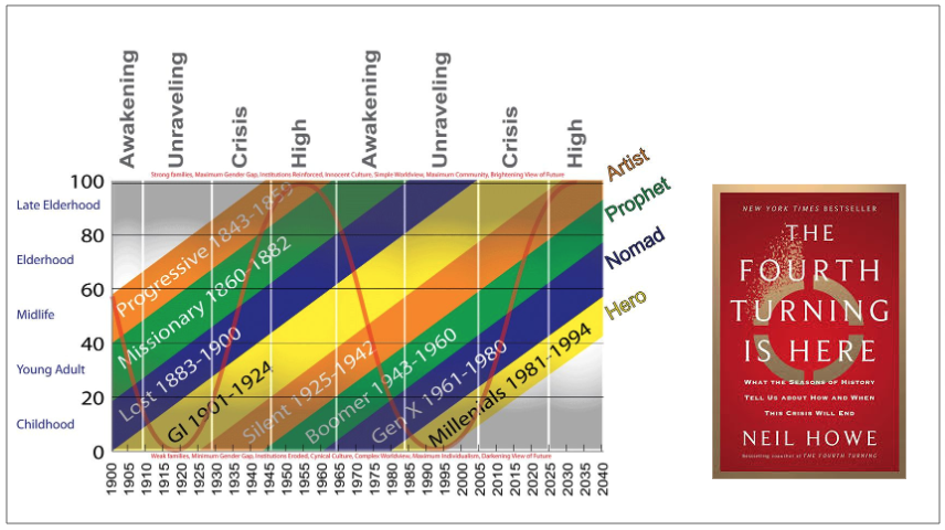
In fact in their book “The Fourth Turning is here” the authors of this theory argue that we are collectively living through the “Fourth Turning” now. The book has been called prophetic given how it seems to have ‘predicted’ way back in 1997, many of the socio political economic cultural and technological realities that we have seen ourselves grapple with over the last two decades in this millennium.
Now let’s conduct this thought experiment.
What if we were to set up a lab where we can observe these inter generational forces at play along with their fall outs? Only this time, the generational intervals are much shorter, thereby allowing us this rare opportunity to get a sweeping view across multiple generations during one single life time.
Wouldn’t we then be able to identify hypotheses, build models, test theories and perhaps even build grounded simulations around how the notions of heritage emerge, propagate and evolve over generations?

Studying species with short generational intervals is not a novel concept. Today, scientists study evolution in species with short generational intervals. This allows for direct observation of changes over many generations, which wasn’t possible in Darwin’s time.
This is Prof Thomas Hunt Morgan who was awarded the Nobel prize in medicine in 1933. His genius lies in establishing the Drosophila melanogaster as the model organism in the study of evolutionary genetics. Why? Because, the whole life cycle of the fruit fly is relatively rapid and takes only 10-12 days.
Over the last century, this discovery has led to an exponential rise in research productivity across a diverse range of topics including genetics, embryonic development, learning, aging, behavior and more.

This is Prof. Clayton Christensen who has developed the theory of “Disruptive Innovation”. Reportedly..
Someone told him that disk drives were the “fruit flies” of technology: they were ideal subjects for studying innovation, because a generation in disk-drive technology was incredibly short. He saw that the companies that made fourteen-inch drives for mainframe computers had been driven out of business by companies that made eight-inch drives for mini computers, and then the companies that made the eight-inch drives were driven out of business by companies that made 5.25-inch drives for PCs.
What was puzzling about this was that the eight-inch drives weren’t as good as the fourteen-inch drives—they had a lower capacity, and a higher cost per megabyte—and the 5.25-inch drives were inferior to the eight-inch drives. So why hadn’t the fourteen-inch-drive companies simply started producing eight-inch drives? It didn’t make sense.
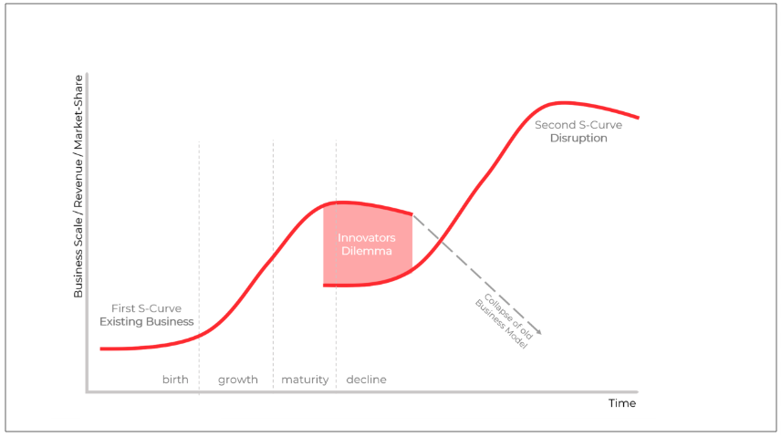
The genius of Prof. Christensen lies in studying innovations in products/categories which have incredibly short generational intervals and rapid evolutionary cycles in order to identify the organizational, economic (and sometimes even political) imperatives that could lead to an incumbent getting ‘disrupted’ by a new entrant in an industry.

In many ways, this – exercising our focus on digital technologies as our canvas – could be inevitable as they pretty much characterise the times that we live in. Students of economics would know the Kondratiev Wave which pretty much says the same thing.
This shows the pattern in the societal waves of advancement since the industrialization era. A few things that you can immediately observe, (1) every k-wave (which is characterized by the dominant technologies of its time) is shorter than its previous wave. (2) We are today living through the 6th K-wave, which could have an even shorter interval span, and finally (3) this wave (loosely estimated to be the one between 2010-2050) could probably be the one around “intelligent technologies”.
Central theme here: Technology’s shorter generational cycles and how that creates a second or a third order influence over the corresponding socio, economic, political and cultural forces at large. It’s pretty much the story of our times.
Let’s take a few examples.
Many people would know what this is.
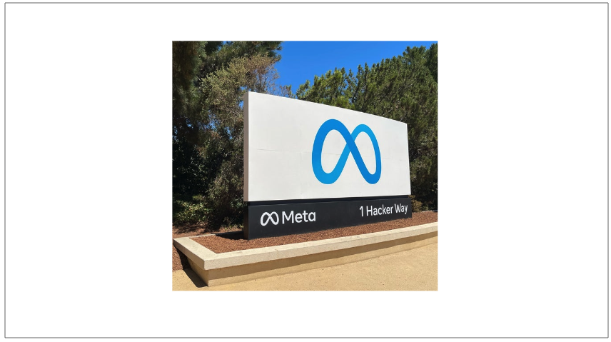
This is the signboard of Meta at their corp HQ at Menlo Park, California. Many people come over here to get their pictures. But not many would know that this has a peculiar “feature”.

Sun Microsystems (est. 1982) had gone defunct in 2010. Subsequently, Facebook has bought over and remodelled the property as its global headquarters by 2011. And instead of replacing the Sun sign, Facebook just flipped it over and put Facebook’s name (now Meta) on the front(!)
Beyond serving as a homage to Sun Microsystems as a company that had significantly contributed to several key computing technologies, many see this as an intentional ‘reminder‘ to those looking from within the campus.

Many of the logos that you see on the left belong to those brands that had been global leaders in their own right. They had defined standards, influenced culture, and pretty much led to our popular narratives around how societal trends and technologies have a symbiotic relationship given the breathtakingly rapid developments in this space. But today they no longer exist!
At the same time, we also have technologies/digital platforms/ device ecosystems that continue to see strong evolution over the times. For e.g., many would know that 2024 also marked the 40th anniversary of the Apple Macintosh and one can’t over-emphasize its socio cultural influence (that spanned several domains) over the years.

It is to chronicle these very stories in technology and with a stated mission to “decode technology—its computing past, digital present, and future impact on humanity” the Computer History Museum (CHM) at Mountain View California prides itself as the largest repository of computational artifacts under a single roof. The museum presents stories and artifacts of Silicon Valley and the information age, and explores the computing revolution and its impact on society.

I would like to believe that it is not an accident that the CHM’s core belief about the inter generational value of computational technologies has parallels with how UNESCO defines ‘heritage’.
(as a fun aside, I couldn’t help but notice the fact that the Centre for Heritage Management and the Computer History Museum share the same acronym!)
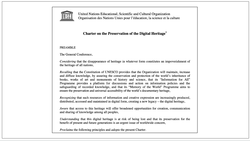
Therefore, the UNESCO’s charter on the “Preservation of the Digital Heritage” proposed in 2009 is a good start to the conversation. But we have a lot more to do.
Given rapid bursts of new technology breakouts coupled with ever shortening generational time spans of these technologies such as AR/VR/AI/Cloud etc, their ever expanding and evolving influence over practically every domain of our existence has a near axiomatic appeal wrt the socio economic political and cultural discourse of our times.

And that leads us to more fundamental questions.
- What is digital heritage? (a question with an ontological lens)
- Why study digital technologies in the realm of heritage research? (a question with an axiological lens)
- What standards inform digital heritage identification? How do these influence how we experience & identify tangible and intangible heritage artifacts? (questions with an epistemological lens)
By virtue of the inquiry along these lines, I would posit that we might soon need to reconsider broader perspectives to help us answer even the central ontological question in our domain – What is heritage?

And that’s why I would argue that Digital Technologies have even more foundational role to play wrt the philosophical aspects of heritage management.

We spoke about the Kondratieff Waves a few minutes ago. Another way to look at these waves, especially in the context of Heritage Management is as follows:
- What a generation calls as ‘legacy’ could be that which it perceives as the vehicle or the marker of its ‘progress’.
- While the first few (known) millennia of the chronicled human history saw progress around the vectors of “transforming material”, the next set of waves – characterized by a dramatically reduced scale (of centuries) – could be seen as a commentary on our progress around the vectors of “transforming energy”
- And today, our progress (and thereby what we’d perhaps call as the legacy of our times) can probably be characterized as that pertaining to “transforming information”
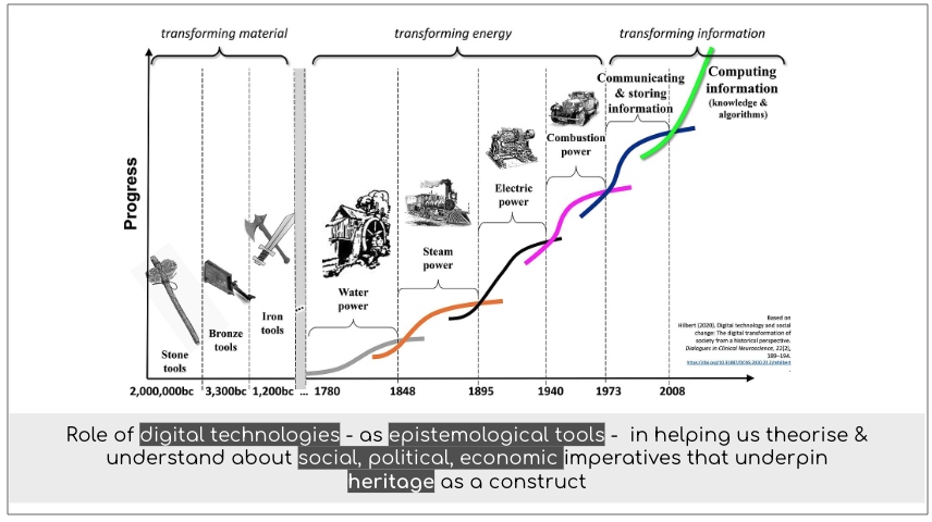
And that leads to the question about: the role of digital technologies – as epistemological tools – in helping us theorize about and understand the social, political, economic imperatives that underpin not just ‘digital heritage’ but also the construct of ‘heritage’ as a whole.

And therefore just as the Drosophila melanogaster (fruit fly) ended up becoming the “model organism” that revolutionized the research in evolutionary genetics, just as the hard disk drives helped serve as the “fruit flies” for research on innovation management, my premise I submit for your consideration – phrased as a question- is as follows…
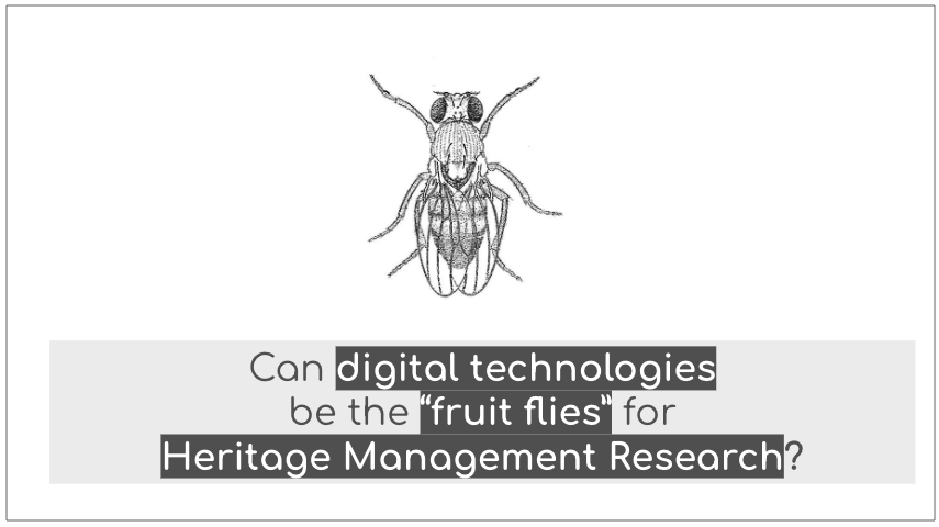
Can digital technologies be the ‘fruit flies’ for research in Heritage Management?
Thank you once again for the opportunity and I wish The 5th International Conference on Heritage Management Education and Practice at the Centre for Heritage Management, Ahmedabad University a grand success!