The Drone View Advantage

Quick read: Drone shots of the Swiss Panoramic Express could remind us about the need to sometimes take the larger ‘meta view’ vs the ‘window view’. And that could perhaps be a good reminder across contexts – from our investment theses, our career choices to even getting a better handle on how we frame our life stories.

Now don’t get me wrong.I LOVED the ride!

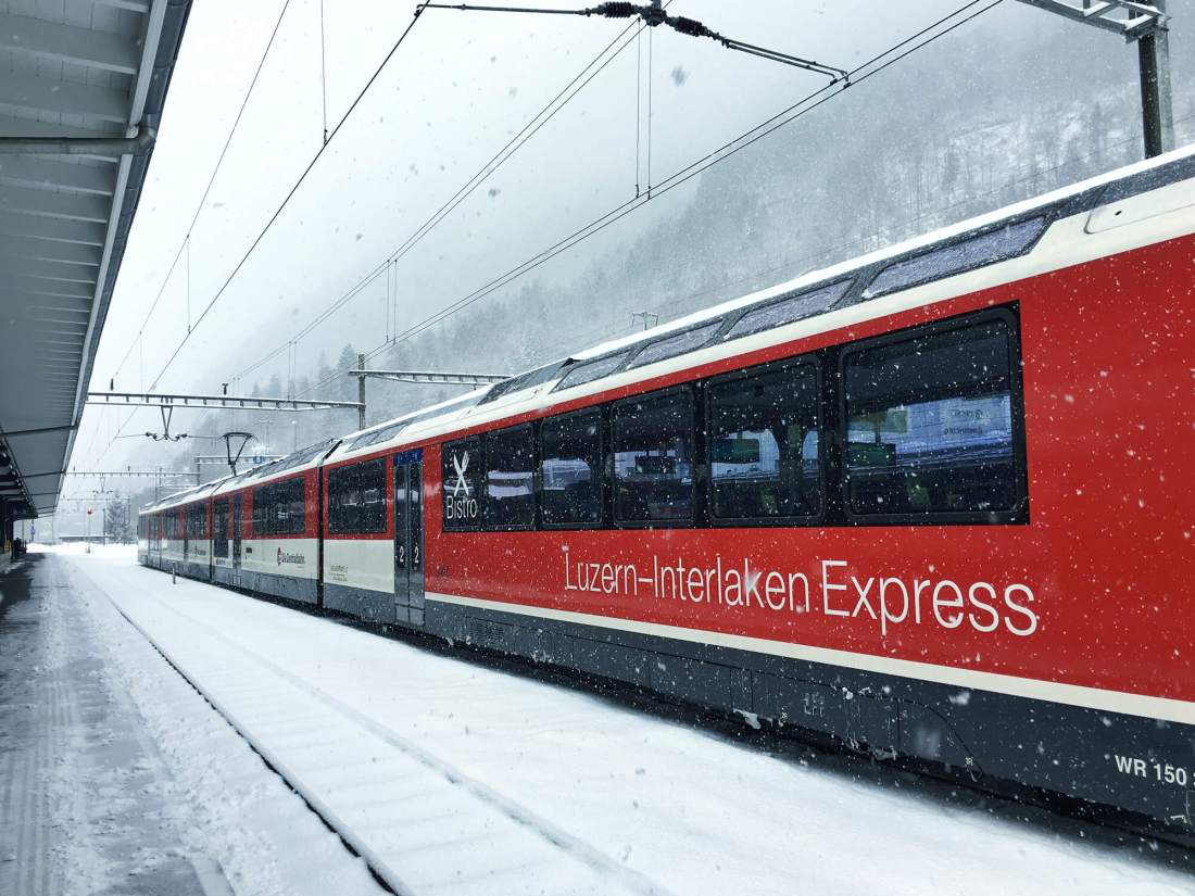
Especially as someone who had found every single nook and cranny of Switzerland picture post card perfect. So, what’s not to like about the truly awesome Lucern – Interlaken Express route? In fact, for once I was happy that a journey would take longer than I had expected – 1hr 55mins to be precise.

Image source

Why should I be the only one that enjoys such magnificent views? (I know! How magnanimous of me, right?) So, I sent a few of such pictures to my friend, who then dutifully responded with a few of such (👍 and ❤️) emojis.

Basking in the sunny snowy views from my train seat, I then turned to the Internet to see what’s the “official word” about this beautiful train ride. The Swiss tourism website said thus

During a train ride of roughly two hours, passengers marvel at five crystal clear mountain lakes that gather the waters from various rivers and waterfalls. At the lakeshore, steep rock faces of surrounding mountains rise up protectively and provide unique photo motifs.

Shortly before starting its steep, winding ascent to BrĂĽnig Pass, the train changes to cogwheel drivetrain technology in order to conquer the gradient. With good reason, the Luzern–Interlaken Express is part of the scenic GoldenPass Line leading to Interlaken and on to Montreux. 

Source

Just as I was trying to situate this romance within my 2-dimensional window view, something caught my eye. And soon enough I discovered I was unable to peel my eyes off these spectacular images from my phone screen.

Image source: MySwitzerland

I now sent my friend the above image and texted him saying that’s the route I am actually on.

Now as if by magic, this stubbornly laconic friend of my mine started on a paragraph of expletive ridden love letter to the stunning beauty of the Swiss landscapes. And I must confess, I found these ‘drone’ shots much more appealing than those that my rectangular windows framed for me along the route.

In order for me to get a more first person / visceral perspective of such a view, I wish I had the equivalent of the “tail camera airshow view” – that one occasionally finds on aircraft – in the train.

What just happened?

I was enjoying the view. But I was sure, the “view of the view” (call it a meta view, if you will, but let me call it the “drone view”) would perhaps be a more spectacular one. And I could bet, that drone view would have trumped my window framed 2D view in story telling too!

That’s why most of the airlines ads we see (print / video / OOH) have more footage/shots like this ..

Image source: Turkish Airlines

.. than those like this.

Image source. Photo by Babaroga / Shuttersrock

The “drone view” vs the “2D window view”.

Taking the view of the view vs well, the view.

If you think about it, that’s what financial advisors never tire of telling us.

The Ayodhya Stock Exchange

No, I didn’t make up that click-baity phrase. A popular news portal had this headline: “‘Ayodhya Stock Exchange’: 10 stock ideas to play the Ram Temple theme”.

Another one said “Ayodhya Ram Mandir becomes new investing theme: 6 stocks in focus”, and another “Ram Temple inauguration: Here are 12 shares that may benefit from Ayodhya tourism boom” and the list goes on.

But if you hear the other voices, they would tell you to stick to fundamentals and take the broader view. In other words, they caution us against mixing this “2D window view” with what should have ideally been a “drone view” that frames the larger journey for us.

And come to think about it- in many other aspects in life: from our considerations that drive career pivots and choices, to relationships, to many other things big and small – wouldn’t this be sage advice?

Of reminding ourselves of the need for taking the “view of the view” vs well, the view?

[Featured Image: Source]

Of Similarities and Split Screen

Quick Read: There are ads that try and communicate a message of ‘contrast’ and there are those that communicate ‘similarity’. While the former type of ads ride on a diverse set of story telling devices, there seems to be an interesting trend in the story telling devices deployed by the latter set. It’s the ‘Split Screen’.

A lot of advertising is meant to tease out / explain / amplify an element of a brand that is supposedly in contrast w.r.t the competition. Think about it for a moment and think of the core narratives behind most of the ads that you see around.
A lot of advertising narratives tend to fall into this camp, where they try to land a message through a narrative that is designed to communicate a contrast – sometimes in a straightforward manner or sometimes in perhaps a tongue in cheek style.
A few share worthy ads of that kind below.
1. Jeep,  Anti Manifesto
(Agency: Arnold Worldwide. H/T: Bhatnaturally)
And oh, btw just for fun, see this one and it’s hard to not think that the Jeep’s creative team didn’t have this in mind while conceptualizing the above work.
2. Fevicol, Ezee Spray
(Agency: Ogilvy)
3. Eko Kom, Flight Attendants / Garbage Collectors
 
(Agency: Havas, Prague. H/T: Bhatnaturally)
As you can see, ads that have ‘contrast’ as the core message, ride on a diverse set of story telling devices.
Interestingly, this is in contrast with ads where ‘similarity’ is the core message.
When similarity is the core message..
.. there seems to be an interesting trend in the story telling devices that most of them seem to draw upon. Most of such narratives are rooted in a singular story telling device – the split screen.  
Sample the following examples.
1. The Day Before 
(Agency: Leo Burnett Chicago)
2. McDonald’s
(Agency: Agency: Leo Burnett Chicago)
3. John Lewis
(Agency: DDB Worldwide)
4. Coca Cola UK
(Agency: David The Agency, Buenos Aires)
For the record, the split screen as a story telling device has also been used in ads that seek to communicate a contrast.
Like this one from Apple.
In fact this entire campaign for iPhone (in May 2017) had creatives that all used the split screen.
What other story telling devices have caught your eye in the recent past?


Repeat After Me

Quick Read: Some deep seated cultural values that we project on to our children are in need of a massive over haul. Nike and Dove have brilliantly brought this to life in their recent campaigns. 

Handwriting just doesn’t matter.

Or does it?

For a long time it was believed that cursive writing identifies us as much as our physical features do, revealing something unique and distinctive about our inner being.

But over a century, the focus on cursive handwriting in schools actually ended up achieving the opposite. Mastering it was dull, repetitive work, intended to make every student’s handwriting match a pre-defined standard.

In fact in the 19th century America, students were reportedly taught to become “writing machines”, holding their arms and shoulders in awkward poses for hours to get into shape for writing drills.

Or take this Lego ad from 1981. See anything unusual here? 

1981+Lego+Ad

(What it is is beautiful. Source |HT Seth Godin “Stop Stealing Dreams“)

Those were the days when LEGO blocks were sold by the “bucket” with blocks of different sizes and colors thrown in together and labelled “Universal Building Sets”.

This approach celebrated a child’s creativity regardless of what she has created. As the ad copy above goes on to say..

“…how proud it’s made her. It’s a look you’ll see whenever children build something all by themselves. No matter what they’ve created”

Sadly this approach didn’t sell a lot of LEGO blocks presumably because it required too much risk on the part of parents and kids—the risk of making something that wasn’t perfect or expected.

So what did LEGO do?

They switched from these all purpose “Universal Building Sets” to a lineup that included more of predefined kits – models that must be assembled precisely one way, or they’re wrong.

Why would these pre-defined kits of LEGO blocks sell so many more copies? As Seth Godin says, it is because they match what parents expect and what kids have been trained to do.

Lego Products Page

(The LEGO products page today, with a disproportionate focus on predefined kits)

These discourses on cursive handwriting or LEGO are metaphors of what’s happening with schools around. 

By the turn of the 19th century, the biggest challenges of our newly minted industrial economy were two fold.

  1. finding enough compliant workers and
  2. finding enough eager customers

The school system – that most of us would have been brought up under – evidently solved both problems.

But the world around has changed into a culture that celebrates ideals like ingenuity, connection, ideas, courage and risk Vs one that only promoted values like conformity, obedience and risk aversion.

Sadly our schooling system has changed little from that originally envisaged for a completely different era. (More in Seth Godin’s must read manifesto ‘Stop Stealing Dreams – What is school for?’)

So a scene with a class full of students repeating ad nauseam after their teacher, rhymes or lessons that only serve the purpose of further perpetuating outdated or worse still outlandish values against today’s realities is certain to provoke anger and perhaps even instigate an active change in our world view. 

Two brands have recently used this very scene, to demonstrate how deeply we have tried to graft our misplaced conceptions of ideas around individualism and beauty in our children.

Nike’s Minohodoshirazu

Earlier this month, Nike Japan  launched a new campaign with a spot that redefines the phrase ‘Minohodoshirazu’, which translates to “Don’t know your place.” While the term is typically used as an insult towards the overly ambitious, the anthem ad tells viewers that not knowing your place can instead be a mindset for athletes to strive for. (source)

Created by W+K Tokyo and directed by Omri Cohen, the ad manages to contrast the values being embedded in children with shots of athletic achievements that run counter to these messages of compliance and obedience. Video here.

https://www.youtube.com/watch?v=WvvpKGVOf0Q

Dove’s Is That You? 

The famous nursery rhyme ‘Chubby Cheeks, Rosy Lips…’ is used as the background score for this video created by Culture Machine (and subsequently pitched to Dove).

The rhyme and the contrasting visuals make you wonder if this is how we have sought to institutionalize a misguided set of beauty ideals in generation after generation of young girls, every single year. Video here.

It is always interesting to see different brands, different agencies from different parts of the world adopt a similar executional approach to land their respective ideas.

(Featured Image: Source)

Modern Molinism

Quick Read: Want a sure shot ticket down a rabbit hole? Your bet: Choice Design. So much for free will. 

Morioka Shoten Ginza is a book store in Tokyo where you wouldn’t have a problem with deciding which book to buy.

Why?

Because in any given week it sells copies of a single title. Each title is displayed for six days in a row—Tuesday to Sunday—and then swapped out for a new book.

Yoshiyuki Morioka – the founder of this “single room with a single book” concept believes that focusing on a single book would help foster a deeper relationship between a book and its reader and drive up the pleasure of reading to a whole new level.

Additionally, every evening an event is organised to discuss the book and connect its author with readers, while pieces of art that relate to the book are displayed around the store for the readers to soak in and enjoy.

Morioka-Shoten-bookstore

(Morioka Shoten bookstore: Pic Source)

Unsurprisingly this approach of ‘choice design’ combats decision fatigue and stifles crippling indecision that customers tend to face in a conventional book store set up – online or offline.

Result: An invisible hand that influences its customers’ free will, subtly leading them from a cursory browsing mindset to that of a deeper meaningful engagement leading to purchase.

One customer at a time. And one book title at a time

According to Morioka, the store has sold more than 2,000 works since it opened last year and attracted numerous visitors from all over the world. (source)

Meanwhile at the other end of choice spectrum 

A unique adventure beckons you with the promise of debilitating you with mind boggling levels of choice at every turn of the journey.

Sample this.

You’re sitting alone in your apartment minding your own business when, out of nowhere, someone bursts through your front door. So what do you do? 

ClickHole

(Source: Clickventures)

So begins your adventure that starts off on a simple note.

But even before you realise, you will soon find yourself deep down a rabbit hole staring into frustrating levels of complexity and a ridiculous set of choices being thrown at you at each turn.

And surprisingly you find it addictive!

Clickventures, as they’re called, are exercises in absurdist escalation.

Despite the apparent air of triviality around them, each clickventure is an evil design experiment that lies at the intersection of comedy, interactive fiction, game design and behavioural research.

No wonder, brands are not far behind in tapping into this space.

For e.g, Old Spice has created a wild and wacky choose-your-own-adventure social experience on Instagram with Wieden + Kennedy.

The more you click, the further you go and the more wackiness you can experience. Exactly like in the Clickventures. Try out few of them here and see who wins.

Your “free” will? 

A basic tenet of Molinism is that in addition to knowing everything that will happen, God also knows what His creatures would freely choose if placed in any circumstance.

It’s essentially a doctrine which attempts to reconcile the providence of God with human free will.

Molinism is perhaps still going strong in the 21st century. It’s just that these molinists go by a slightly different name today.

And they subscribe to a doctrine that attempts to reconcile the providence of an invisible hand (also known as the ‘choice designer’) with human free will.

Now, did I just call marketers, the modern day molinists?

(Featured Image: Quote from the cult movie The Matrix)

Convergent Evolution

Quick Read: ‘Convergent Evolution’ while being a concept from the life sciences could actually be seen playing out with a greater degree of recurrence in creativity and arts.

What you see here on the left is the picture of a butterfly. But what what you see on the right, is not.

Convergent Evolution

(Pic source: The Economist)

In fact it is that of a fossil of a lacewing (an insect) called Oregramma illecebrosa. Supposedly it flew in the forests of the Jurassic period between 165m and 125m years ago, dying out 69m years before the first-known butterfly fossil. (source)

These are examples of Convergent Evolution: the emergence of similar bodies in unrelated groups of species, to permit the pursuit of similar ways of life.

Another example of Convergent Evolution is the Jurassic Ichthyosaurs and the modern Dolphin.

CONVERGENT EVOLUTION (1)

(Pic Source: The Dinosaur Store)

But that’s not the interesting part.

Convergent Evolution while being a concept from the life sciences could actually be seen playing out with a greater degree of recurrence in creativity and arts; where it can loosely be defined as follows:

Convergent Evolution in the arts is the emergence of similar kinds of ideas and creative executions from unrelated sources or disciplines, to permit the pursuit of similar expressions.  

Let us take two projects Futuristic Archaeology and Inherit the Dust and a set of OOH executions by Amnesty International as examples.

Futuristic Arhaeology 

Mongolia has long been home to one of the world’s largest nomadic populations, with more than a third of its population pursuing their livelihood on the vast Mongolian-Manchurian steppe. But in recent years, the grassland has been drying up.

Korean photographer Daesung Lee’s series Futuristic Archaeology explores what the desertification of their home means for Mongolian nomads through a series of fantastically staged images.

They feature landscapes-within-landscapes — barren, desert environments inlaid with decidedly greener ones.

futuristic-archaeology-1-1024x682

futuristic-archaeology-10-1024x683

(Images from Futuristic Archaeology. Full collection here)

These incredible scenes aren’t digitally orchestrated: Lee actually printed out billboard-sized photographs and strung them up on site, using former nomads as models. Inside the smaller images, people ride horses, herd goats, and go about their lives fenced in by red rope barriers. (source)

Inherit the Dust

Nick Brandt is as much an activist as he is a photographer. After spending 15 years working in Africa he was depressed by the changes he saw sweeping across the African landscape, like illegal logging predicted to eliminate some 30 million acres by 2030.

Thus was born his latest project Inherit the Dust a collection of  moody portraits of elephants, giraffes, and lions to call attention to Africa’s vanishing megafauna. Each picture in this project has been meticulously staged and exquisitely shot in black and white to bring to life these beautiful creatures wandering the landscapes they’ve long since been driven out of.

Brandt_04-1024x474Brandt_05-1024x474Brandt_008-1024x489

(Images from Inherit The Dust, Nick Brandt. Source)

While with Inherit The Dust, the quiet dignity of the animals that Nick Brandt photographs is shockingly juxtaposed against the indignity and disarray of our own…

…. Amnesty International flips this concept a bit

…by juxtaposing the shocking indignity of human rights violations against the backdrop of a quite dignified civic life that most of us easily take for granted.

Amnesty International_1

Amnesty International_2

(Advertising Agency: Walker, ZĂĽrich, Switzerland. More executions here, here and here)

As one reviewer of Nick Brandt’s Inherit the Dust puts it..

“These haunting photographs force us to think about what we are doing, and who is at stake.”

Now even at a nuanced level, if you come to think about it, isn’t this statement equally applicable for all the other projects featured here?

Perhaps that’s what makes them apt examples of convergent evolution.

(Featured Image: Wasteland with Elephant, by Nick Brandt from Inherit the Dust)

Story Tellers, Super Powers And Second Lives

Quick Read: For the first time in the history of story telling we seem to be having the means to explore the dimensions of *actual* time and space in building narratives. Story telling might just be at an inflection point.

Andrew Stanton while talking about The Clues to a Great Story quotes an incredibly insightful definition of what constitites drama.

Drama is anticipation mingled with uncertainty.” 

Now, while keeping the uncertainty element constant, what if you can build anticipation at the rate of actual human experience?

Wouldn’t the drama get amplified?

Let’s elaborate.

World’s Most Boring Television 

Stick a camera to an ordinary train on an ordinary day. Shoot the entire 7 hr + footage of this ordinary journey as the train pulls from station to station, and put it on national TV with almost no editing.

Sounds like the most boring television show in the history of mankind. Right?

Wrong.

The results of this Norwegian TV show were extra-ordinary, fascinating and even bizarely insightful.

Welcome to the world of ‘Slow TV‘.

What began as a pilot by the Norwegian TV producer Thomas Hellum and his team turned out to become a national phenomenon leading to more shows such as an 18 hour fishing expedition, a 5.5 day ferry voyage along the coast of Norway and many more.

These went on to receive extensive attention in global media, and were considered a great success with coverage numbers exceeding all expectations and record ratings for the NRK2 channel!

But why were these ostensibly boring shows so popular?

To paraphrase Thomas Hellum from the following must watch TED Talk..

Slow TV is so popular because it builds drama by letting the viewer make the story themeslves. 

In otherwords Slow TV is an amazing example of a narrative that rides on building anticipation at the rate of actual human experience in time.

Not to be left behind, the advertising/marketing world has also begun to experiment with the concept.

Virgin America has produced a six-hour-long commercial (!) about how unbearably dull the average plane ride is. The video shows passengers on a flight across the US, playing out its events in real time.

And it has clocked around 850K views till date!

Now moving over to the other dimension.

A New Photographic Language Is Born 

..so says dronestagram – an instagram for footage shot with dones. We even have drone film festivals celebrating the art of films shot with drones.

Meanwhile, YouTube this year has begun supporting 360 degree videos.  And we already see several brands experimenting with this format to create truly amazing ads like the one below by Nike that lets you be Neymar on the field as you check out the action in all its 360 degree glory.

And then you have the likes of Oculus and Google Cardboard pushing the envelope in bringing immersive VR experiences to life. The Economist in its recent feature has in fact taken a serious take on VR and believes that its time may have truly come.

This year the Tribeca Film Festival has even called for ‘virtual reality’ submissions.

So why are we raving about films shot with drones, 360 degree videos and VR experiences?

It is possibly because they all have one thing in common.

Thanks to these, for the first time ever, we see possibilities in constructing narratives that can build anticipation at the rate of actual human experience in space. 

So what’s next?

From Story Telling To Crafting Experiences To Creating Parallel Lives

As story tellers build increasingly immersive narratives that progress at the rate of actual human expereince in time and space, it ceases being just a story and moves on to becoming an experience.

Now throw in sensory elements to this and you suddently have multi dimensional multi sensory experiences that could possibly shift the business of story telling to that of building parallel realms of existence.

What does that mean?

I don’t know.

But at the least it could herald a second life for the likes of Second Life.

(Featured Image, Source)

Food Is Food Is Food. Or Is It?

Quick Read: Good design can drive a price premium –  and this adage could hold good even in a category like perishables. 

Have you heard of flour by Prada, infant formula by Chanel, coffee by Cartier,  fruits by Nike and pasta by Ferrari?

coffee1

(Source: Peddy Mergui: Wheat is Wheat is Wheat)

Well they do ineed exist. Albeit as exhibits by Peddy Mergui under his series titled Wheat is Wheat is Wheat. These funny and provocative exhibits challenge our notions of branding and perception by casting them against a category like perishables/food.

Eggs by Versace anyone?

Let’s drop brand names for a moment and see how else can a product possibly command a price premium. We know tons of examples across different categories where design has helped a product command a premium.

Now, could design play a prominent role in commanding a premium within a category such as perishables? These two examples prove this point.

1. Whole Foods: 

When it comes to applying design for selling something as commoditised as veggies, there’s only one name. Whole Foods.

Avinash Kaushik recently posted this picture and the following lines regarding what he found at a Whole Foods store.

Avinash Kaushik Whole Foods

(Source: Avinask Kaushik)

“Do we shop at Whole Foods simply because the produce is so exquisitely displayed? And we pay a premium?

I think there is something to that. Look at it! Everything so perfectly symmetrical and lovely. There was a sprinkling of mist on all the veggies, drawing out the color and freshness.

For an engineer, me, all this organization definitely had an impact. It looks good, it shows people care deeply about the food, they went into extra trouble, it must be all good (and it was!).

What a great way to get someone to pay a premium.”

His lines encapsulate everything in this context.

2. Nuna Ice – Cream:

Billed by PSFK as a molecular-gastronomy popsicle that is set to take next summer by storm, Nuna is a design innovation in ice-cream born at the intersection of disciplines such as architecture, design and science.

Nuna(Source: Nuna)

According to it’s spokesperson, the Nuna Popsicle is design innovation in a crystal/pyramid shape, and stands for the ultimate refreshment that reflects the sensation of ice crystals bursting on the tongue while causing a unique and intense tingling in the mouth.

While it is expected to have a soft launch in art openings, fashion shows and music festivals during 2015, Nuna – which got its name trademarked recently – is expected to contract with a major manufacturer soon. (source)

Now that’s form following taste!

(Featured Image: Tiffany & Co Yogurt byPeddy Mergui)

Straddle Categories, Redefine Competition

Quick Read: Straddling categories can sometimes help redefine competition and build a unique position in the market place. 

“If I should have a daughter, instead of Mom, she’s gonna call me Point B … “

began Sarah Kay, in a talk that inspired two standing ovations at TED2011.

Sarah Kay is called a genius. She has invented a new medium, a new way of sharing an idea. It’s called Spoken Word Poetry. Arguably others have done spoken word poetry before, but not like this.

Mixing in the magic of her poetry, presence, and exuberant energy her art form straddles two categories – poetry and theatre. This unique combination has helped her redefine her ‘comparison set’ – not poets and not theatre artistes, but someone at the intersection of both to become a truly unique voice to reckon with.

Today she is the founder and co-director of Project V.O.I.C.E., founded in 2004, a group dedicated to using spoken word as an educational and inspirational tool. Her TED talk has been loved so much that Seth Godin has published her poem ‘B’ by himself.

Why Do We Love Some Comic Strips More Than Others?

Most of us have our favorite four paneled comic strips that we enjoy and share on a regular basis. Why do we love them so much? Is it because they resonate with us at a deeper level? Is it because they have that spark of insight – a blinding flash of the obvious? Or is it because they remind each one of us that we are not alone?

calvin-and-hobbes-relativism(Source: Calvin and Hobbes)

Seth is a cartoonist, illustrator and book designer based in Guelph, Ontario. Based  on his research on Charles Schulz’s Peanuts, his insight is that most of the best known four paneled comic strips have one thing in commonthey straddle the art forms of graphic design and poetry and occupy a truly unique space of artistic expression. He calls such comic strips Visual Haiku and elaborates.. 

It seemed so clear that his four-panel setup was just like reading a haiku; it had a specific rhythm to how he set up the panels and the dialogue.Three beats:doot doot doot— followed by an infinitesimal pause, and then the final beat:doot. Anyone can recognize this when reading a Peanuts strip.These strips have that sameness of rhythm that haikus have — the haikus mostly ending with a nature reference separated off in the final line. (source)

Peanuts - pe_c140414.tif(Source: Peanuts)

What Sets Brita Filters Apart?

Ever heard of Brita Filters? A leading company in portable household water filtration, its products are distributed in more than 60 countries world wide. But what sets it apart is how it straddles categories and redefines competition. As per this HBR article..

Brita filters compete against other filters when they are placed in the kitchen appliances section at big-box stores, for instance. But Brita changes both its comparison set and the economics of the consumer decision when the filters are placed in the bottled-water aisle at supermarkets. Here Brita filters have a competitive cost advantage, delivering several more gallons of clean water per dollar than bottled water. Of course, not all buyers of bottled water are buying solely for the criterion of cost (some are buying for portability, for example), but for those who are, Brita is an attractive choice.

Brita Filter Jugs

As the article goes on to say, in choosing how to position products, there’s a tendency to pay attention to the size and growth of the market and overlook the intensity and identity of the competition. Such times, all it might take is to challenge our playing field (the category) and see new niches emerge for tapping into a new consumer base.

Opportunity – it seems – could sometimes be rife at the intersections.  

For artistic forms of expressions or water filters.

(Featured image: Calvin and Hobbes by Bill Watterson May 05, 2014)

Commodities and Fakes. Branded

Can fakes be branded? 

Can fakes be differentiated and charged a premium for? Two recent examples show they bloody well can be!

1. Fakes with an accompanying personal escort flying first class  

A 24 hour escort is the norm for valuable paintings when they are transferred between museums. But a set of forged paintings have been recently extended security arrangements that rival that of the originals. Why?

Because these are not just any other fakes. They are imitation paintings by the world’s most notorious forger Han van Meegren the world war II era painter and master forger – who so well replicated the styles and colours of the legendary artists that the best art critics and experts of the time regarded his paintings as genuine and sometimes exquisite. His wikipedia page says that he is considered to be one of the most ingenious art forgers of the 20th century, so much so that his paintings including his signature have been subsequently forged as well!

Van_Meegeren_signatures(Source, Wikipedia. A collection of genuine and fake signatures of Han van Meegeren)

Today his forged paintings are a brand on to themselves and are treated as prestigious artworks that require the same measures of security as the authentic ones.

2. 3D printers being used to fake Vincent van Gogh 

Now this time, the story to brand the fakes of none other than the works of Vincent van Gogh comes with  its own coined term and a trade mark! Introducing Relievo™

Relievo

(Source: PDF on the Relievo Collection by the van Gogh Museum)

Interestingly this initiative to develop and sell the fakes of the legendary artist is being led by none other than the official van Gogh museum.  Accordingly to this post, the museum is hoping to increase access to pictures which, if they were sold, would go for tens of millions of pounds to Russian oligarchs or American billionaires.

The replicas, called Relievos, are being created by the museum in partnership with Fujifilm, with which it has had an exclusive deal for three years. Such is the complexity of the technology, known as Reliefography, that it has taken more than seven years to develop. It combines a 3D scan of the painting with a high-resolution print. The “super-accurate” reproduction even extends to the frame and the back of the painting. Every Relievo is numbered and approved by a museum curator. And best of all – there is a limited edition of 260 copies per painting.

A limited edition of fakes with each copy uniquely numbered and approved by the curator!! 

Clearly, some fakes are more equal than others!

Commodity Branding 

On a related note, even among commodity products, some brands can be more equal than others. And when they are, as always they make for an interesting marketing case study.

Double A – the paper brand for office supplies and photocopiers has an understandable challenge. Drive user preference in an extremely commoditised category.

So how did they do it? The recent ad campaign by Double A is a case in point. Read the full story here and see all the 4 featured ads in the post by L.Bhat. My favourite 25s spot below. (For email subscribers the URL to the video here)

(Turn on closed captions for subtitles)

So, a paper is a paper? Or is it? 

[Featured Image: Wheatfield Under Clouded Sky by Vincent van Gogh. One of the paintings to be reproduced using the 3D printing technique Relievo™]

Adjacencies and Algorithms

30.56 degrees Celsius.

That’s the temperature at which fungus is normally known to thrive. Now, since fungus is the staple diet for termites, even in the scorching heat of Sub Saharan Africa, they are known to meticulously maintain this constant level of temperature within their mounds.  But how do they pull this off?

The answer for this question has been the inspiration for the design and construction of Zimbabwe’s largest commercial complex – The Eastgate Centre. Designed to be ventilated and cooled by entirely natural means, it was probably the first building in the world to use natural cooling to this level of sophistication.

During a Formula 1 race, a car sends hundreds of millions of data points to its garage for real-time analysis and feedback. So why not use this detailed and rigorous data system elsewhere, like … at children’s hospitals?

These tangents of thought are some of the several examples that stand out for the power of combining seemingly different ideas to  arrive at breakthrough concepts and revolutionary designs.  Frans Johansson calls this The Medici Effect in his insightful book by the same name – a must read for anyone fascinated by the world of creativity, innovation and ideas. This is very similar to the concept of The Adjacent Possible that Steven Johnson speaks about in his book Where Good Ideas Come From.  

Essentially it is about two things:

  1. Identifying seemingly different or intuitively unrelated ideas and
  2. Combining them together in new and unexpected ways to yield  actionable insights or practical – yet unforeseen –  solutions to existing problems.

One related concept of The Adjacent Possible is what could possibly be called as Meaningful Adjacencies.

Two very interesting ways in which the application of this concept has panned out in the recent past. One in the field of stylometry and the other in ‘commemorative design’.

(1) The Algorithm that declared “It’s J.K. Rowling” 

When The Cuckoo’s Calling – a detective story was released earlier this year, the novel has received lavish praise and the writer one Robert Galbraith was marked as someone to watch out for. But, reportedly The Sunday Times believed that Robert Galbraith was just a pen name for an author who could possibly be a bit more familiar. So on July 11, Professor Patrick Juola received an interesting mail from The Sunday Times. The task? To verify that Ms. Rowling was indeed the author of The Cuckoo’s Calling!

So what did Prof Juola – the stylometry expert do do?  He deployed a computer program called the Java Graphical Authorship Attribution Program (JGAAP) that he had designed to recognize writing styles undetectable by human readers.  He loaded the e-version of The Cuckoo’s Calling into JGAAP, along with several other texts, including The Casual Vacancy, J.K.Rowling’s post-Potter novel, set the program running and sat back to watch the fun.

Essentially, the JGAAP algorithm works by comparing the following variables in each of the book within the comparison set:

  • Word-length distribution
  • The use of common words like “the” and “of”
  • Recurring-word pairings and
  • The distribution of “character 4-grams,” or groups of four adjacent characters, words, or parts of words.

While the first two variables are more distribution and frequency related, the last two are adjacency related. Now this was an insight for me-

– that a set of adjacent words / characters / or even part of words can potentially have a unique pattern of their own so much so that they constitute a distinctive signature of their own and can thereby possibly bring out unique attributions to a specific author!

So in just 30 mins, Prof Juola’s JGAAP did confirm J.K.Rowling as the ‘suspected’ author and to his delight the conclusion was later confirmed by Rowling herself!

The interesting question that this now begets is – Should we teach literature students how to analyse texts algorithmically! Well, if an author’s literary signature is hidden deep within the recess of adjacent characters and words and if algorithms can squeeze out meaning from these adjacencies – then, I’d say Why Not?

(2) The ‘Commemorative Calculus’ Of The 9/11 Memorial

Nearly 3,000  men, women, and children were said to have been killed in the attacks of September 11, 2001, and February 26, 1993 on the Twin Towers.  In order to commemorate them, the 9/11 memorial has a very unique feature – the names of every person killed inscribed into bronze parapets surrounding the 9/11 Memorial’s twin pools.

National-9.11-Memorial-4a-Credit-Amy-Dreher

(Image Source)

As Michael Arad – an architect of the memorial puts it “(the idea of having the names of all the 3,000 men, women and childen) allows families’ and friends’ stories to be told.” He says “the river of names, without other identification (like age or title or company affiliation), was meant to convey simultaneously a sense of individual and collective loss.”

But it’s here that it gets interesting. These names on first look, would seem to be randomised in their grouping.

However on deeper inspection it becomes apparent that this grouping has been the result of some truly complex set of algorithms based on the concept of Meaninful Adjacencies – whereby each name has been meticulously mapped to each other on the basis of specifics like location, floor, company of a person and laid out in relation to other people based on relevant relationship contexts .

The result?  An intricate mapping of names that commemorates those laid to rest in a deeply compelling way by reflecting thousands of complex interpersonal relationships among them – and thereby telling a story with a real emotional impact.

193921

(Image, Source)

So there we have it – an analytical process that brings in a new twist to the adjacencies of words inherent in an author’s writings and a design paradigm that is predicated on bringing out narratives based on adjacencies of the underlying elements. 

So the next time when someone tells you that new ideas thrive at the intersection/adjacency of seemingly different concepts, tell them that it can literally be the case.

(Featured Image, Termite Mound in Namibia, Source)