
Ever wondered what could be the primary cause of our childhood fascination with cartoons? I did. Tons of times in fact. With little success very often. Thankfully for me Scott McCloud in Understanding Comics gives a clear and a straightforward explanation for that.

(Scott McCloud, Understanding Comics, Pg 36)
Essentially, he posits, the mental picture that we we have of ourselves is simple and basic . Therefore, we are able to project ourselves into the ‘simple character’ but not the ‘complex one’.
The obvious lesson here that is applicable to advertising could be – if you want your audience to feel like they are the main character, make sure the character isn’t overly elaborate and detailed.
The classic iPod ads of 2001 have smartly taken this theory a step further by featuring just a set of male and female silhouettes.

(Image Source)
This abstraction of pictures from reality to icons is thus a powerful mode of expression that comics (and comic artists) have deliberately and meaningfully perfected over the years. For, after all, (visually) quoting Scott..
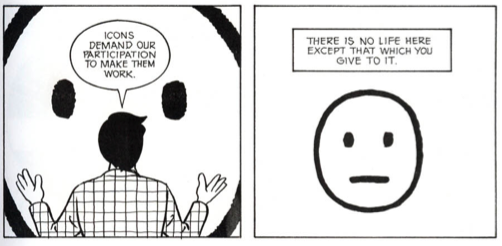
(Scott McCloud, Understanding Comics, Pg 59)
“There is no life in an icon except that which you give to it.”
While this insight forms the cornerstone of what constitutes the vocabulary of comics, it lends a very powerful commentary that is relevant for our practical lives too. Let me explain.
Just like we are said to be exposed to thousands of marketing/ brand impressions per day, I’d wager that we are also exposed to as many (if not more) iconic impressions each day. While a brand’s logo – by definition – could also be called as an ‘icon’, my focus here is more on icons that constitute the typical signage/symbols that we are used to seeing all around us each day – e.g., traffic signage, safety signage, industrial signage, traveler signage etc.
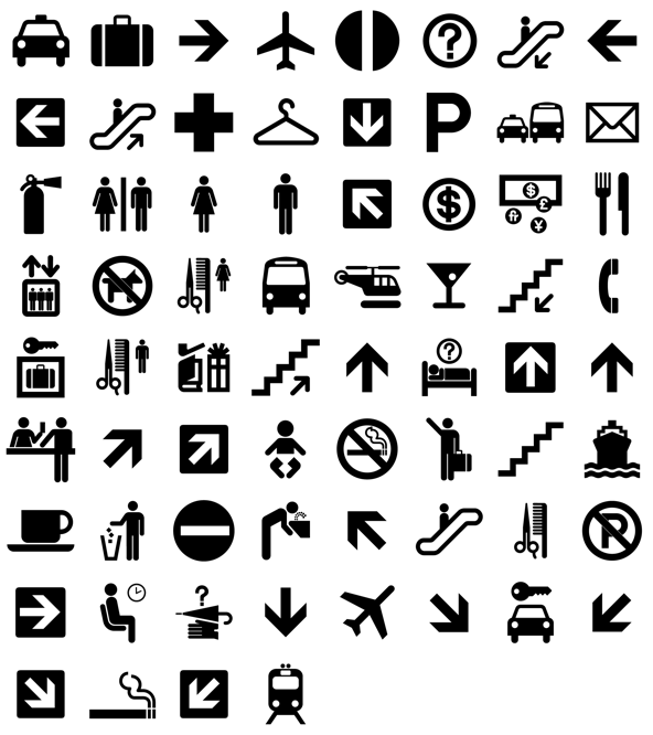
Since these signage icons have been around for years, most of us grow up intuitively accepting them as part of our unspoken language. Thereby they practically end up becoming the visual metaphors of our culture.
Armed with this insight – The Accessible Icon Project was born with a goal to show a more humanized depiction of the differently abled in the International Symbol of Access.
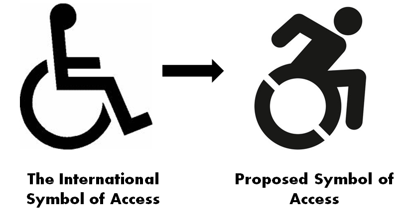
I’ll let you read a comprehensive account of the project here, but the highlight of this guerrilla art project was that it succeeded in reorienting the visual focus of the symbol from the chair to the person, while replacing the rigid, static representation with something more dynamic and active.
Result: The idea has been gaining tremendous momentum around globally as we speak, with NYC becoming one of the first cities in the world to formalize and adopt this new symbol with many disability organizations around the world vehemently following suit.
Metaphors are said to have the power of influencing our ideas, challenging assumptions and creating new world views. And if a picture is worth a thousand words, the power of a visual metaphor like this new ‘access icon’ above can be said to be amplified a thousand fold in shaping our collective biases, informing our cultural opinions and influencing our societal attitudes as humanity.
That’s when things get interesting. Symbolically and literally.
