The Other Side Up

Quick Read: Invert the traditional workflows, dispel orthodox notions and see lateral thinking come to life for newer ways of going about things.  

Every once in a while there come initiatives and executions that turn the tables on traditional concepts that we have always taken for granted. Such instances compel us to re-evaluate our existing notions of what we consider to be the norm and thereby make great fodder for some lateral thinking.

Three such recent examples.

1. Photography

Trevor Christensen is a photographer who shot to international acclaim with his recent series called Nude Portraits.

What is interesting about this project? In this series the photographer is naked, the subjects are not.

According to himThe photographer/subject paradigm is one of inequality. Nude Portraits is about leveling the playing field in an unorthodox way. Instead of focusing on bringing the subject to a place of ease–where I am, this project brings me to a place of vulnerability.

Nude Portraits

(Source: Nude Portraits by Trevor Christensen)

The results are an interesting commentary on the photographer/subject paradigm and hold a thought provoking mirror to the subject and photographer’s feelings around vulnerability, shame, guilt and self composure.

Talking of portraits, meanwhile elsewhere…

Samsung had an interesting set of executions that reframed selfies as Self Portraits.

2. Painting 

Rainworks is a project  by Peregrine Church.

What is interesting about the project? It is art that appears when it rains! Check this video out:

This cool project challenges our notions around negative space and opens up newer possibilities of creative expression.

Talking of negative space, meanwhile elsewhere…

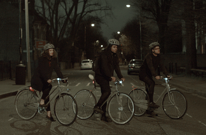
Volvo introduces Life Paint to promote safety for those both inside and outside its cars.

According to this must read post, Life Paint is a unique reflective safety spray aimed at increasing the visibility and safety of cyclists, and other vulnerable road users.

What makes it special? It is invisible by daylight, but glows brightly in the glare of car headlights, making the invisible, visible at night.

Life Paint

(Source: Life Paint by Grey London for Volvo)

The Life Paint concept was developed by creative agency Grey London, in collaboration with Swedish startup Albedo100 and is one of a series of projects to highlight the key product innovations of the all-new Volvo XC90.

3. Reviews

Online reviews have become both a boon and a bane for many a marketer. As this HBR post says,

The idea that a new (reviews) website or app can undercut years of careful messaging may be deeply frustrating to marketers—but it is a reality they must face.

But what if we turn the tables around on the traditional concept of reviews. Australia based Art Series Hotel Group has recently initaited what it calls Reverse Reviews‘. 

What is interesting about the concept? While you review their hotels, you would also be reviewed by the hotel. Get five stars and get a free night to stay again (applicable between April 17 until May 31 2015).

Reverse Reviews AU

(Source: Art Series Hotels )

Talking of reviews, meanwhile elsewhere…

Today’s new world of ‘on-demand everything’ is being touted as The Shut In Economy.

Read this brilliant piece on why this is so and you would probably agree that institutionalising a ‘Reverse Review’ system could just be what the doctor would have ordered to make our world a better place.

Result: People behind the doors (who use the apps, platforms and services to place their orders online) and the people outside the doors (those that deliver) could live in a world that is more inclusive and respectful of each other.

Isn’t it?

(Featured Image: ‘This Side Up’ table design by DEDE DextrousDesign)

The IKEA Test

Quick Read: Well let’s just say that if IKEA had considered opening a couples’ relationship counselling centre at each of its stores, it might give the couples’ counsellors a run for their money! 

If there were to be a prep school for wannabe couples, the final test for graduation could argaubly be throwing them at the task of shopping for furniture… together.

Full discosure: Mrs and I somehow aced that test – though she derives an indescribable pleasure everytime she sees this PepperFry commercial.

No wonder then IKEA is parodied to be the #1 place where couples could realise that they actually can’t stand each other!

Probably armed with this insight, Ramani Durvasula – a California-based clinical psychologist is actually using IKEA shopping runs as a communications exercise for her couples therapy. (H/T Racked)

Ask her if IKEA is a domestic wonderland or a map of a relationship nightmare, and you are told that it could be the later. In fact, according to this WSJ report, she thinks the Ikea shopping experience is fraught with anxiety for couples, for example the kitchen models can lead to arguments about who doesn’t do the dishes and so forth.

Speaking of which, doing dishes could be a seperate thesis altogether on the perils of matrimony.

Actually make it ‘doing dishes’ + ‘trying to own the remote’ and you could have a perfect reciple for domestic disaster.

This commercial for Pril dishwashing liquid is a little undiscovered gem along those lines (though it could be accused of packing a little too many of a punch in one single ad).

(sorry non Hindi readers, wish there were sub titles)

And by the way there even seems to be a compelling case that says  – when in need of a marriage therapy, just do the dishes!

So the next time someone tells you that brands could do with some insights from ethnographic and psycho-analytical research. Tell them that the later could also be true.

[Bonus (and unrelated) Read: Nearly 3 years ago, BrandedNoise featured a post called ‘The IKEA Effect‘]

(Featured Image: Rashid and Shirley Smith got married at the IKEA in Elizabeth, N.J., in 2013. Source)

Imagination. For Selling and Unselling

Quick Read: Evoking imagination has always been a classic trick in the marketers’ book. Let’s see some recent examples where it’s been used to sell. And to unsell.

Man-eaters and the ritual of imagination

For four years, Dutch designer Daniel Disselkoen made the same journey on the same tram route to his art academy, and realised that he had stopped looking out of the window and being curious about what he might see. So he developed a simple little real-world hack called Man-eater.

Predicated around the idea that familiarity with a subject, our environment, surroundings or routine can limit discovery, Man-eater is a simple yet compelling call to action to invoke our imagination to make extra ordinary out of the ordinary.

Is at about seeing the world through a child’s eyes? 

Museum of Childhood

Museum of Childhood (yes, there indeed is a museum by that name!) says exactly the same thing in its recent campaign – wherein with a bit of imagination, the medium and the context become the key parts of it’s message. spaceman_aotw

whale_aotw

(Check out the other executions at this blog post)

Banana Bunkers that look like…um.. bananas?

It appears that it doesn’t require a hell lot of imagination to see why this particular product of GroupOn turned to be its most popular post on Facebook ever! Screen Shot 2015-04-01 at 11.28.33 PM But GroupOn’s real imaginativeness came to the forefront in what happened after the post went live.

Knowing full well of what is to come, they decided to stay ahead of the hilarity and replied each and every one of the comments on their Facebook post. Check out this snapshot of the epic comments that followed!

Now that’s some great imaginativeness to combat (and perhaps even abet) imagination!

And meanwhile else where..

Can imagination be used to ‘unsell’?

The Gun Shop‘ had recently popped up on Manhattan with a store front that read “First Time Gun Owners” in big, bold letters. The catch? Each gun in the store had been tagged with its history: from shooting a mom in Walmart to the Sandy Hook massacres. The result: imagination that just ‘unsells’!

This video captures it well.

The Gun Shop has been a pop-up demonstration created by New Yorkers Against Gun Violence – a partner of States United Against Gun Violence that seeks to make families and communities safer.

Can you think of any other examples? 

(Man-eater –  H/T Neil Perkin | Museum of Childhood – H/T L.Bhat)

Featured Image: The Gun Shop store front on Manhattan, Source

Annotations About Annotations

Quick Read:Who would have thought what had begun as a traditional 17th century readers’ habit of jotting down some thoughts and gossip on the margins of a sheet of paper could turn out to become a concept for world domination?

Annotations are in vogue today!

In the 17th and 18th centuries, it was traditional for newspapers to include space for readers to jot down thoughts, gossip, and observations before passing along their copy to others. Some papers kept their margins wide for such notes; others, like the very first American newspaper, Publick Occurrences, included an entire blank page.

Annotations are an extension of that tradition.

Annotations in the past

(Annotations in Boston Gazette and Country Journal (1770): Source)

…Saying this, Quartz – a popular blog, annouced the opening up of its margins to users’ comments – also known as annotations.

Medium – the acclaimed blog publishing platform – introduced this concept of ‘notes’ that let readers comment (annotate) on specific paragraphs of the story instead of at the bottom of the piece.

Today Soundcloud allows users to annotate audio; Gawker Media allows users to annotate images and New York Times experimented with annotations around news as a more participative means of user engagement.

Annotations – as a creative narrative device

Even novels have begun to adopt annotations as a narrative device. S. – a novel previously featured on BrandedNoise –  has at least four different interconnected narratives unfolding at the same time. One such narrative is the dialogue between a guy and a girl who read and discuss a book through their notes passed on to each other written as annotations.

ship-of-theseus-3

(This is how an actual page of S. looks like. Image source)

If there is one book that you should buy – even for the sheer experience of just leafing through its pages and marveling at its creativity and design. This is it!

‘Annotations’ as a billion dollar idea?

Genius.com – a Andreessen Horowitz backed startup – is believed to be testing a new feature: the ability to annotate any page on the web, adding a new stratum of knowledge to the largest store of information in human history.

Currently in beta, the new functionality lets users add genius.com/ to the beginning of any URL to access a version of the page on Genius. The page is fully annotatable, so users can highlight and annotate any text on the page and view others’ annotations. (source)

Genius Annotate

(Annotations from Genius.com: Image Source)

Enough and more is already being written about Genius.com and its stated goal of “annotate the world”, with some even predicting that Annotate would soon transcend into the class of those fundamental verbs of contemporary culture, such as Google and Like!

Bonus read: Recently a mysterious billboard had appeared on the streets of Manhattan. (see the featured image above) Whereas most billboards are logo delivery vehicles, this one is unclaimed. The billboard is the work of Emily Segal for Genius.com. A great post on this avante-garde marketing campaign here

Food Is Food Is Food. Or Is It?

Quick Read: Good design can drive a price premium –  and this adage could hold good even in a category like perishables. 

Have you heard of flour by Prada, infant formula by Chanel, coffee by Cartier,  fruits by Nike and pasta by Ferrari?

coffee1

(Source: Peddy Mergui: Wheat is Wheat is Wheat)

Well they do ineed exist. Albeit as exhibits by Peddy Mergui under his series titled Wheat is Wheat is Wheat. These funny and provocative exhibits challenge our notions of branding and perception by casting them against a category like perishables/food.

Eggs by Versace anyone?

Let’s drop brand names for a moment and see how else can a product possibly command a price premium. We know tons of examples across different categories where design has helped a product command a premium.

Now, could design play a prominent role in commanding a premium within a category such as perishables? These two examples prove this point.

1. Whole Foods: 

When it comes to applying design for selling something as commoditised as veggies, there’s only one name. Whole Foods.

Avinash Kaushik recently posted this picture and the following lines regarding what he found at a Whole Foods store.

Avinash Kaushik Whole Foods

(Source: Avinask Kaushik)

“Do we shop at Whole Foods simply because the produce is so exquisitely displayed? And we pay a premium?

I think there is something to that. Look at it! Everything so perfectly symmetrical and lovely. There was a sprinkling of mist on all the veggies, drawing out the color and freshness.

For an engineer, me, all this organization definitely had an impact. It looks good, it shows people care deeply about the food, they went into extra trouble, it must be all good (and it was!).

What a great way to get someone to pay a premium.”

His lines encapsulate everything in this context.

2. Nuna Ice – Cream:

Billed by PSFK as a molecular-gastronomy popsicle that is set to take next summer by storm, Nuna is a design innovation in ice-cream born at the intersection of disciplines such as architecture, design and science.

Nuna(Source: Nuna)

According to it’s spokesperson, the Nuna Popsicle is design innovation in a crystal/pyramid shape, and stands for the ultimate refreshment that reflects the sensation of ice crystals bursting on the tongue while causing a unique and intense tingling in the mouth.

While it is expected to have a soft launch in art openings, fashion shows and music festivals during 2015, Nuna – which got its name trademarked recently – is expected to contract with a major manufacturer soon. (source)

Now that’s form following taste!

(Featured Image: Tiffany & Co Yogurt byPeddy Mergui)

The Simmel’s Barrier

Quick Read: A Milan store with debranded perfumes helps consumers find the perfect scent without being distracted by the label. But is branding a barrier in consumer experience?

Wine tasting is arguably a junk science.

WineTasting

There have been several studies conducted over the years to debunk the accuracy of wine tasters in assessing the attributes of wines. A common theme of most of these experiments is an assessment of our capability in being able to accurately identify and analyse multiple sensory stimuli at the same time.

One such landmark study in debunking the expertise of wine tasters is called ‘The Color Of Odors‘. It investigated the interaction between our vision of colors and odor determination and found out that by a simple act of artificially coloring a white wine with a an odorless dye,  you can fool not 1, not 2 but an entire panel of 54 wine tasters into getting it classified as a red wine!

The insight? By just throwing in some basic visual stimuli you can effectively screw up your olfactory assessment skills.

Now add in the other 3 senses and it is not hard to begin pitying ourselves for the sensory overload that we subject ourselves to on a daily basis.

Sensory Overload

The wikipedia page on Sensory Overload speaks about Georg Simmel – a renowned sociologist who writes about an urban scenario of constantly appearing stimuli that trigger our brains’ senses. Interestingly he calls for a barrier that must be erected to protect the individual from this constant stimulation in order to keep one sane.

The new Desirée Parfums store in Milan has identified a particular marketing element as its ‘Simmel’s Barrier’ to protect its customers from sensory overload. What does it do?

It organises its fragrances by aromatic quality, rather than brand. According to this source, when walking into this store, customers aren’t subconsciously guided towards the most expensive perfumes like they might be in another store. Instead, the outlet has decanted all of the fragrances it sells into nondescript tester bottles, which are organized by their olfactory quality.

Assistants guide customers through the options available, helping them to find their perfect scent while also teaching them about the different qualities that make up a perfume. Only when they get to the counter so they get to find out which fragrance they’re buying.

desireeparfum store

(Image source)

With perfume stores using branding as their ‘Simmel’s Barrier’, wine stores might not be far off from adopting the same.

Have you heard of any other examples?

(Featured Image: Jacquelinewilkinson)

Sonder And The Art Of Photography

Quick Read: Perspectives can be valuable.  A Kickstarter campaign shows us how to create value out of them while a multi million dollar campaign from a global brand shows us what it can learn from the former.

Sonder is a fascinating word.

It is the realization that each random passerby is living a life as vivid and complex as your own—populated with their own ambitions, friends, routines, worries and inherited craziness—an epic story that continues invisibly around you. (source)

At a fundamental level, Sonder for me is a shift in perspective that makes me cognizant and appreciative of the tens of thounsands of stories unravelling around me, in all their characteristic diversity and profundity.

It’s sonder that makes Street Photography fine art. It’s sonder that makes Vernacular Photography artistic to our eyes.

In fact, it’s sonder that can even help us put a price to perspectives.

Heard of Tribe Photo? James Kell is a photographer and sailor. In his words..

Recently during my work in Haiti I had an opportunity to put my subjects on the other side of the lens – to give them the chance to experience the pleasure of photographing people.  I found the perspectives of the locals – when they were making the photographs – was completely, strikingly unique. This was the kernel of the idea that is now Tribe Photo.

Read more about the business model of Tribe Photo on its kickstarter page.

But the essential idea that underlies Tribe Photo is insightful and impactful in many ways than one. It gets to the heart of the “art in photography” by transcending the narrative of the camera gear. It puts a value to perespectives as seen through the photographer’s eyes and thereby puts the photographer first, celebrates the art of photography and gives back to the community.

Tribe Photo

I Am Generation Image

Now, contrast that to the campaign that Nikon is introducing this week timed for the Christmas shopping season. This campaign with an estimated budget of $ 5 – $7 million themed “I am Generation Image“, is essentially a plea to the generation Y – the millenials –  to shoot more with a DSLR than with their phones. (source)

So what is this campaign all about? Check this video out.

This attempt at speaking to the millennials by asking them “Are Your photos good enough?” loses out on two counts:

  1. In putting people first: in fact it challenges them in a way that might actually provoke them to go out of their way to shoot outstanding photos with their phone camera
  2. In celebrating the art of photography: While the campaign does have at it’s core this page being promoted through this video audaciously titled “See Through The Eyes Of This Generation”, the content on the page tries hard to dumb it down for their TG. Sample this: “Zoom out as wide as you can, and you can even do selfies on a DSLR”

Really? All this from the brand whose theme has been to be proudly “At The Heart Of The Image”?

(Featured Image: IamGenerationImage.Com)

Rationalising The Emotional

Quick Read: At one end we have ads with heavy emotional messaging and at the other we have those with hardcore rational, persuasive messaging. And then there are those that make interesting attempts at occupying the space in between.  

My contention is that truly great advertising does something far more important than deliver a rational message, and far more important than entertain: what it does is to establish associations. (Heath, 2002)

Seducing the Subconscious is an acclaimed book by Robert Heath on how advertising works. A key argument that he makes in this book is that the best advertising actually works through emotive as opposed to persuasive messaging, and emotional content is processed most efficiently at low levels of attention, not high.

Read this great post by Steve Genco for a more detailed commentary on Heath’s theory. He says..

..a substantial body of research has shown that emotional associations established at low levels of attention lead to longer-lasting influences on attitudes and behavior than rational arguments (i.e., traditional persuasion).

This is because they facilitate the memory activation mechanism of recognition rather than recall.  Recall requires effort, fades relatively quickly, and has to be reinforced regularly.  But recognition is triggered effortlessly and lasts indefinitely.  So recognition, unlike recall, is more likely to result from low attention processing.

(So the thumb rule?) Combine a brand with an emotionally engaging ad, repeat the association under low attention conditions like TV watching, and you will get both recognition and a favorable default attitude toward your brand.

That’s probably why the new John Lewis ad works. And that’s probably why we have attempts at advertising like this one for Obsession by CK.

While this ad and its iconic print campaign by Robert R. Taylor are said to be some of the most memorable advertisements of all time, it is also billed by many as “the ultimate in abstract and meaningless advertising”. (source)

Arguably it does take a strategic leap of faith for a marketer to ride on just emotion and disband the century old model of ‘rational’ or ‘persuasive’ messaging that much of marketing communication still cleaves to. So it’s not uncommon to see many ads that – while narrating an emotional story – also ensure they rationalise it and close the spot with a persuasive messaging for the viewer.

Interestingly, almost as if to exemplify the above point, Pfister‘s new ad on its touch free range of faucets called REACT takes a dig at ‘Obsession’-isque narratives by attempting to unwrap the enveloped message for us.

Talk about rationalising the emotional.

(H/T this nytimes report)

(Featured Image: React Faucet by Pfister)

Inspiration From Across The Category Fence

Quick Read: Sometimes, the best idea for a brand campaign might be just around the corner, albeit with another category. Even when the core of the campaign idea is ‘Originality’. And perhaps rightfully so.

Inspiration from across the category fences is no new news. But that’s no excuse why we should take such instances for granted. Some recent examples of brands taking inspiration from other categories and appropriating them in a way that is relevant to their campaign idea/ brand personality. Virtual High Five (Coke – KLM) In May 2013, Coke had this huge hit campaign that ‘connected’ people from different countries (India – Pakistan) through what it called as ‘Small World Machines’.

Cut to this year (Sep 2014),  KLM gave a reason for Amsterdam and New Yorkers to ‘get connected’ through this Virtual High Five campaign.

As this article says, KLM’s deployment of this idea is clever because it underlines the message that while technology has the power to interactively connect people like never before, it’s airlines that have the ability to physically connect people faster, easier and more effectively than we have ever experienced in the past. KLM-Live-High-Five-1-640x340

(Source: Creative Guerrilla Marketing)

Unique, Original & Extraordinary (Absolut – Coke) In Sep 2012, I wrote about Absolut’s brilliant execution of their limited edition design series called Absolut Unique. A story of carefully orchestrated randomness powered by 35 different colors, 51 different pattern types all governed by algorithms meticulously devised to induce a method to this madness of design. absolut-unique-vodka-bottles-02

(Source:Absolut)

Result: A first of its kind design spectacle at a massive scale resulting in over 4 million bottles where no two bottles are alike. See the video here.

And then in 2013, Absolut followed this up with Absolut Originality. Video here.

Cut to this year (Oct 2014), a new campaign for Diet Coke in Israel revolves around the concept “Stay Extraordinary,”  as part of which it produced over 2 million different bottles using a printing system that printed every bottle with a different look. Video here.

Any other examples of well executed campaign ideas inspired from different categories?

(Featured Image: Absolut Originality)

Exploring the Boundaries Of The Traditional Concept

Quick Read: The idea of Traditional Concept and its reliance on metrics like Purchase Intent for validating product ideas is being challenged. More so in the realm of Retro Innovations.  

The Traditional Concept and its classic three part construct – Insight | Benefit | Reason To Believe – to represent a product idea for consumer research has been coming under scrutiny. In fact, there are even obituaries being written about it citing reasons like:

  • It is too rigid, rational and over – engineered as a construct to represent a product idea
  • Puts far more emphasis on our deliberative ‘System 2’ thinking
  • Fails to take into account how consumers tend to make decisions (unconsciously, quickly, swayed far more by emotional impact and immediate impressions)
  • Relies heavily on metrics like purchase intent for validation

Academic arguments apart, one thing that a Traditional Concept cannot possibly help with is screening product ideas that fall into the realm of Retro Innovations – new products that are designed around connecting us with the past and invoking our nostalgia.

Two recent product examples where a traditional concept could have had a tough time cracking the consumer code:

The ‘Miller Light’ Retro Design And Its Placebo Effect

Miller Lite is known as the first mainstream light beer in the US. But over the years, the U.S. sales of the beer had been declining, trailing Bud Light, Coors Light, and Budweiser. Revenue dropped 7 percent in just 2013 (source). So in January 2014, as part of a product placement tie in with the film Anchorman 2, Miller released a limited edition version  of its original 1975 white can.

bottle(The Retro Designed Miller Lite Can)

Surprisingly for Miller Lite, this retro designed packaging proved to be a success (it sold 32 million cans more than that during YTD 2013) that by September 2014 it decided to switch back to this packaging full-time, including on bottles and tap handles.

And reportedly, taken by surprise, when Miller marketers conducted some post launch evaluation, they learnt that the Millennials had liked it because it seemed iconic and old while their parents had liked it because it reminded them of what they used to drink. Strangely, customers even started telling the company its “new” beer tasted better even though they were still drinking the same old beer(!)

Obviously, a Traditional Concept and conventional testing for metrics like Purchase Intent, could not have driven the brand along this unexpected ‘retro’ direction.

Leica M Edition 60 – The Digital Camera Without An LCD Screen

To celebrate the 60th anniversary of the legendary Leica rangefinder system, the company recently announced the Leica M Edition 60. The unique thing about this camera is that it does something bold – it ditches the back LCD screen and all onboard menus. One cannot even review their photos. It leaves photographers with physical controls of aperture, shutter speed, and ISO. And it forces them to look through just one thing – the viewfinder.

Is this a good idea? Will consumers like it? Does it even make design sense? The debate is on.

But one thing is certain:  this reductionism as a celebration of photographic art – as Leica calls it – could not have been conceived of through the lens of the Traditional Concept and testing for Purchase Intent.

Is the Leica M Edition 60 too high end to be a realistic example here?

Well, then let’s get a bit ‘low end’ – Music CDs and online music.

Let’s think of product ideas in terms of Traditional Concepts and test for their Purchase Intent to sell online music to the Japanese vs the good old CDs. 

And good luck to us doing that!

JAPAN-MUSIC-01-master675(AKB48, a popular Japanese group, has sold CDs containing tickets to its performances, encouraging fans to buy multiple copies. Source)

(Featured Image: The New Leica M Edition 60)